CNN debuts new graphics
Subscribe to NewscastStudio for the latest news, project case studies and product announcements in broadcast technology, creative design and engineering delivered to your inbox.
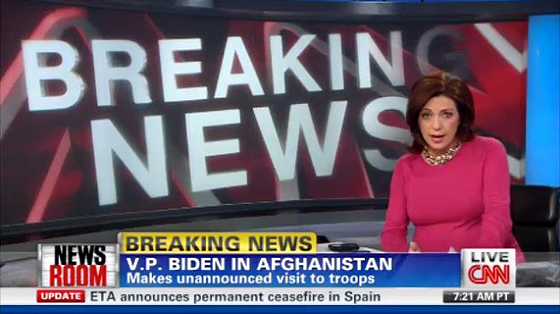
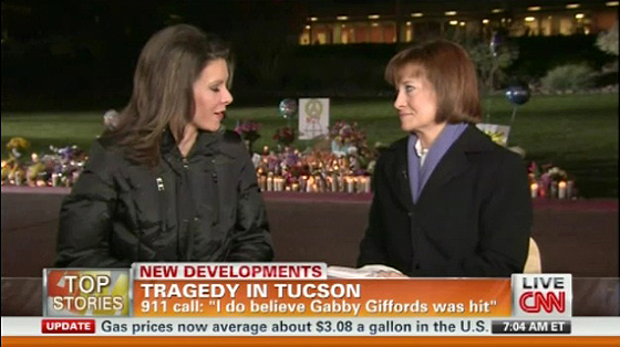
CNN rolled out new network graphics this morning. The new graphics replace a package that debuted in 2009.
Unlike the previous package, the new graphics change color based on the program. Orange for “American Morning,” blue for “Newsroom.” The graphics loose the floating feel of the previous graphics and are more like HLN’s graphics. The new L3 also goes the entire width of the screen, similar to the package used in 2008.
With the change, CNN also moved to a letter box format for SD viewers, like Fox News Channel. ICN notes that with the change, safe zones are dead.
“[CNN] can now make the graphics bigger and wider, taking up more of the screen. And more graphics is, of course, a bad thing…”
Overall, the new graphics are effective, but still don’t feel as polished as HLN or MSNBC’s current packages. On many elements, the text seems a little too big. Also, the elements don’t always interact well with each other, creating a rainbow of color on some programs.
Thanks to CNNFan.org for the caps.
Subscribe to NewscastStudio for the latest news, project case studies and product announcements in broadcast technology, creative design and engineering delivered to your inbox.


tags
CNN
categories
Branding, Cable News, Graphics