
‘Rock Center’ swaps graphics again
Subscribe to NewscastStudio for the latest news, project case studies and product announcements in broadcast technology, creative design and engineering delivered to your inbox.
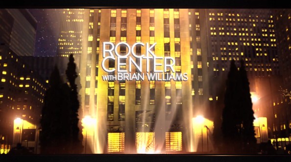
NBC News’ “Rock Center” debuted a new graphics package on last week’s edition, marking the show’s third graphical look in its two year history.

The new look harkens back to the show’s original graphics, refocusing on 3D imagery of Rockefeller Center and bringing back gold tones. However, the new design tones down the glassy look in the original package, seen in this YouTube clip:
The graphics also use a more subtle orange and yellow toned color palette in favor of the rich orange, golds and icy blues found in the original look.
The new package replaces the show’s previous look, which used a monotone black and gray scheme accented with teal. This design also didn’t include any visual references of the show’s namesake and historic home.


The new colors sometimes come across as a bit sickly, with the yellows often getting a bit too close to the green color range, especially in some of the bursts of lighting such as the one seen to the left of the video box above.

Another element carried over from the original look is the use of boxes, though they are less stylized (and with less of a cube effect) and more in line with the treatment used in the most recent “NBC Nightly News” package, which does provide some nice visual continuity.

That box motif is also used in a more pixelated, mosaic treatment, as seen in the teaser graphic seen above.
It’s worth noting that “Rock Center” has managed to keep the same logo treatment throughout its short life.
It’s no secret “Rock Center” is fighting an uphill ratings battle, having been yanked from the NBC schedule last season and jumping around the schedule, with its latest timeslot move reportedly angering anchor Brian Williams.
Subscribe to NewscastStudio for the latest news, project case studies and product announcements in broadcast technology, creative design and engineering delivered to your inbox.

tags
Brian Williams, NBC, NBC News, rock center
categories
Graphics, Networks