
Al Jazeera website shows restraint, simple design
Subscribe to NewscastStudio for the latest news, project case studies and product announcements in broadcast technology, creative design and engineering delivered to your inbox.
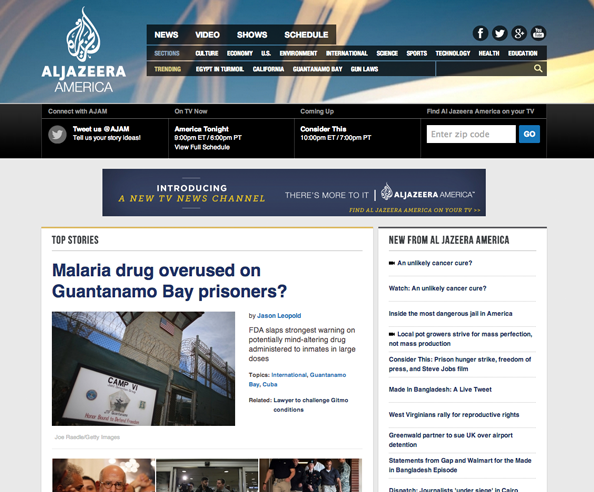
Just in time for its television debut, Al Jazeera America’s website switched over from the “beta” version that went live about a week ago for the real deal — and it’s a study in a simple, minimal design without fancy bells and whistles.
The new site retains much of the beta versions clean look and feel, but uses a more refined navigation bar and a header that features a closeup view of the network’s signature graphical elements.
The section fronts and story pages of the site continue the clean look and seems to be making a concentrated effort to eliminate much of the clutter seen on other news websites.
The social media icons, for example, are simply outlines set against the page’s white background.
The site also shows restraint in linking to other content — where most news websites have scores of clickable headlines to get readers to stay on the site longer, only a few small boxes in the right column (where the advertising also resides) offer links to other pages on the site.
Subscribe to NewscastStudio for the latest news, project case studies and product announcements in broadcast technology, creative design and engineering delivered to your inbox.

tags
categories
Cable News, Featured, Online and Digital Production