
‘The View’ furthers its graphical identity crisis by going pink
Subscribe to NewscastStudio for the latest news, project case studies and product announcements in broadcast technology, creative design and engineering delivered to your inbox.
ABC‘s “The View” is marking Breast Cancer Awareness Month by going pink — and along the way has managed to further muddle the on air look and feel that’s barely had a chance to stretch its (metaphorical) legs.
The show, which debuted a completely new look in September, also recently tweaked its graphics to include a stylized cityscape background in place of the more subtle design originally used.
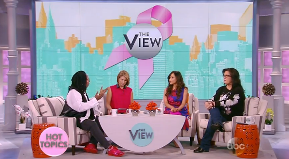
Now, the show has switched things up again and has added pink to its bug and lower thirds. In addition, the show has added a pink ribbon to the video wall background graphic shown behind the hosts — resulting in a rather glaring clash of pink v. orange.

The show’s logo also appears in a silver gradient now, a subtle change that was actually made before the ribbon was added for the month of October. Normally the logo is shown in a light teal color.
The pink bug features subtle glass-like effects around the edges — which seems to indicate the show isn’t quite sure whether it wants to switch to its simplistic, flat look or something with a bit more flair.
The new bug also presents a bit of a legibility issue since there isn’t quite enough contrast between the pink and medium-gray used for the letters.
The show has also updated parts of the set to become pink — notably the backlit square-shaped panels on either side of the set and that front the sliding wall, located between the audience risers, where the hosts and guests emerge from.

Some subtle pink downlighting has also been added around the set, which is especially noticeable with the splashes of color on the columns.
Overall, the pink look just adds to the haphazard graphical identity crisis the show seems to be having just a few weeks into its new season.
One suggestion: If you’re going to “go pink” for breast cancer, then why not do it all the way? Dump the teal and orange for the month (especially since orange and pink almost universally look horrible next to each other).
Another piece of advice: Stop playing with the logo. Pick a design and stick with it — and stop adding every cheesy Photoshop trick in the book to it.
Subscribe to NewscastStudio for the latest news, project case studies and product announcements in broadcast technology, creative design and engineering delivered to your inbox.

tags
ABC, ABC Studios NYC, color, logo, pink, Studio TV1, The View, video wall
categories
Featured, Graphics, Networks, Set Design