
HLN keeps ‘talking’ with new logo
Subscribe to NewscastStudio for the latest news, project case studies and product announcements in broadcast technology, creative design and engineering delivered to your inbox.
Along with the debut of CNN‘s HLN new set in CNN Center Tuesday and a “social vibe” centric focus, the cable network also switched to a new logo that still keeps its speech bubble theme.
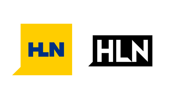
Originally known as CNN2 and then CNN Headline News, HLN began using its three letter acronym in 2008, the same time it introduced its square-shaped yellow logo.
This design featured a triangle tacked on to the lower left of the square container, making the entire mark resemble a speech bubble. The logo also merged the left side of the “L” into the right side of the “H,” which sometimes made it a bit difficult to read.
Tuesday’s logo is mainly used in solid black or white and morphs into a more rectangular shape, eliminating the empty space above and below the letters. The network has retained the triangular part in the lower left, which was no doubt kept as a reference to the network’s new social first focus.
The typeface, meanwhile, has changed and the “H” and “L” are now separated, while the “L” has a a chunk removed from its “foot” to make it match the angle of both the triangle on the left side and sharp angles in the “N.”
The new logo creates a bolder, more legible look that’s also more cohesive with the stylized speech bubble theme.
Subscribe to NewscastStudio for the latest news, project case studies and product announcements in broadcast technology, creative design and engineering delivered to your inbox.

tags
CNN, HLN, logo
categories
Branding, Cable News, Featured