
‘Nightly’ switches to angled tease graphics
Subscribe to NewscastStudio for the latest news, project case studies and product announcements in broadcast technology, creative design and engineering delivered to your inbox.
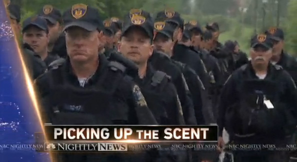
“NBC Nightly News” has begun using new angled graphics for its teases.
The NBC News broadcast, currently being hosted by Lester Holt, as the network decides if Brian Williams will return from leave (Holt, meanwhile is said to be angling for a higher salary should he take over the broadcast), now starts with a wide shot of Holt standing in front of the set and quickly switches to a full screen graphic that uses an angled wipe that incorporates the package’s world map along, show logo and a bright gold edge.
A similar design is used as a sidebar of sorts that helps frame a lower-third style title with the “Nightly News” logo beneath it. Here, too, the gold edge is very prominent on both the left angled element and between the title and logo.

The new titles have been updated to the use the font the newscast switched to using in on Studio 3B‘s rear projection screens back in September. That update was part of a broader change that saw the broadcast shift to using the zone previously designed for the now defunct “Rock Center.”

After the open, the show transitions to another shot of Holt that quickly pulls out before switching to the open, which remains unchanged.
To start the show, NBC has switched to having Holt standing, pushing in from a wide, dramatic wide shot to a tighter shot of Holt with one of the studio’s video walls as an OTS.

The introduction of angled elements is an interesting choice for the broadcast, given that its current graphical look is heavily rectangular and square. That said, the September updates did see some subtle, angled elements introduced into the on-set graphics.
The addition of the bold gold accents is also a bit of a shift away from the existing package which uses mostly blues — albeit with some gold accents, but the new tease graphics seem to utilize a brighter, more prominent iteration of the color.

The stacking of the show’s logo and the title bar is a bit awkward as well. The show’s logo’s placement seems a bit too close to the title bar — especially when you consider the gold burst sometimes awkwardly obscures parts of it. The left edges of the boxes, meanwhile, overlap the angled sidebar by just enough to make one wonder if it’s a mistake or done that way on purpose.
Subscribe to NewscastStudio for the latest news, project case studies and product announcements in broadcast technology, creative design and engineering delivered to your inbox.

tags
lester holt, NBC News, NBC Nightly News
categories
Branding, Featured, Networks, TV News Graphics Design, TV News Graphics Package, TV News Motion Graphics Design