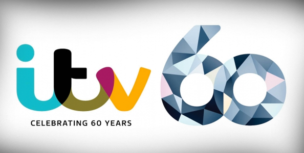
ITV celebrates 60 with multifaceted logo
Subscribe to NewscastStudio for the latest news, project case studies and product announcements in broadcast technology, creative design and engineering delivered to your inbox.
Britain’s ITV is celebrating its 60th anniversary with a diamond-inspired logo that’s every bit as colorful and quirky as its everyday logo.
When the current logo, a colorful script of the letters “ITV,” debuted in 2013, its design was greeted with mixed reviews.
The logo’s unusual, custom typeface and offbeat colors were certainly unique for a television network and a big shift from the very corporate looking renditions of the ITV logo that was seen through the years:

The 60th anniversary logo retains the 2013 logo but tacks on a large “60” that uses an array of multicolored polygons as a filler.
This polygon look is, interestingly, a very popular design trend right now given that it works well with the popularity of flat design and use of strong geometric shapes.
While the majority of the logo’s polygons are used in a variety of shades of blue-gray with a few segments of tan and pink mixed in. The overall effect is that of a multifaceted diamond, which is appropriate given that diamonds are the stone of choice for 60 year anniversaries.
The color scheme selected for the “60” does a good job of complementing the one used in the main logo, though the shape of the characters seems a bit mismatched and perhaps overly clean for the playful curves and letterforms found in the “I,” “T” and “V.”
Specifically, the lower curves of the “6” and “0” could have been refined a bit to match the dips found between the letters “I” and “T” and “T” and “V,” giving the overall design a bit more of cohesive look and feel.
Subscribe to NewscastStudio for the latest news, project case studies and product announcements in broadcast technology, creative design and engineering delivered to your inbox.

tags
itv, logo
categories
Branding, Featured, Networks