
HLN tweaks lower thirds
Subscribe to NewscastStudio for the latest news, project case studies and product announcements in broadcast technology, creative design and engineering delivered to your inbox.
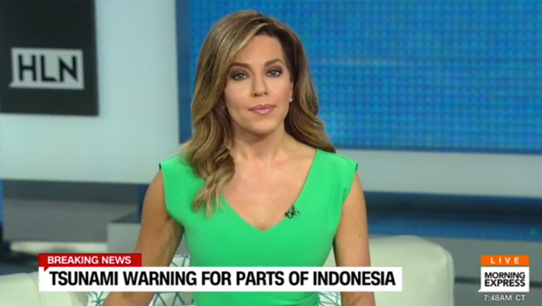
CNN‘s HLN has quietly rolled out a new graphics package that sheds much of the blocky speech bubble motif that the network introduced in January 2015.
The move comes after the network, which has undergone a bit of an identity crisis on the past few years, announced plans to shed its social media focus in yet another failure of social media driven news.
The new graphics keep much of the simplicity of the old package, but do come across as being slightly more cluttered — likely due to a more condensed typeface that squeezes in more words and less spacing between elements.

A new animation pattern where graphics zoom on screen at a slightly larger size than they appear normally and quickly “shrink” down is also used. The new look also incorporates a bit more color and tighter spacing in addition to the aforementioned font change.
Everything is also a bit more bold — thanks to the removal of much of the transparency and more subtle shades used for text.

Much of the network’s remaining graphics remain the same and it appears the most significant changes have been made to the lower thirds.
The new look replaces a design that used clean and simple box-shaped speech bubbles with a tiny “tail” on them for almost all graphics — a design so simple that it came across as elegant and unique.
While the “tail” has been retained (which makes sense since it also is used in the network’s logo), it appears, in some odd way, to more of an accent than a nod to social interaction.
[field name=iframe]
Subscribe to NewscastStudio for the latest news, project case studies and product announcements in broadcast technology, creative design and engineering delivered to your inbox.

tags
CNN, HLN
categories
Branding, Cable News, Graphics, Heroes, TV News Graphics Design, TV News Graphics Package, TV News Motion Graphics Design