
Apple plans redesigned news app with updated icon
Subscribe to NewscastStudio for the latest news, project case studies and product announcements in broadcast technology, creative design and engineering delivered to your inbox.
Apple has announced a complete redesign of its Apple News app for its iOS devices — along with a new logo and icon.
In many ways, it appears the news app is taking on a more traditional approach — with content clearly organized by topic.
The current version of the app centers user experience around a more feed-style approach where stories are ranked based on user history and preferences. This could cause, for example, an in-depth story about the Taliban to appear next to the latest sports story.
The new app, announced at the Worldwide Developers Conference, will still let users dictate specific topic areas of interest that go beyond the typical “Sports,” “Tech” and “Money” headings. In one example shown at the event, the headings “Formula 1” and “Supercars” is visible.
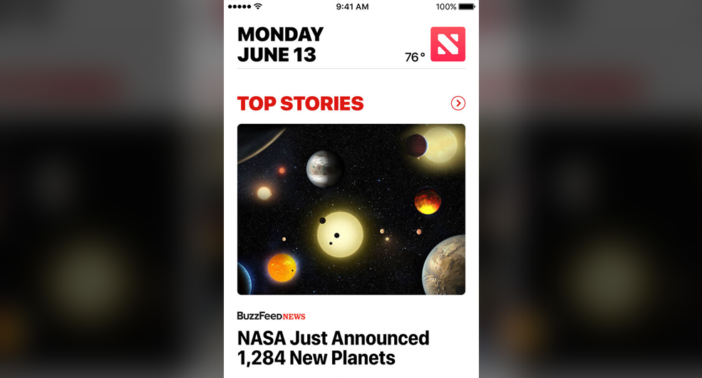
In addition to a complete redesign of the app itself, the app is getting a new logo and icon.
Gone is the newspaper icon and in is an abstract rendition of the letter “N.” The bold red logo is essentially a square separated by two diagonal lines that go from the the top left to bottom right.
The result are three white segments, two of which are mere triangles, with the third being more of a diagonal bar. Together, these form the rough outline of a letter “N,” presumably for “news.”

The logo could also be interpreted as conveying motion, arrows or lines of text. Looking at it another way, the icon also mimics a compass rose, albeit a crocked. This could be a subtle nod to the supposed origin of the word “news” as corresponding to the four cardinal directions of north, east, west and south.
The redesigned app will be part of the free iOS 10 update that will be released to the public this fall.
Subscribe to NewscastStudio for the latest news, project case studies and product announcements in broadcast technology, creative design and engineering delivered to your inbox.

tags
App, Apple, Apple News, ios
categories
Heroes, Online and Digital Production