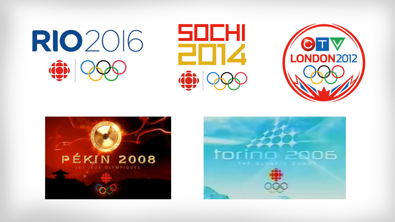
A look at Canadian broadcasters’ Olympics logos
Subscribe to NewscastStudio for the latest news, project case studies and product announcements in broadcast technology, creative design and engineering delivered to your inbox.
Where U.S. Olympics broadcast rights holder NBC tends to create more intricate, thematic Olympics logos, Canadian broadcasters tend to take a more typographic approach.
![]()
Through 1996 to 2010, CBC was the broadcast rights holder and used a simple sans serif typeface for its title cards and logo.
The exact arrangement and typefaces used varied slightly and, for the centennial games in Atlanta in 1996, the letters were turned gold with an outward bulge.
![]()
In 2000, the year was spaced out above the words “Olympic” and “Summer,” with the word “games” spaced out below.
![]()

2002 saw the word “Olympic” become more prominent and the logo lost its wide letter spacing.
![]()
In 2004, the typography switched over to an elegant, Greek-inspired font. Shown here is the French rendition of the title card — but there was, like the other designs in French shown here, a similar English version as well.
Here too, the network began using background designs with a bit more local flavor.
![]()
After that, the CBC opted to use the organizing committee’s logo set against a most icy blue motif.
![]()
For Beijing in 2008, the CBC switched back to using a typeface inspired by the host country — with a typeface that’s, in some ways, similar to NBC’s choice for that same year.
As an icon for these games, the network added a gold gong above the logotype. Splashes of gold, a silhouette of a pagoda completed the look.
In 2010 and 2012, a consortium of a broadcasters including CTV and TSN all teamed up to broadcast the games in Canada — which included a bit of a detour in the past logo design strategy.
![]()
For Vancouver, the networks switched to a round logo — perhaps inspired by the shape of Olympic medals — with a stylized mountainscape below. As a bit of a creative twist, the design also included points in the center of the mountains inspired by the iconic maple leaf of the Canadian flag.
Above this are the Olympic rings, the logotype and a space for each network to place its logo (the CTV version is shown here).

![]()
For the next games, in London, the same basic shape and style was used — with the Union Jack added at the bottom instead of the mountains. The design kept the subtle nod to the Canadian symbol with both the center element and general shape of the flag pattern.
These two designs could have been an interesting design direction to create consistency of the brand, but when the games returned exclusively to CBC in 2014, things were changed up again.
![]()
The network returned to using a typeface at least somewhat reminiscent of the host country (though, in many ways, the Sochi version of the logo shown here could have just as easily been used for Beijing, especially given the color choices).
![]()
For Rio, CBC went with a clean typeface that has almost too-subtle rounded edges. This overall approach was similar to what NBC did — much more successfully — with its Rio logotype in an attempt to add a bit of Carnival “flair” to the logo.
In the CBC’s version, however, the curves are very easy to miss and the rather dull shade of blue doesn’t capture the vibrancy of the country, either.
Subscribe to NewscastStudio for the latest news, project case studies and product announcements in broadcast technology, creative design and engineering delivered to your inbox.

tags
2016 Olympics, Canada, CBC, CTV, logo design, TSN
categories
Branding, Broadcast Design, Heroes, Olympics