
CBC opts for a different view of the Olympics in Rio
Subscribe to NewscastStudio for the latest news, project case studies and product announcements in broadcast technology, creative design and engineering delivered to your inbox.
For its coverage of the 2016 Summer Olympics in Rio, the Canadian Broadcasting Corporation opted to think a bit outside the box — quite literally — for its scenic design.
Instead of building its studio in the International Broadcast Center, the network chose to have its primary location in the middle of Olympic Park, utilizing two window-lined spaces in a broadcast tower.
“The IBC was a box with no windows. It had no connection to Rio and could essentially be anywhere in the world,” explained Kyle Sanvictores of AKA Creative, the designer of the project.
CBC had two nearly-matching studios in the tower, with one serving CBC and another serving Radio-Canada.
Capturing the Spirit
“Shooting from the TV tower became experiential for viewers at home because they could see in real time what athletes and spectators there in Rio were experiencing: celebration and a sense of community,” explained Sanvictores.
The main idea behind CBC’s space in Rio was to provide a window into the games and connect viewers at home with the spectacle and energy of the city.
AKA Creative was given creative free rein on how the design strategy would proceed, working with CBC well in advance of the games. From the start, Sanvictores knew there would be some challenges to overcome.
For one, the tower locale meant a relatively small space, especially compared to what might have been available at the IBC. The setup also needed to be flexible enough to accommodate multiple talent configurations while looking great across a myriad of television and mobile device screen sizes.

Despite the spaces only being about 16 feet by 30 feet, AKA Creative was able to create enough room for the home base plus an athlete interview area that could seat up to six guests.
The team even managed to make enough space for a jib to provide sweeping and dramatic views of the set.
Creating a Rio Connection
As the design process progressed, the team knew they wanted to provide a visual connection to the unique branding and look of the Rio games that had already been established.
Example mood board from AKA Creative.
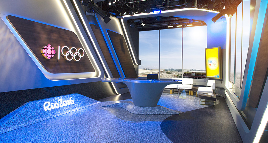
Whereas Sochi was all about edges and diamonds, Rio was about soft curves, undulating lines and sweeping arcs.
Sanvictores worked hard to build upon the Olympic identity and IOC Branding package, as well as the Olympic rings and the Olympic pictograms, for the CBC design.

Example mood board from AKA Creative.
Since these icons and patterns would show up across the various venues themselves, it was important for them to be tightly integrated with the look and feel of the CBC’s sets and motion graphics.
To that end, Sanvictores drew upon the “guitar pick” shape of the pictograms to create the undulating anchor desks for the space.

The design was also carefully configured to take full advantage of the view from the tower. However, the exact view wasn’t known until installation began. That view ended up being the central promenade of the Olympic park, which was seen as a modernized interpretation of the iconic Copacabana walkway.
When the fabrication teams arrived on site, several broadcasters had to request that some lamp posts be removed from along the walkway so the windowed studio spaces could take better advantage of the sweeping view.
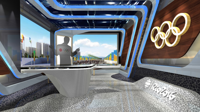
Rendering of the space. Courtesy of AKA Creative.
“These soft curved lines and undulating bends became a motif which we translated into the walls and floors of the studio. We wanted the space to feel like an extension of the celebration space beyond.”
Once the graphics package was established, the scenic team worked closely with graphic artists to develop a unique visual language that would allow the set and the graphics to complement each other. Soon the two teams found they were beginning to inspire each other, and that this synergy began to influence elements of both the 2D and 3D design environments.

An example of this is the neutral color palette seen on the sets. Since the graphics team at the CBC created a colorful look, Sanvictores wanted to make sure the amount of color wouldn’t clash or become overwhelming on-air.

The design solution was to have hints of wood and gold trim to warm up the space, most of which was finished in a stark but elegant black and white motif that was selected, in part, due to the small amount of space available.
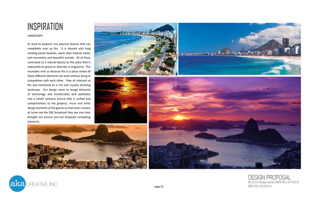
The team was also inspired by the tactile environment of Rio, especially the rich mosaics that form iconic graphic patterns, rich woods and warm tones, along with the nation’s unique landscape.
Controling the Sun
Shooting a naturally lit background provided immense challenges for the CBC as well.
“We could not always depend that the view out the window would always be as dynamic and filled as desired,” explained Sanvictores.
It was difficult to light and keep appropriate levels during the afternoon when the sun was setting — especially since the games took place in the southern hemisphere, where winter meant the sunset was much earlier.

To solve these challenges, a Rosco blind system was custom made to fit the windows with several different levels of diffusion.
A blackout option was included as well and the design team strategically planned ahead with a video wall at the opposite end of the studio to serve as a secondary backdrop for when the sun was too intense or the view out the window was less than desirable.
In the Radio-Canada space, a green screen for integrated virtual graphics was incorporated into the look, allowing the broadcaster to have an additional canvas to work with through augmented reality graphics.
Shipping to Rio
The sets themselves also needed to be flexible enough to be broken down to fit in shipping containers — all of which had to be done months ahead of the time it would actually arrive in Rio.
Special attention had to be paid to the durability of materials and the unpacking sequence in order to maximize the limited crew in Rio brought in to help re-assemble the set.
Brazil also has specific import regulations meaning that any containers with wood or wood byproducts would need to be fumigated before it would pass customs, so the set pieces needed to be able to withstand that process, explained Sanvictores.
Since the containers were traveling a long distance with varying climates, the production crew needed to be mindful of selecting materials and adhesives that would stand up to varying temperatures, humidity levels and, of course, the normal wear and tear that comes with shipping.
At the end of the games, the CBC also opted to ship all of the set pieces back, — since Rio imposed heavy fees on broadcasters disposing of sets or other refuse in Brazil — so everything needed to be broken down quickly and be designed to fit as efficiently as possible into the containers that would head back to Canada.
Project Credits
Set Design — AKA Creative Inc.
Creative Director — Kyle Sanvictores
Lifting Directors — Rob Brilli, Melanie Lessard, Paul Grant
Set Fabricator — Benchtop Scenery Inc.
Technical Producer — Rob Bunn, Eric Milotzki and Sylvain Archambault
Executive Producer English — Chris Irwin
Executive Producer French — Luc Lebel
Graphic Creative Director — Theresa Warburton
Subscribe to NewscastStudio for the latest news, project case studies and product announcements in broadcast technology, creative design and engineering delivered to your inbox.

tags
2016 Olympics, 2016 Summer Olympics, AKA Creative, Benchtop Scenery, Brazil, CBC, kyle sanvictores, Olympics, radio-canada, rio, Rio de Janeiro, temporary set design
categories
Exclusives, Heroes, Olympics, Set Design, Sports Broadcasting & Production, Sports Set Design