Notable Channel 9 TV station logo designs

Subscribe to NewscastStudio for the latest news, project case studies and product announcements in broadcast technology, creative design and engineering delivered to your inbox.
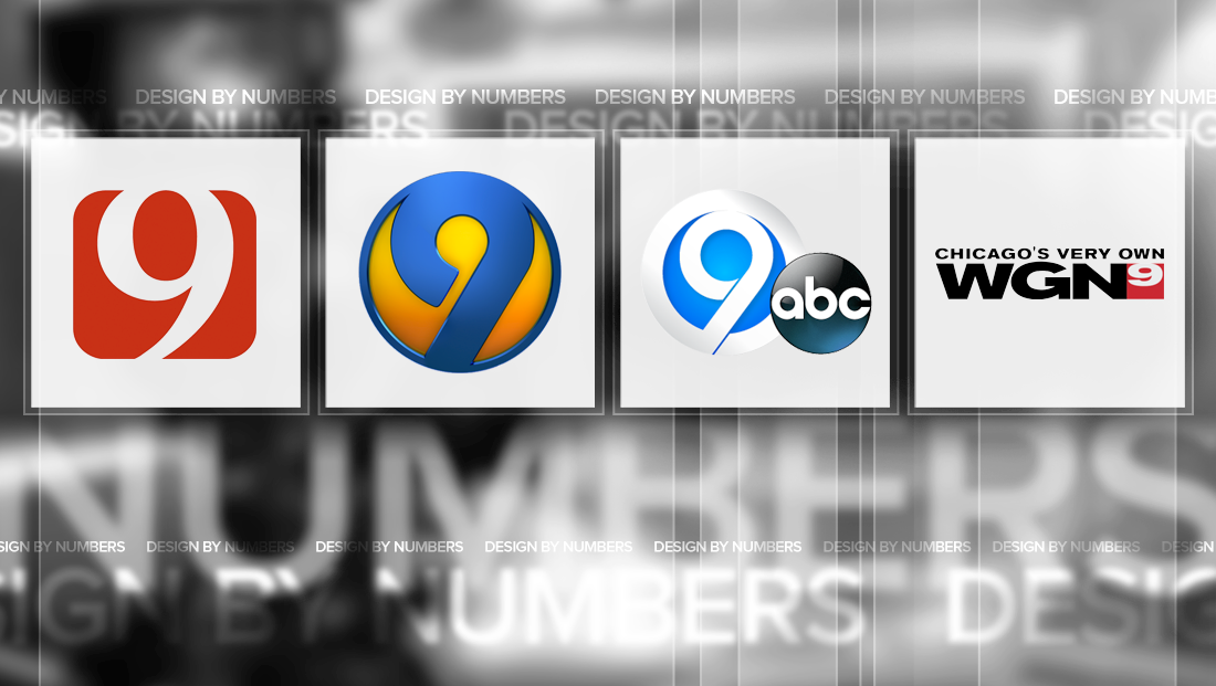
Here’s a roundup of our picks for some of the most notable Channel 9 TV station logos.
KWTV-TV

We mentioned Oklahoma City CBS affiliate KWTV-TV’s sister station, KOTV-TV, in our post on Channel 6 logos because the two stations switched to a similar look back in 2010.
Since KOTV-TV, based in Tulsa is Channel 6, and KWTV-TV in Channel 9, the two stations basically have the same logo — just flipped vertically.
That being said, there’s nothing much new to say about the KWTV-TV incarnation of the logo, but the station’s previous logo is worth a a quick look:

Before switch over in 2010, KWTV-TV used a thick and geometric “9” that was distinguished by the fact the main stroke didn’t connect back to the right side after hooking to the left and back toward the right — which seems to be a common design technique used in Channel 9 logos.
The result was a comma-shaped negative space inside the blue box.
Overall, while this logo did have the small disadvantage of perhaps being misread as “2,” it certainly was more distinct than the bold red logo the station switched to. The ultra narrow typeface used in the “News 9” lockup definitely needed an update, but it would have been interesting to see the station keep its old number, perhaps with some minor updates and tweaks.
KUSA-TV

Denver’s Tegna-owned KUSA-TV, meanwhile, uses a similar “9,” in its current logo, albeit with slightly narrower and refined curves. The logo also isn’t set inside a box, which somehow makes it less like it could be a “2.”
The rest of the station’s logo, namely the “News” text, could have used a bit of refinement. For some reason, the “N” floats out by itself while the “EWS” are connected — and not exactly in the most elegant way, with odd little “cuts” appear between the “E” and W” and “W” and “S”
WSOC-TV

Meanwhile, WSOC-TV in Charlotte uses yet another variation of the same “9” design, though it places the numeral inside a circle with a bold orange, yellow and blue color scheme.
The Cox Media Group ABC affiliate’s design uses an ultra-thick number surrounded by a thinner circular border, which keeps the emphasis on the number while also giving the logo a sort of “bulging” or lens-like effect.
WSYR-TV

Nexstar’s WSYR-TV continues the trend of the geometric “9,” but with a another twist — it sort becomes a bigger cousin to the iconic “Circle 7” Channel 7 logo design — call it “Circle 9,” if you will.
Also of note is the ABC affiliate’s use of much narrower spacing between the “hook” of the “9” and the addition of an additional space to the right of the base, making the circle ring around the numeral slightly less than a full cycle.
WGN-TV

Instead of the popular geometric look we’ve seen above, Chicago’s Tribune owned WGN-TV instead places its “9” inside the upper portion of a box (the exact color may vary), with the very tip of the numeral touching the top of the box. A little less than half of the box remains a solid color and is commonly placed directly against the right side of the “N.”
One nit-picky point: the slight upward stroke when the “9” comes back to connect to itself is mirrored in the curve of the “G” — though the lower left “tail” of the “9” is inexplicably ever so slightly tilted one way, which seems odd in contract to the strong horizontal lines found in the lettering.
The station’s logotype, meanwhile, includes well spaced and bold letters. The “G,” which features a sort of hidden arrow, is particularly of note. The station’s “Chicago’s Very Own” tagline, meanwhile, appears in a Helvetica-ish font that’s slightly different than the call letters.
It’s also worth noting that, since dropping its CW affiliation earlier this year, the network no longer has to place that network’s logo on the other side of the “9” — which is a vast improvement given the latter’s curved swoops that also managed to turn the logo into alphabet clutter.
This post is part of a semi-regular series on NewscastStudio that takes a look at TV station and network logos that include the numbers 1 and up. These posts aren’t meant to be a comprehensive list of all logos featuring the number in question, but rather a look at notable logos with creative, historic or an otherwise significant impact on branding design. If you have other logos with the number featured in this post, feel free to share it in the comments and stay tuned for a “reader’s favorites” version of this post coming soon.
Subscribe to NewscastStudio for the latest news, project case studies and product announcements in broadcast technology, creative design and engineering delivered to your inbox.


tags
Charlotte, Chicago, Circle 7, denver, design by numbers, kotv, kusa, KWTV, logo design, logos, Nexstar, Nexstar Media Group, oklahoma city, syracuse, tribune, tulsa, WGN, wsoc, wsyr
categories
Branding, Design By Numbers, Featured, Local News