Readers pick notable Channel 10 logo designs
Subscribe to NewscastStudio for the latest news, project case studies and product announcements in broadcast technology, creative design and engineering delivered to your inbox.
Here are your picks for Channel 10 TV station logo designs.
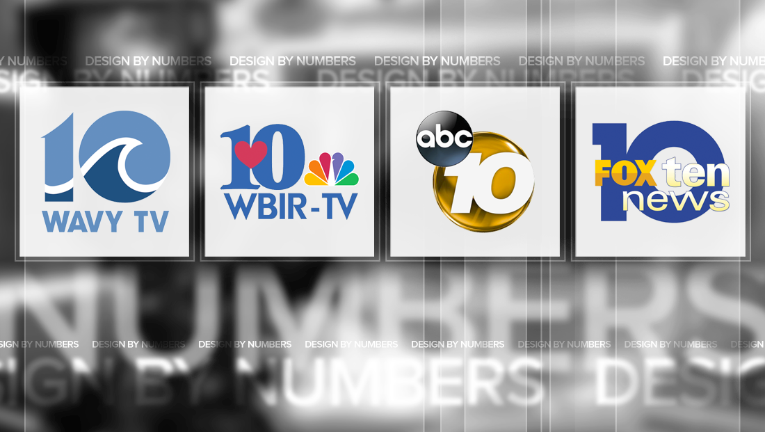
WAVY-TV
![]()
WAVY-TV, the NBC affiliate in Hampton Roads, Virginia, uses a logo design that’s a not-so-subtle nod to its call letters and waterfront locale.
The “1” in the logo is a thick stroke with a curved top with two subtle points. Below this, is the start of a stylized wave shape created from negative space that winds its way through the “10.”
Those waves, meanwhile, dictate the curve at the top of the “1” while also matching the circular shape of the “0,” which also features the crest of the wave in place of the negative space normally found in the middle of a “0.”
The wave stroke also serves as a visual separator between two shades of blue, which can be read as a reference to sea and sky.
WBIR-TV
![]()
The logo for WBIR-TV features a somewhat unique element for a TV station logo — a heart.
That heart, which is in reference to the station’s “Straight from the heart of East Tennessee” tagline, is positioned to overlay the space between the “1” and “0” in the logo.
The “10” itself used by this Knoxville, Tennessee station, is in a thick serif typeface with elegant “feet” and “head” serifs and a narrow negative space in the “0.”
![]()
The station’s call letters, meanwhile, are rendered below the logo in a strong, geometric font that has parallels to a previous version of the typography in the “NBC” logo, though it notably lacks the distinctive “W” found in the NBC News version of the logo but still manages to hold the strong points and diagonals.
![]()
KGTV-TV
![]()
KGTV-TV, the ABC affiliate in San Diego, California, uses a circular logo with a strong, italic “10.”
The “10” is offset to the right side of the the glossy circle it sits upon, while the numbers themselves jut up against each other.
The thicker, wider font used also allows the station’s number “10” to echo the circular shape of the background element, though it’s obviously not a perfect match.
Interestingly, while the gold-toned circle if often rendered in a glossy tone, the number “10” often appears in flatter style with a subtle shadow, which creates a bit of visual disparity.
WALA-TV
![]()
The extreme circle shape of the “0” in “10” is echoed, meanwhile, at in the logo of Mobile, Alabama, Fox affiliate WALA-TV.

In addition to the nearly perfect circle of the “0,” the logo also features a distinctive “1” with a “cap” rendered at a perfect right angle.
In addition to the numerals in the logo, the station also has the notable practice of spelling out the word “ten” in many cases, including its “Fox Ten News” branding.
WTEN-TV
![]()
Last, but not least, we come to WTEN-TV, that loves its channel number so much it made it part of its call letters.
The station, based in Albany, New York, features a wide, stylized “10” with circular “0” similar to WALA-TV, though it does have an angled “cap” on the “1.”
This version of the number “10” also runs together, similar to KGTV-TV, making the thick number a single, cohesive unit.
The station also makes use of a chunkier font for the word “News” next to its “10” glyph, while a blue-to-red gradient fills the polygon behind the entire lockup.
This post is part of a semi-regular series on NewscastStudio that takes a look at TV station and network logos that include the numbers 1 and up. These posts aren’t meant to be a comprehensive list of all logos featuring the number in question, but rather a look at notable logos with creative, historic or an otherwise significant impact on branding design. If you have other logos with the number featured in this post, feel free to share it in the comments.
Subscribe to NewscastStudio for the latest news, project case studies and product announcements in broadcast technology, creative design and engineering delivered to your inbox.

tags
Albany, Channel 10, design by numbers, Hampton Roads, kgtv, knoxville, logo design, Mobile, san diego, wala, wavy, wbir, wten
categories
Branding, Design By Numbers, Heroes, Local News