
Readers pick notable Channel 11 logos designs
Subscribe to NewscastStudio for the latest news, project case studies and product announcements in broadcast technology, creative design and engineering delivered to your inbox.
Last week we named our picks for notable Channel 11 TV station logo designs — and now it’s your turn.
KARE-TV
![]()
Tegna-owned KARE-TV in Minneapolis/St. Paul, Minnesota, which brands on air as “KARE 11” (with the call signs pronounced as the word “care”), uses a dynamic 11 logo.
The two ones are created using exaggerated broad strokes with small “hooks” in the upper left, while the upper right includes a gently curved tip.
The top and bottom of each number, meanwhile, is sheered off at diagonal angles.
To the left, the station’s call signs are rendered in a serif typeface somewhat reminiscent of Friz Quadrata (a/k/a “the Law & Order font”). Notably, the serifs and sharp arrow-like angles found in the center of the “K” and “R” provide a good visual connection to the angles and “hooks” on the “11.”
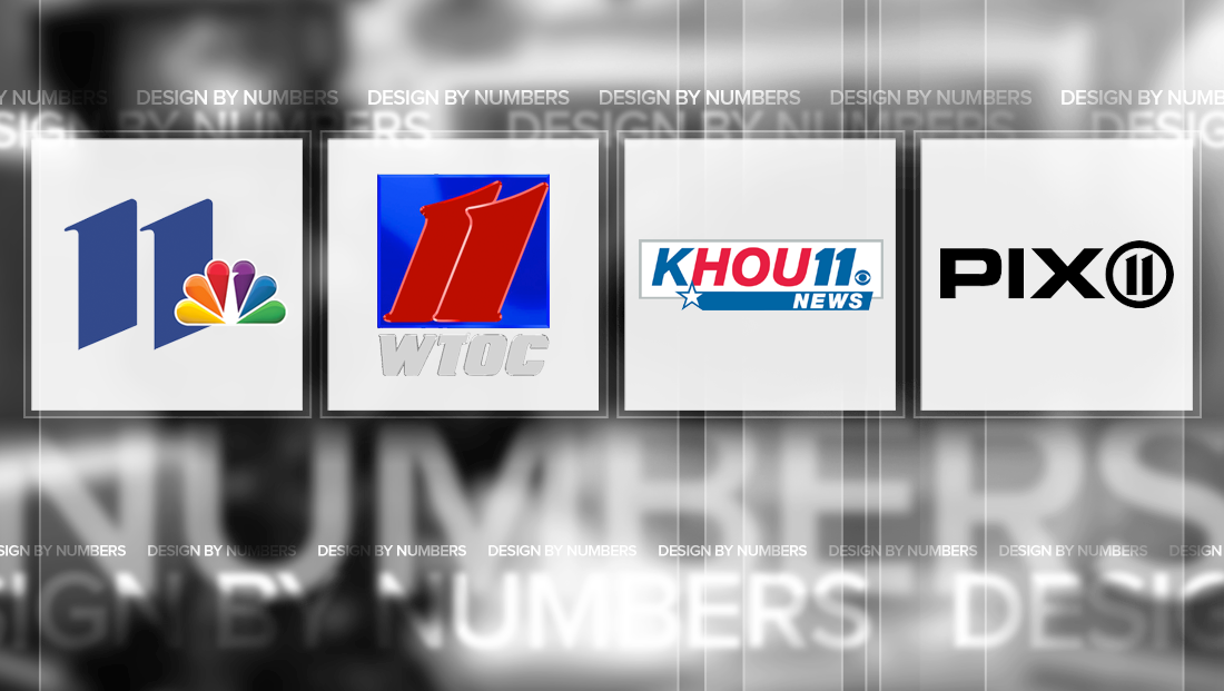
WPIX-TV
![]()
Tribune-owned WPIX-TV, the CW affiliate in New York City, uses a variation of the “circle 11” logo used by similarly call-signed WPXI-TV, though it notably lacks the open space at the bottom center of the ring and the “11” figure stands alone.

Similar to the KARE-TV logo, the top of both “1”s include a diagonal slice and subtle, pointed “hook.”
KHOU-TV
![]()
Houston’s KHOU-TV, the city’s Tegna CBS affiliate, uses a simple approach the its typography in its Channel 11 logo, though some key refinements make it stand out.
Though the typeface is a rather plain Helvetica-ish font, attention to detail is paid to the spacing and angle of the italicized typeface.
The angle of the letters is mirrored in the angle found at the end of the bar housing the word “News” that runs under the lettering, which itself is capped on the left by a star.
That star’s top point is subtly tucked into the “H” in the call letters, which also renders the recognizable “HOU” letters in a bright red.
Specifically, the “11” uses two strong “1”s with heavily-capped numerals.
It is somewhat interesting that the station’s logo designers didn’t opt to tilt the gray box that surrounds the lockup to match the angle of the letters and blue bar — which could have made the logo a bit more cohesive and give it even more of a forward motion feel.
WTTW-TV
![]()
Though it doesn’t broadcast traditional local newscasts, PBS affiliate WTTW-TV in Chicago sports a noteworthy logo that relies strictly on carefully integrated lettering.
In the lockup, the call letters, rendered in downstyle, are linked together to form a single unit with the crossbars of the “t”s.
Meanwhile, the two “1”s in the “11,” which also sport distinctive “caps” are linked together, with the left side of the second “1” jutting directly into the other “1.”
Though not completely connected to the last “W” in the station’s call letters, the upper right of the “W” and the lower left corner of the first “1” just barely touch — creating an eye-catching crosshair that creates the illusion of a single, cohesive unit.
WTOC-TV
![]()
Perhaps one of the more unique “11” logo is that of WTOC-TV in Savannah, Georgia.
The Raycom owned CBS affiliate uses two flowing “1” figures that mirror the strokes used by KARE-TV and WPIX-TV, but in a slightly more flowing rendition.
The second “1” also overlaps the first one, with a sharp beveled edge effect serving to separate the two numbers.
The numbers themselves are placed inside a bright blue box, which also has a strong bevel effect. It’s worth noting that the shades of blue and red used in the logo don’t have the best contrast, making the logo a bit of a visual enigma.
The station’s call letters, meanwhile, are rendered in a thick, flowing typeface with an angle that’s similar (though not exact) to the numerals above.
Subscribe to NewscastStudio for the latest news, project case studies and product announcements in broadcast technology, creative design and engineering delivered to your inbox.
tags
Chicago, design by numbers, houston, kare, KHOU, logo design, minneapolis, new york, raycom, savannah, St. Paul, Tegna, TV station logo design, wpix, WTOC, WTTW
categories
Branding, Design By Numbers, Featured