
A look back at the history of HLN’s branding, logos
Subscribe to NewscastStudio for the latest news, project case studies and product announcements in broadcast technology, creative design and engineering delivered to your inbox.
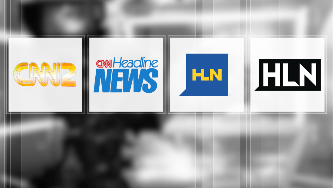
CNN’s HLN network, which has struggled to find its identity over the years, has a long history of changing logos, branding and strategies — with its latest revamp debuting Monday.
Here’s a look back at some of the looks, logos and branding the network has had:
![]()
HLN’s original name was actually CNN2, though the name didn’t last long after its launch. The logo, not surprisingly, simply tacked on a “2” to the iconic CNN logo. The curve in the upper right closely mirrors the curve in the upper left of the “C” — though it did not include the narrow line dividing the letters, making it thicker and helps make it stand out.
![]()
CNN would go on to rename the network “Headline News” and create a stacked logotype with a thin, geometric typeface for “Headline” and thick, narrow font for “News.” In some iterations of this logo, the network also used an icon that combined the initials “H” and “N,” formed from squares and triangles.
Subscribe to NewscastStudio for the latest news, project case studies and product announcements in broadcast technology, creative design and engineering delivered to your inbox.

tags
CNN, cnn headline news, CNN2, headline news, HLN, logo design, TV station logo design
categories
Branding, Broadcast Design, Cable News, Featured