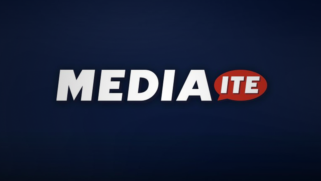
Mediaite gets new logo

Subscribe to NewscastStudio for the latest news, project case studies and product announcements in broadcast technology, creative design and engineering delivered to your inbox.
Media news website Mediaite got a bit of a makeover over earlier this week.
The site is sporting a new, simplified logo that uses a bolder but still italicized typeface for its logotype and drops the “city top hat” element.
The new logotype also sheds the rounded corners of the old typeface.

The streamlined also includes the addition of a red speech bubble to house the “ite” part of the name. In the old logo, a similarly shaped element (albeit not a speech bubble, though), housed the same letters.
In addition to changing the logo design itself, the new logo also uses a simplified color palette that eliminates some of the lighter shades of blue and uses red as more of an accent color rather than the dominant one.
Part of the goal, according to Abrams Media graphics designer Sean Panzera, was to make the site’s name easier to read — and avoid people thinking the website is named “Mediate.”
Mediaite has also updated its website to include the new logo and simplified navigation, as well as redesigning other elements.
The site’s social media profiles have been changed to use just a white “M” from the logo against a solid red background with a subtle solid shadow.
The use of this single letter is interesting given that another well known news site, Mashable, already uses a similar design approach on the icon version of its logo.
In a general sense, the new logo is similar to the new logo that Huff Post introduced earlier this year — given its bold, tilting text and use of a single accent color.
Subscribe to NewscastStudio for the latest news, project case studies and product announcements in broadcast technology, creative design and engineering delivered to your inbox.


tags
Abrams Media, logo design, mediaite
categories
Branding, Featured, Online and Digital Production