
‘The Jam’ pops with colorful look, flexible set
Subscribe to NewscastStudio for the latest news, project case studies and product announcements in broadcast technology, creative design and engineering delivered to your inbox.
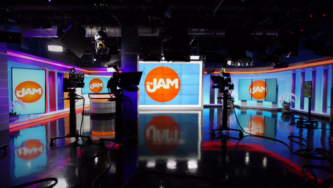
The show’s graphics, meanwhile, are centered around a bold red-orange circle featuring a custom drawn logotype with an exaggerated hook on the “J” — a lockup that both provides a “seat” for the word “the” as well as integrating a reference to the station’s trademark “U” branding.
The logo is accented with subtle dotted rings and burst effects, including in the lower left corner of the screen, where it serves as a secondary bug (the station’s primary logo appears in the lower right with the time and temperature).

The show’s graphics package also includes a bright light blue and darker shade along with a condensed, boldface typeface.
Lower thirds features a semi-transparent blue bar with the pop dot effect on the left side and smooth gradient fade on the right, while the primary tier’s typography sits directly on top of this element.

Other graphics, such as the show’s 7-day forecast, “mini” sidebar-style forecast, tease banners and stingers, feature a slightly angled line.


Both versions of the weather graphics feature minimalist icons and also shed the typical boxes or dividing lines found in these elements of a graphics package.

Subscribe to NewscastStudio for the latest news, project case studies and product announcements in broadcast technology, creative design and engineering delivered to your inbox.

tags
Chicago, Danielle Robay, Felicia Lawrence, FX Design Group, Jordan Cornette, The Jam, Video Walls, wciu
categories
Graphics, Heroes, Local News, Set Design, TV News Graphics Design, TV News Graphics Package, TV News Motion Graphics Design, TV News Music, TV Show Production Design