
Inside the redesign of NBC’s Snapchat newscast ‘Stay Tuned’
Subscribe to NewscastStudio for the latest news, project case studies and product announcements in broadcast technology, creative design and engineering delivered to your inbox.
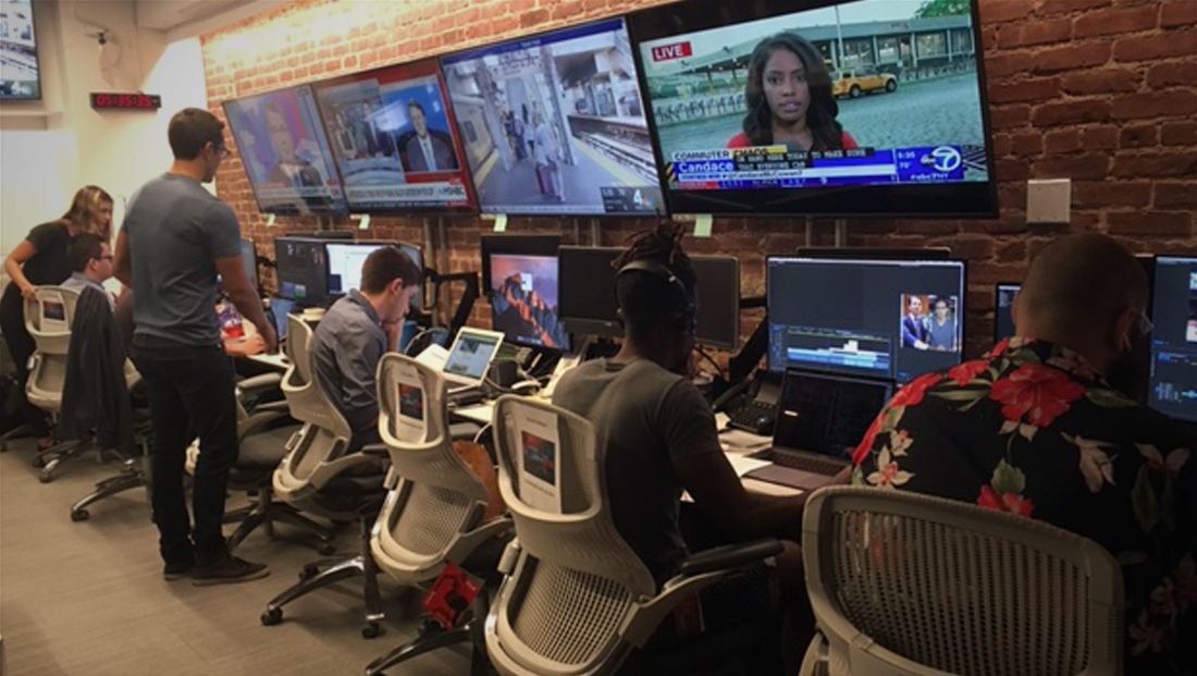
After a month on the air, NBC News redesigned the look for its Snapchat show “Stay Tuned” — a move that wasn’t surprising given the fast-paced world of digital newscasts on alternative platforms.
NewscastStudio interviewed Moritz Gimbel, the head of product and design for “Stay Tuned” to learn more about why the changes were made and the strategy behind it — as well as how the original design played a role in the overhaul.
Why did you think it was time for a new look?
“We wanted to first focus on getting the content right and learn what worked best for our audience. We are already in the middle of creating a new design system for all our digital properties at NBC News Group and this is an extension of that design system.”
What factors did you take into consideration when designing the new look?
“There needed to be a more contemporary and ambitious design that would be better aligned with the creative environment and younger audience of Snapchat’s Discover channels. We also wanted to have a coherent motion and visual design thread throughout each show, including horizontal cuts in transitions and the 60s stereoscopic 3D red (and) teal inspiration.
“Since we are currently redesigning all of our websites and apps at NBC News Group and building a brand new design system that will inform new products and digital verticals, we were able to bring the Stay Tuned design into that same family. So while it will always look a little younger and stay differentiated, it is now part of our wider, evolving, new digital look.”

What lessons did you take from he previous look and incorporate into the new look?

“A key lesson was to balance variation and creativity with scalability – since the Stay Tuned team produces two shows a day with ultra fast-turnaround times, it was necessary to make sure that transitions, maps, etc. were setup for ease of use. We also made sure a producer/editor was with the design team every day, validating everything accordingly.”
Where did the inspiration for the new color palette come from?
“Rapid iteration. We tried several versions and changed them every day, testing with internal and external stakeholders to arrive at the current design. People loved the idea of using the 60s stereoscopic 3D red/teal as shadows and everything grew out of that. Like the rest of our digital design system, we wanted fresh, crisp colors that pop on digital screens.

“We also had to avoid a few things. For example, using too much red is tricky since the team will use that color for breaking news. It’s like writing in all caps all the time – we can’t keep shouting at our users.”
Subscribe to NewscastStudio for the latest news, project case studies and product announcements in broadcast technology, creative design and engineering delivered to your inbox.

tags
Moritz Gimbel, NBC News, Snapchat, social, social media, social networking, social newscast, social tv, Stay Tuned
categories
Broadcast Industry News, Exclusives, Featured, Online and Digital Production