AMAs production design goes big using LED, entire building

Subscribe to NewscastStudio for the latest news, project case studies and product announcements in broadcast technology, creative design and engineering delivered to your inbox.
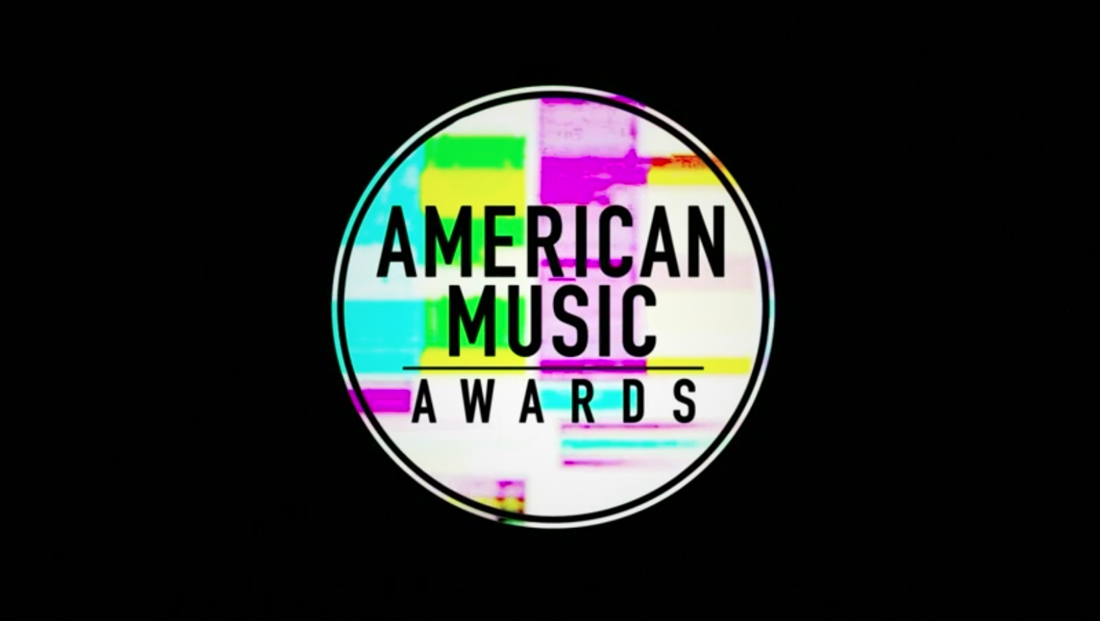
This colorful, boxy look also inspired the show’s logo design, a circular design with “glitchy” animation effects and an eclectic array of brightly colored rectangles.

That look was also used for transitions and wipes and other graphical elements used in the broadcast.

The same clear and condensed typography was also used in lower-third style banners, which also took advantage of the show’s color palette.

Most of the award presentations were done from a catwalk style “peninsula” that jutted into the audience, a departure from the traditional award show setup where these announcements are typically made from the stage proper.
Subscribe to NewscastStudio for the latest news, project case studies and product announcements in broadcast technology, creative design and engineering delivered to your inbox.


tags
ABC, American Music Awards, Awards Shows, LED walls, Microsoft Theater, production design
categories
Heroes, Set Design, TV Show Production Design