Meet Nexa: The NBC PyeongChang Olympics font
Subscribe to NewscastStudio for the latest news, project case studies and product announcements in broadcast technology, creative design and engineering delivered to your inbox.
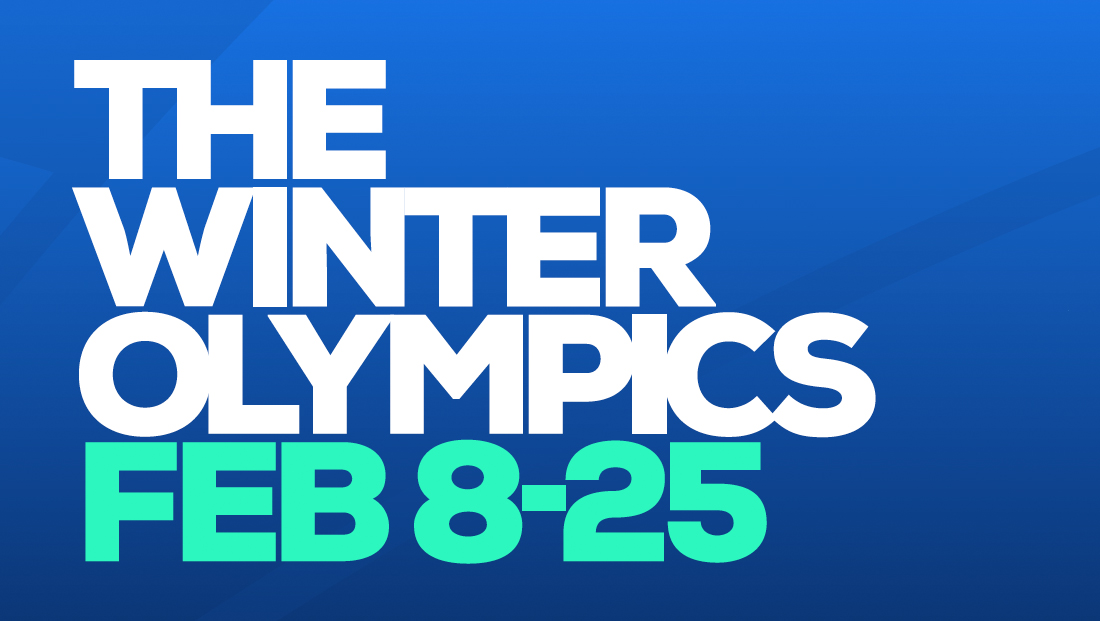
NBC’s pick for its on-air typography during the 2018 Winter Olympics is a contemporary, clean typeface with unique letter shapes that hint at a subtle reference to a well-known symbol of the games.
The font family, called Nexa, from foundry Fontfabric, is a wide, geometric typeface that is available in a variety of weights and styles.

In the font, the uppercase characters “J,” “P,” “Q” and “R” have unique characteristics — with the “J” sporting a “cap” that extends to the left of the vertical ascender only. The “Q,” meanwhile, closely follows the path of the capital “O,” with its “tail” a short, distinctive “nub.”
Finally, the lines in the “R,” which closely mirror the “P,” connect back to the vertical stroke at a slightly lower height, while the “leg” of the “R” juts downward at a dramatic angle.


On the lowercase side, the many letters, including the “a,” “b,” “c,” “d,” “g,” “o,” “p” and “q” have broad, circular shapes — a shape that is carried over in the curves found in characters such as “c,” “e,” “m,” “n” and “u.”
Perhaps most notably in all of the standard alphabet glyphs is the lowercase “g” that not only uses the circular shape but has a unique “hook” and tiny accent stroke in the upper right. It’s worth noting that the font also comes with an “alternative” lowercase “g” — though NBC doesn’t use it.
The circular shapes have a striking visual similarity to the Olympic rings — one of the most recognized logos in the world.

Subscribe to NewscastStudio for the latest news, project case studies and product announcements in broadcast technology, creative design and engineering delivered to your inbox.
tags
font, fonts
categories
Branding, Broadcast Design, Broadcast Industry News, Featured, Graphics, Olympics, Sports Broadcasting & Production