
Australia’s Seven goes colorful and bold for Olympics look
Subscribe to NewscastStudio for the latest news, project case studies and product announcements in broadcast technology, creative design and engineering delivered to your inbox.
Australia’s Seven network is making use of bold boxy elements blended with bright colors to create a clean and modern look for its 2018 Winter Olympics coverage.
The network’s look is dominated by a wide variety of color palettes with bold, all caps typography placed inside of rectangular shapes with subtle bevels and drop shadows.


In the background, strong geometric shapes representing Korean lettering adds depth and an additional splash of color to the fullscreen graphics.

Insert graphics, meanwhile, continues the rectangular shape approach, while the network’s small studio space at the International Broadcast Centre is decked out with a background that mirrors the bold graphics.

Accents throughout the look include small, pointed triangles that double as arrows and lighter, widely spaced microtext reading “Seven_Sport” and “Live_and_Free” with underscores replacing spaces.

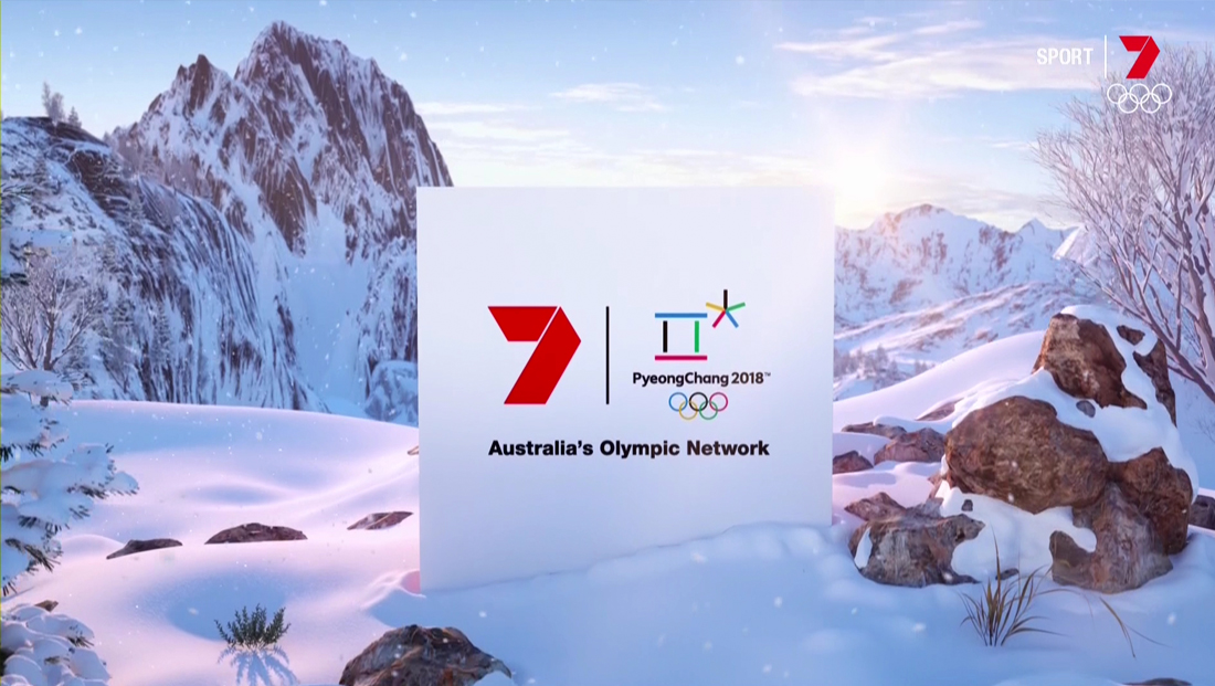
While much of the network’s look doesn’t include visual references to winterscapes, at least one title-slide design features the network’s iconic “7” logo alongside the PyeongChang 2018 logo within a white square box that appears to be “sitting” in a snow drift in the foreground of a mountain scene.
Some airchecks courtesy of mediaspy.org
Subscribe to NewscastStudio for the latest news, project case studies and product announcements in broadcast technology, creative design and engineering delivered to your inbox.

tags
2018 Winter Olympics, Australia, PyeongChang Olympics, PyeongChang Winter Olympics, seven, Seven Network
categories
Broadcast Design, Featured, Graphics, Olympics