Television news set design, television news graphics, television news links, television news blog
SetStudioGraphicsLinksBlog

Home >

Blog   A blog about television news set design, news music, news graphics package design and television station Web sites

Posted by NewscastStudio on Wednesday, May 7th, 2008 at 7:46 pm
Tags: , , , | Categories: Graphics, Local News
Leave a response | Trackback | RSS feed for this post

An anonymous tipster sent NewscastStudio these screen grabs. NBC Artworks is currently putting the final touches on a new NBC division wide news graphics package. The package will begin its rollout in May and then continue with the lead up to the Beijing Olympics (Dallas O&O KXAS-TV has been using elements of this package in promos for a while now).

Here is a sneak peak…


Advertise with us

The package starts with a bold open as the peacock bursts into layers all creating a peacock feather. The package uses these same peacock feather elements throughout.

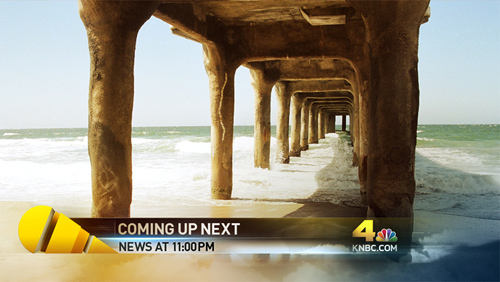
The lower third is simplistic and to the point allowing viewers to easily see the information.

The OTS also is to the point. Each element features the new colors of yellow and blue.

Overall, the package is a great new addition to the NBC family and will look great in HD. Stay tuned for its launch in the coming weeks.

Also on NewscastStudio


-->
11 responses

jim Says:
May 8th, 2008 at 9:03 am

Major yawn!


Chris Says:
May 8th, 2008 at 8:59 pm

The colors almost seem Countdown-like. Seems like it might be kind of a cleaner style compared to the ones we’re used to seeing, so I can’t wait to see the final product.


anon Says:
May 9th, 2008 at 2:11 pm

So the exploding feather isn’t part of the lower-third? Either way it’s gonna look really weird… I like the color scheme, but the exploding feather seems a bit hokey.


Dak Dillon Says:
May 9th, 2008 at 3:48 pm

The feather is part of the l3 but will be outside the safe zone, not the text. The text is within safe areas.


Matt Says:
May 9th, 2008 at 9:30 pm

So is KNBC the first to be getting these graphics then? I cannot see these being usesed here in Chicago for WMAQ. WMAQ however, has been adding a lot more blue. Is this new package customizable? If they are it will be intersting that they will be creating a same package for each station that will have the same elements just different colors for their respective areas.


Matt Says:
May 9th, 2008 at 10:44 pm

So will KNBC be the first to start this package? I do not think this will work here in Chicago for WMAQ. WMAQ just updated their street side studio (Studio 5) with all blue. They also upgraded some of their set with more blue up in the Tower. So, is Arthouse making each station customizable with this package? It will be intersting to see!!


anon Says:
May 11th, 2008 at 12:12 pm

The package will be customizable for each station I believe. They wouldn’t do these bright yellowish for WMAQ and WNBC who have way darker sets. Blue for WMAQ and WNBC and Yellow for KNBC, KXAS, ect. It will be very interesting to see how they roll out these new graphics, because as Matt mentioned above WMAQ has added alot of blue to their sets, and has gone with a darker tone for their sets in the recent weeks, making me think that WMAQ will get the blue version of this pack. Also, a note is that the open screen cap with the peacock(the top one) has that background that literally matches the backround to some of the Olympic promos being run here in Chicago.

Only time will tell I guess, but I think it will be interesting to see these. Also, I’m thinking when these debut KNBC will start their HD, I would hope the graphics are meant for HD usage looking at the screencaps.

Cheers.


I AM LEGEND Says:
May 12th, 2008 at 9:01 am

It still seems like those lower 3rds are messed up. The main element of the pack (the weird feather) is outside the safe zone so really why put it there in the first place.


IDw/held Says:
May 23rd, 2008 at 9:13 pm

The same package will be sent to all the current look A stations. The station will choose what they will air but the AH will have only one look that will support daily graphics. That’s the whole reason for a graphics hub…one look supporting many stations. So more than likely the station will adapt to the look not the opposite. WNBC is the exception to the rule. The will more than likely stay with their Pyburn look. Other Pyburn Look B stations KNTV will have the option of switching.

The L3rd is in safe title…HD safe title. Remember HD coming SD leaving. The whole package is designed with HD in mind.

Also the peacock doesn’t “explode” it extrudes. The stills above doesn’t do the package justice. The best part isn’t the beginning or the end but everything in between.


anon Says:
June 3rd, 2008 at 1:00 pm

IDw/held you are 100% incorrect. Everything needs to be desgined with HD AND SD in mind. there will prolly never be a complete switch over to HD and all graphics need to be workable in SD 4 by 3. And there is not option of switching the graphics….stations will get them. All O&O at that. The above poster got nearly all of his information wrong. KNTV will get the new graphics along with all the O&O at the time of the debut.


IDw/held Says:
July 3rd, 2008 at 10:49 pm

Anon, you should read my post more carefully. No where did I say that graphics need not be workable in SD. Nor did I make a blanket statement about all graphics. My comment was directed to the design of the L3rd and its safe title parameters. Of course any broadcast design will be governed by SD considering that the majority of television viewers are customers of cable or satellite and they will continue to receive their programming in SD. But any broadcast designer not designing in HD is wasting their time. Your second point like your writing skill is unclear. If you’re saying that stations don’t have a choice in what graphics package they air…you are wrong. They do and they have. WTVJ in Miami was Look B then they decided to become the new Look A. Now with the upcoming Look C they will again update their package unless their prospective new owners decide not to. WVTM (now with Media General) was the original Look A then they also switched to Look B instead of the then not finished new Look A. KNTV chose to stay as Look B when the new Look A was debuted but now have decided to go with Look C. As for your proclamation that there will never be a total switch to HD you were they guy who said “Go with betamax”, “Bluray will never make it” & “Why would you need more than 8 Tracks?” What did I get wrong this time?

Leave a Reply

GOT NEWS?
E-mail us your anonymous tips

CATEGORIES
Cable News
Election 2008
Graphics
HD
Local News
Music
NAB 2008
NAB Preview 2008
Networks
Online
Podcast
Set Design
SetStudio
Site Updates
Sports
Uncategorized
Weather

MORE...
News set photographs
TV news graphics packages
TV news resources and Web links

TAGS


 Subscribe to our RSS feed

 Add to Technorati Favorites


Join our mailing list to get the latest updates delivered to your inbox


Newscast Studio Home SetStudio  Graphics  Links Blog 
Masthead
Advertising with Us
TV News set photos
Contribute your photos
TV news graphics
Contribute graphics
TV news links TV news anlysis and tips

Copyright © 2008 Clearhill. All rights reserved. NewscastStudio is a trademark of Clearhill.