London Olympics graphics draw inspiration from Union Jack
Subscribe to NewscastStudio for the latest news, project case studies and product announcements in broadcast technology, creative design and engineering delivered to your inbox.
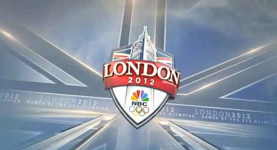
The graphics package designed for the Games of the XXX Olympiad use the angular lines of the British flag’s Union Jack to provide a sleek look with a nod to the host country.
The intersecting diagonal lines are used throughout the package, including the full screen title card show above. This design is an example of one of the more obvious, straightforward uses of the Union Jack as a textural element accented with a shine effect.
Not only is the Union Jack a great cultural reference to the United Kingdom, but it does a great job of drawing the eye to the focal point of the various graphics in the package.
This is similar to past Olympics, where one element is repeated: ice and mountains for Vancouver, Union Jack for London.
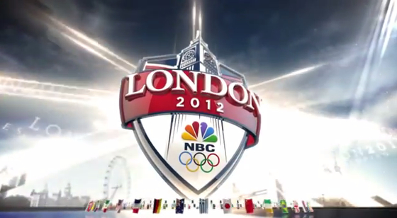
In the title card, it’s the London 2012 emblem that’s reminiscent of a shield of coat of arms and features a stylized version of the tower housing Big Ben as an instantly recognizable element.
Alternate version of the title card don’t include the background is quite the same obvious way, instead displaying them as bursts of intersecting lights along with a subtle skyline of London and a 3D ring of flags.
In athlete full screen imagery, the angular lines direct the eye to the athlete’s posed publicity shot, while the name and sport are overlayed using 3D letters.
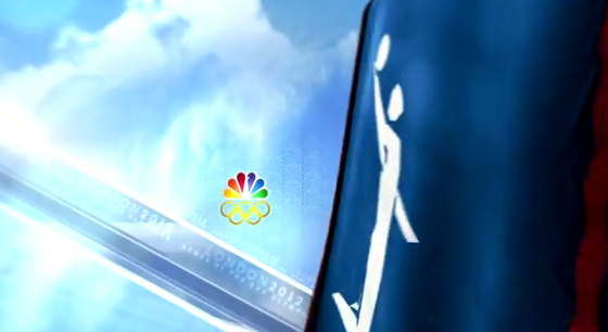
On these graphics, the angular lines serve as both a background element and surface on which reflections can appear. Continuing the British graphical inspiration, NBC displays the sport icons in a subtle waving banner in this design and other part of the package.
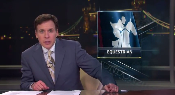
That draped flag look is continued on full screen graphics used for players’ names. These graphics include an much less subtle version of the British flag in the background, blended with clouds, with the sport’s icon and name incorporated into the box containing the name.
On other package elements, the viewer is treated to a virtual flyby of the sport icon flag with a cloud background that incorporates a bold diagonal bar, again drawn from the Union Jack, that also serves as a holder for repeating text elements.
NBC also makes use of the British flag design in full screen transitions that feature the name of the sport dramatically incorporated into glass-like arms of the Union Jack. The sport name is repeated in larger, but blurred text in the background.
The Union Jack also finds its way in to the OTS graphics, again serving as a visual cue to draw attention to the actual boxed graphic. Here the angled lines appear as bright white bursts of light with subtle repeating text elements as well.

During the opening ceremonies, the lower third giving viewers information about each country used a quadrant of the Union Jack design as a backing for each country’s animated flag. The design then uses a wedge-shaped element that to the right of the flag where the country name, abbreviation and “lineup” appears.
It’s also worth noting that the standard lower thirds and scoreboards do coordinate with the rest of the graphics package but don’t make use of the London-themed graphical elements. These elements debuted earlier this year on NBC Sports Network and were created by Troika. The package was designed with the Olympics in mind, but are being rolled out to all NBC Sports properties.
Subscribe to NewscastStudio for the latest news, project case studies and product announcements in broadcast technology, creative design and engineering delivered to your inbox.


tags
david barton, Graphics, london, london olympics, motion graphics, NBC, nbc graphics, NBC Olympics, nbc sports, Olympics, Real Time Graphics, Troika
categories
Branding, Graphics, Olympics, Real-Time Graphics, Sports Broadcasting & Production