
Bloomberg debuts politics section with unique design
Subscribe to NewscastStudio for the latest news, project case studies and product announcements in broadcast technology, creative design and engineering delivered to your inbox.
Financial news organization Bloomberg has debut a new politics section that features a unique, innovative design.
The new look is a bit confusing at first — there’s a header with something called the “Curiosity Index” and then what appears to be a large video ad. That video panel, however, eventually becomes a live feed of the Bloomberg channel.
To get the meat of the politics section, however, scroll down below that for a series of full width sections.
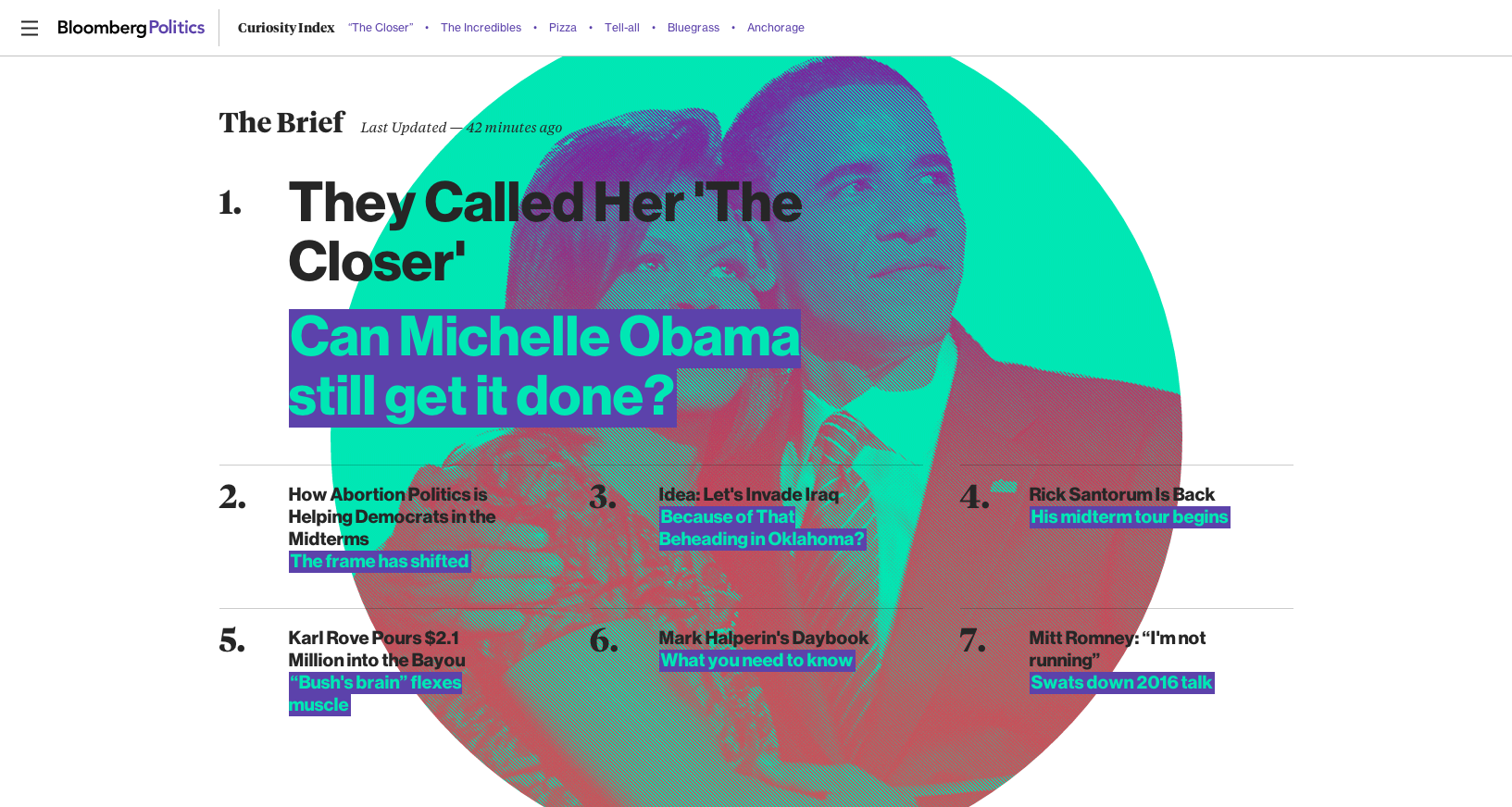
First up is a section called “The Brief” that features a numbered list of stories backed with a large thematic image.
Below this are the “Cover Stories” designed as a two column setup with large photos and headlines. Under this are more stories displayed in a grid-like container using a mix of photos, stylized quotes and text headlines.
As the user continues to scroll down the page, the “Curiosity Index” remains fixed at the top of the page while additional sections either link to multiple stories or spotlight a single topic or story using large blocks of color, photography or infographics.
Overall, this site represents an innovative approach to online storytelling. By using a mix of layouts that include some more traditional looks and feels, the site manages to be both visually appealing without getting in the way of usability too much.
The site’s biggest weakness is that large video panel, which seems to be a bit of a roadblock that gets in the way of diving into the political-themed content the user is likely looking for.

(Update: The site appears to have, at least temporarily, removed the video panel)
Story pages, meanwhile, feature large headline typography and easy-to-read body text along with subtle photo backgrounds.
In many ways, one can’t help but wonder if this approach could have worked out better for NBCNews.com.
Subscribe to NewscastStudio for the latest news, project case studies and product announcements in broadcast technology, creative design and engineering delivered to your inbox.

tags
Bloomberg, nbcnews.com
categories
Cable News, Featured, Online and Digital Production