There’s a new awful media company name and it’s worse than ‘Tegna’

Subscribe to NewscastStudio for the latest news, project case studies and product announcements in broadcast technology, creative design and engineering delivered to your inbox.
Just when you thought media company names couldn’t get any stranger, along comes Tribune to ruin your day.
Tribune Publishing, the newspaper arm of Tribune, has announced it’s changing its name to Tronc.
Well, actually it’s “tronc” (all lowercase), but we flat out refuse to stylize it that way — just like you’ll never see “Tegna” or “USA Today” in all caps.
Speaking of Tegna, it’s interesting that the idea changing your company’s name to a made up — and slightly goofy — sounding word has found its way into yet another media company.
Somewhat ironically, the whole rebranding is also part of a larger effort to stave off a takeover from Gannett, the fine folks behind the “Tegna” name, which it uses for its broadcast division.
So, why Tronc?
CEO Michael Ferro claims the name stands for “Tribune online content” (apparently the name “TOC” didn’t make the grade).

So, basically, the new name is a thinly veiled attempt to appeal to both millennials and investors at the same time.
You can almost hear the wheels turning inside some exec’s head: Those crazy kiddos aren’t using capital letters any more, so let’s use that in the company name. Oh, and we have to use the word “content” since everyone loves that word.
The whole idea of weaving in the word “content” wherever possible is reminiscent of the trend of media organizations thinking of themselves not as “news” outlets, but rather “information” outlets. It’s no longer a “news”room — it’s an “information center.”
There’s also the issue of how the name is pronounced. With only a single vowel, the variety here is a bit limited, so it’s probably meant to sound something like a cross between “trunk” and “honk,” which are, of course, great words to associate with a media company.
Stretch the rules of phonics a bit and you could also probably arrive at a sound something like “tranq.”
There’s also the inevitable comparisons to a certain presidential candidate’s last name.
It’s also worth noting that “Tronc” appears to be the name of a handbag and luggage company that’s “coming soon.”
![]()
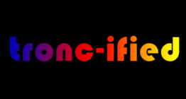
And, in case you didn’t think the name “Tronc” was bad enough, just take a gander at the company’s logo.
The logo, probably drawing on the name’s similarities to science fiction brand “Tron,” has opted to use what was once a “high tech” looking font but nowadays is probably better described as “retro” or “ugly.”
The font appears to be a modified version of Blippo Black.
The design then works in the subtle pattern of a circuit board (think MSNBC circa-1990s) and a left to right gradient from yellow to blue with a stop in the red and orange neighborhood on the way.
Oh, and just in case it’s not clear that the logo is meant to be all internet-y, the designer made the “t” look like it’s becoming digitized pixel by pixel.
Clever, right?
At the end of the day, once the dust settles, the Tronc will gradually blend in to the seemingly endless landscape of odd company names.
Subscribe to NewscastStudio for the latest news, project case studies and product announcements in broadcast technology, creative design and engineering delivered to your inbox.
tags
logo, Tegna, tribune media, Tribune Publishing, Tronc
categories
Branding, Heroes