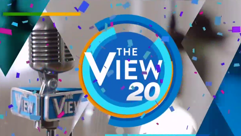
‘The View’ smacks on ’20’ to its logo for new season

Subscribe to NewscastStudio for the latest news, project case studies and product announcements in broadcast technology, creative design and engineering delivered to your inbox.
20 years on the air is a big deal — so it’s no surprise that ABC’s “The View” decided to mark the occasion with some changes, but one change could have used a bit more refinement.
The first change is a “20th anniversary” version of the show’s logo.
The blue circular logo, which was originally more of a teal but underwent tweaking since it debuted in 2014, now has an italicized “20” in a Helvetica-ish font slapped on the lower right corner.
This font, and the softer one used in the show’s name are simply too similar to each other — and it almost looks like a mistake that two separate ones were used.
That’s not to mention that prior to getting its “20 treatment” the “View” logo was already pretty bad — with its faux small caps and odd proportions.


Not only did the show add the “20” to its digital incarnations, but the dimensional logo in the audience area of the set has been updated as well.
The set, by the way, has been given a fresh update that, thankfully, is much better done than the logo updates, bringing a warm and contemporary look to the show.
The show is also sporting the “#View20” hashtag as well as a new theme song from Mary J. Blige.
Subscribe to NewscastStudio for the latest news, project case studies and product announcements in broadcast technology, creative design and engineering delivered to your inbox.


tags
ABC, ABC Studios NYC, Branding, logo, logo design, Studio TV1, syndicated, syndicated tv, talk show, The View
categories
Branding, Broadcast Design, Featured