
Grammys, Oscars logo design have interesting similarities
Subscribe to NewscastStudio for the latest news, project case studies and product announcements in broadcast technology, creative design and engineering delivered to your inbox.
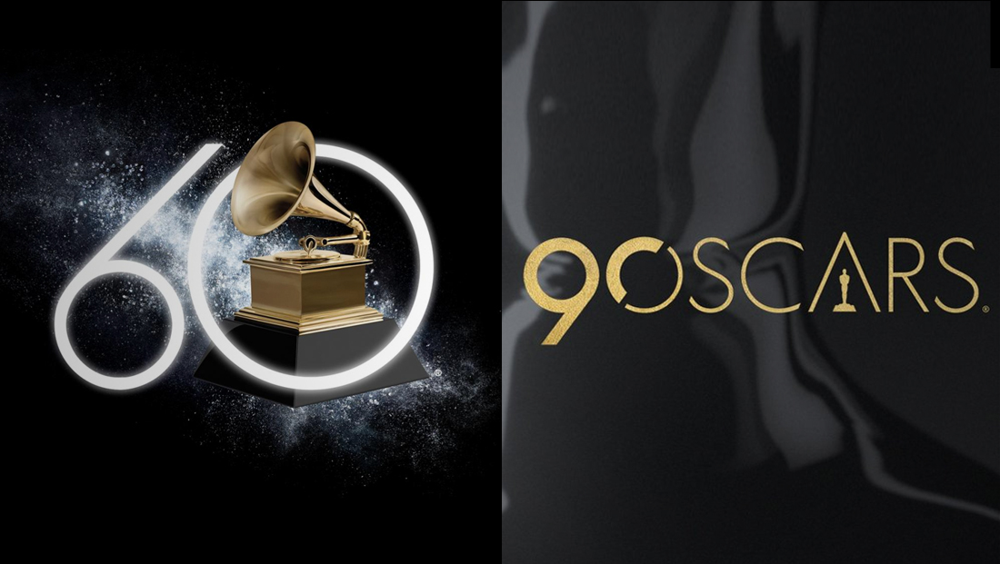
The Grammys and Oscars are both celebrating milestone years — 60 and 90, respectively — and both ended up using similar logo designs for their telecasts.
![]()
The Grammys, which air Sunday, Jan. 28, 2018 on CBS with “Late Late Show” host James Cordon at the helm, is using a geometric logotype that includes a large, almost exaggerated zero and a “6” that has a purposefully smaller circular element.
Not only does this design choice make the logo more compact and eliminate potential pesky white negative space between the two numbers, but it also suggests, in an abstract way, a record player needle and record — or even musical notes.
That said, in some ways the modification of the upward stroke is a bit jarring.
![]()
The Oscars, meanwhile, which are airing on ABC March 4, 2018 with Jimmy Kimmel hosting, combines the clean Oscars logo the telecast has used for some time now with the number “90” merged into the “O.”
The “9” and half of the zero are in a bolder font, a move that both emphasizes the number and the fact that the circular elements after the “9” serve double duty as both a zero and “O.”
Similar to the Grammys “60” look, the Oscars logotype includes large circular element with a “leg” that hangs below the baseline, though the angle of the leg is not quite as extreme or exaggerated as the Grammy’s.
In some ways, however, the Oscars logo reads a bit like “90 Scars.”
The Oscars logo’s use of the strong geometric font is well matched to its normal logo — while the Grammys secondary typeface is significantly different.
Subscribe to NewscastStudio for the latest news, project case studies and product announcements in broadcast technology, creative design and engineering delivered to your inbox.

tags
ABC, CBS, Grammys, James Cordon, Jimmy Kimmel, logo design, Oscars
categories
Branding, Broadcast Design, Broadcast Industry News, Graphics, Heroes