
NBC News rolls out cluttered, facts focused new coronavirus branding
Subscribe to NewscastStudio for the latest news, project case studies and product announcements in broadcast technology, creative design and engineering delivered to your inbox.
NBC News rolled out a completely overhauled graphics package for its coronavirus coverage that puts the concept of facts at the forefront and also appears to be an effort to create a look that blends better across multiple shows, networks and platforms.
The changes started rolling out Wednesday, April 29, 2020, on “Today” and then appeared more consistently throughout the day on MSNBC.
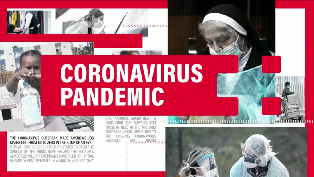
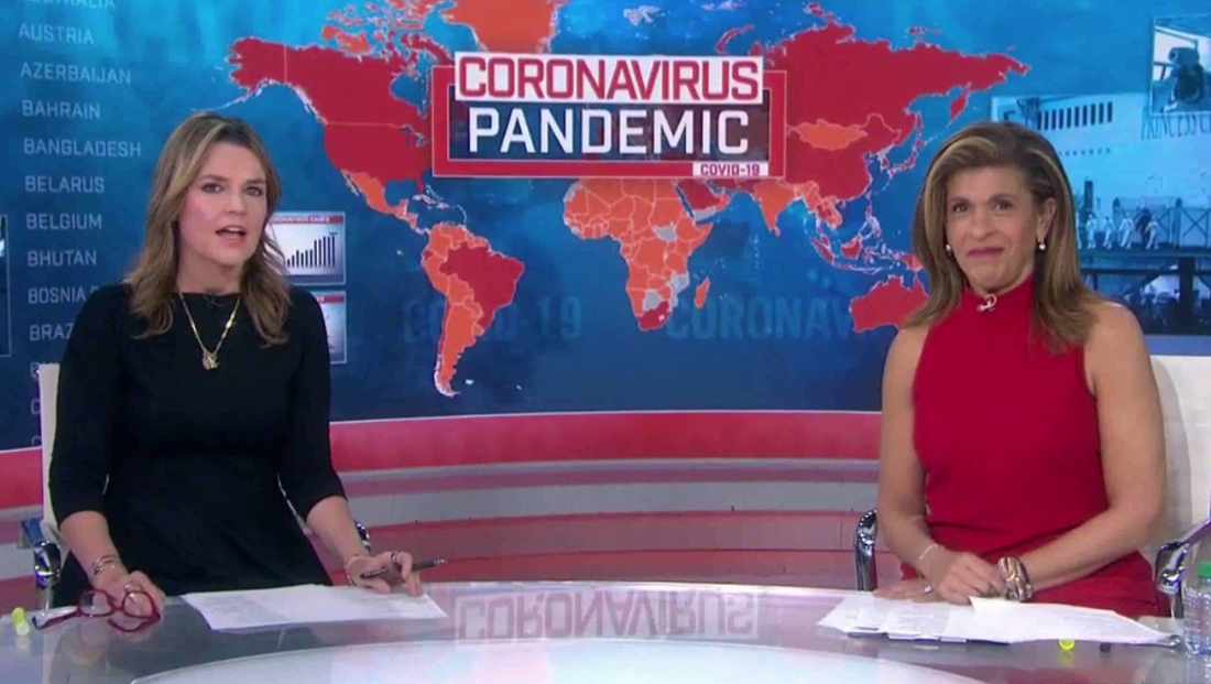
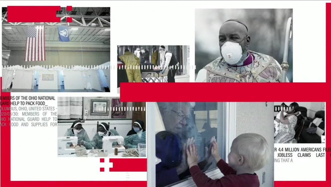
The network has kept its “Coronavirus Pandemic” branding that it used from the early days of the outbreak, but switched away from the teal-ish blue and bold red box to a look that uses a more traditional red, white and blue color scheme — with a powder blue worked in too.
The network’s previous coronavirus look.
The typography has also been switched away from the blocky font in favor of a simpler, bolder and condensed typeface, perhaps in an effort to make the look more streamlined across more of the network’s programming and platforms since it fits better with the various typographic treatments used there.
Oversized elements, including bold typography, bring a bit of the feel of streaming service NBC News Now to other properties, while the condensed typeface fits in a bit better with the condensed font used on “Today” in addition to the wider spaced Proxima.
Previously, oversized typography was sometimes worked into background elements.
The new look also uses lighter typographic microtext elements that are actually readable facts — if you pause your screen at just the right time.

Some of the “facts” are actually full paragraphs of text that are on screen for less than a second, making it harder to read that a Chuck Lorre vanity card.
That, combined with fast animation sometimes pushes the envelope toward “graphics overload” and makes it hard for the eye to decide where to settle.
Previously, microtext elements listed country and state names.
Other elements include hashmarks, arrows, thick bars of red and photography.
The new look also switched to a more wide “ribbon” look for lower thirds and other elements, which is perhaps a better match for “Today,” MSNBC and NBC News Now.

In most cases, there is a red element with a design element on the far right that, at first glance, looks a bit like an oversized pixel effect. However, on closer look, the negative space formed by the end of the bar and the two floating squares actually creates a cross, an internationally used symbol for medicine.
This element notably has slightly rounded corners, which give it a bit of a unique look (and also helps it stand out from the checkerboard pattern on “CBS Evening News,” but that perhaps could have been used more consistently across the board.
That said, most of NBC’s signature news programming, including “Today,” “NBC Nightly News” and MSNBC use squared off corners so the mix of corners could be a way to bring a bit of extra attention to the “cross” icon.
On MSNBC, the “squeezeback” graphic that forms an L-bar of sorts has an updated background and space for a rotating feed of national and international statistics and maps as well as room to promote the network website.
While MSNBC is more consistent in using the look during all coronavirus coverage (which is basically all of dayside), “Today” stuck with its normal graphics for its main block of coverage, but then switched to the new look for branded segments such as “Search for Solutions,” which is a cross-network effort.
Back over on MSNBC, a full open ran at the start of most hours that also included updated topical music.

MSNBC also kicked off most hours with a “Know the Facts” segment that included a bullet list sidebar with key updates — though at times the rather long stinger used to open this was still running even as the anchor was reading the first fact.
Overall, the new graphics are also much flatter and less textural than the old look — and not surprisingly, a few designs in the old style continued to show up throughout the day, including, perhaps most prominently, on video screens behind anchors and contributors at home.
The MSNBC side of Studio 3A also still had old versions of the graphics for the limited time it was used on air.
“NBC Nightly News” did not make the transition to the new look April 29, though since Lester Holt is anchoring from home, its on air look has been relying heavily on the standard OTS graphics from its graphics package — as opposed to larger canvases that it normally has with its video wall filled studio.
“Nightly” does, however, rely on wide rectangles for its lower third banners, so it could connect to the new coronavirus look that way, but its graphics are a bit more textural with 3D, laser lines, light bursts and flare elements worked in as well that might not mesh as well with the flatter look.

Later in the week, “Nightly” did start using the new look within its OTS template.
NBC isn’t the first network to update coronavirus coverage in the roughly two months the story has dominated the airwaves.
CBS News did some updates to its graphics early in the epidemic and ABC News’ “What You Need to Know” also updated its look.
NBC also redesigned the look for its “Kids Edition” of “Nightly” that was introduced to help answer questions about coronavirus.

Subscribe to NewscastStudio for the latest news, project case studies and product announcements in broadcast technology, creative design and engineering delivered to your inbox.

tags
Branding, Coronavirus, lester holt, MSNBC, NBC News, NBC Nightly News, Studio 3A, Today
categories
Branding, Broadcast Design, Graphics, Heroes, Networks