CBS Sports begins rolling out updated logo design following network rebranding

Subscribe to NewscastStudio for the latest news, project case studies and product announcements in broadcast technology, creative design and engineering delivered to your inbox.
Following its parent company, network and news division, CBS Sports has been slowly introducing a new logo design.
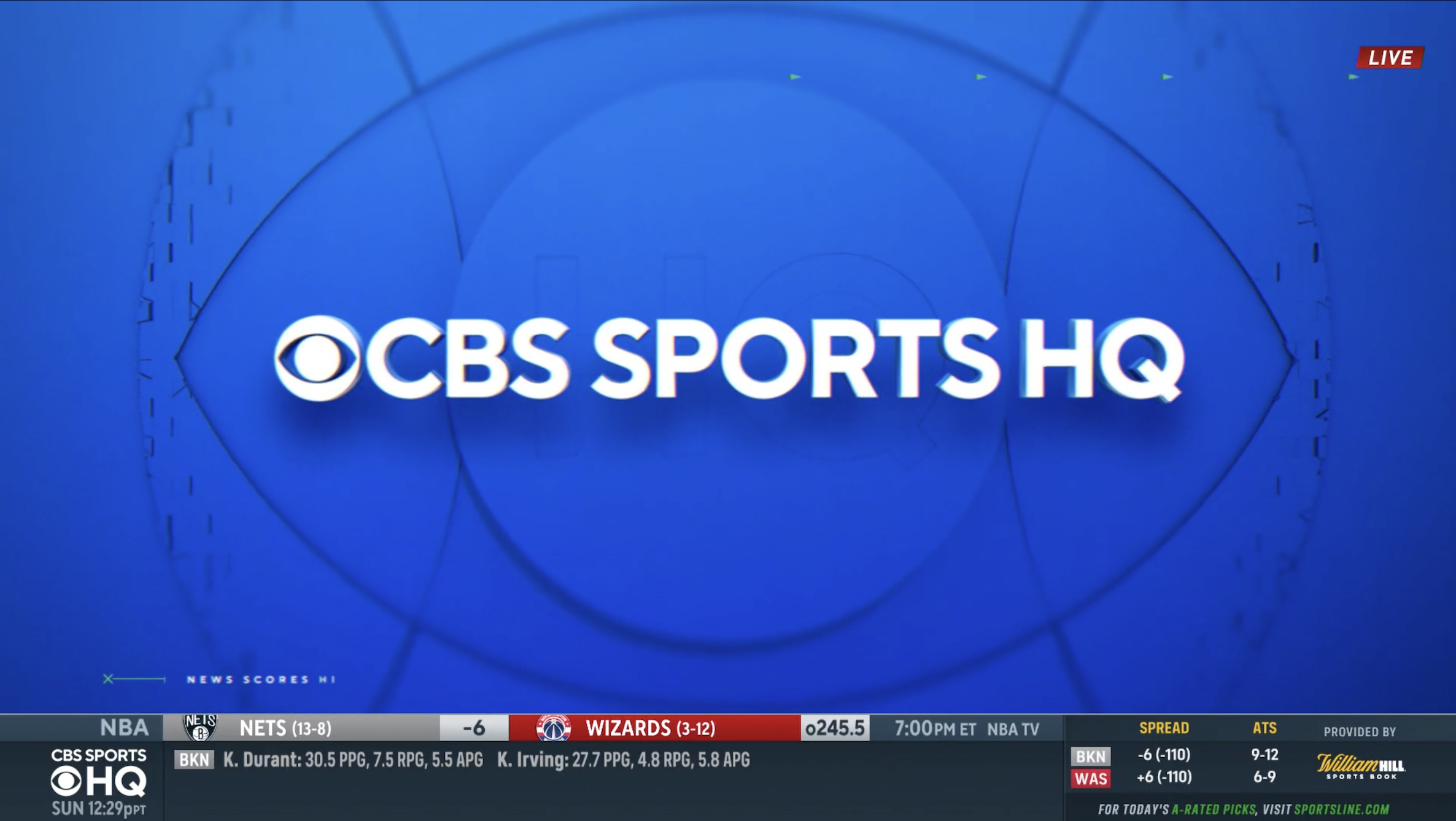
The biggest change is the elimination of the thick frame around the wordmark and elimination of the reversed out CBS eye logo to the left.
In addition to serving as the foundational look for the entire division, the design was adapted for the various franchises, leagues and sports the network has broadcast rights deals with — sometimes in a two-line lockup.
Instead, the eye now simply sits next to the words “CBS Sports,” which, like the other divisions, has transitioned to TT Norms, replacing another, unidentified sans serif.

The old CBS Sports logo, used from 2015 to 2021. Over the years, the look became flatter.
The division’s previous logo rolled out in 2015 after using its previous design for over 35 years, the network said at the time.

The longtime CBS Sports logo used for over 35 years before 2015.
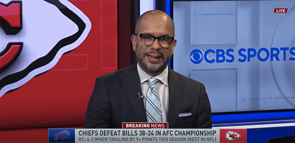
CBS has started rolling out the new logo on its website and apps and it’s also appeared on-air behind talent on CBS Sports HQ, its digital sports network.
It also has introduced, in many of these applications, a fresh blue shade.


Some motion graphics have also been tweaked with the new logo, but the network’s insert graphics currently remain the same.
For the Super Bowl, however, CBS Sports is expected to unveil new insert graphics that will become the standard across its CBS, CBS Sports Network and CBS Sports HQ coverage.
This weekend, CBS Sports welcomes back the @PGATOUR with the @FarmersInsOpen. With 20 total events on the schedule, including two majors and the start of the FedExCup Playoffs, it’s going to be a year to remember.
Full Schedule: https://t.co/74PkzI8Fcz pic.twitter.com/8dGKIRIzlf
— GOLFonCBS (@GOLFonCBS) January 26, 2021
The redesign is the first step in an overall brand update that CBS as a whole embarked upon starting in the fall of 2020, which included CBS News dropping its longtime Didot logotype in favor of sans serif.
Both CBS and CBS News also have distinct audio mnemonics — though a sports one hasn’t been seen yet.
Subscribe to NewscastStudio for the latest news, project case studies and product announcements in broadcast technology, creative design and engineering delivered to your inbox.


tags
CBS, CBS Eye, CBS Sports, CBS Sports HQ, CBS Sports Network, logo design, TT Norms
categories
Branding, Broadcast Design, Broadcast Industry News, Heroes, Networks, Sports Broadcasting & Production