
ABC Chicago’s WX graphics first piece of new group design mandate
Subscribe to NewscastStudio for the latest news, project case studies and product announcements in broadcast technology, creative design and engineering delivered to your inbox.
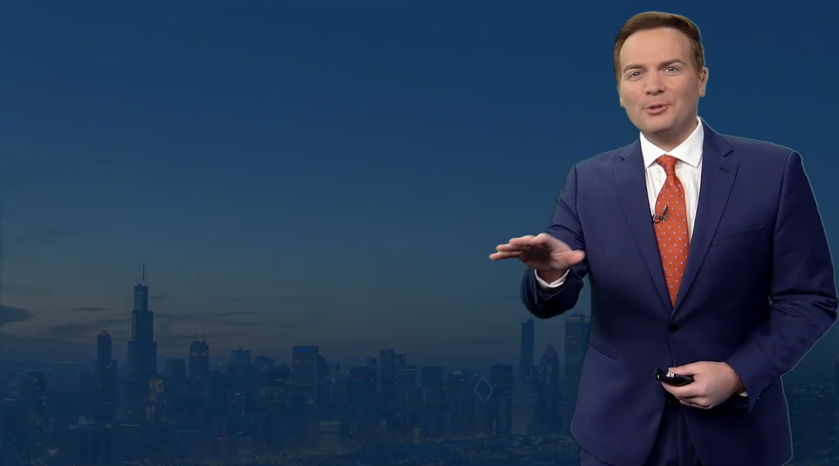
WLS, the ABC-owned station in Chicago, has quietly switched over to new weather graphics which are the first pieces of a new overall graphics package redesign for the station and a jumping-off point for its sister stations.
The new ABC Owned Television Stations package is the product of three years of development with consulting firm SmithGeiger, which conducted extensive research for the redesign effort.
The look moves toward a flat design aesthetic with opacity and overlays, losing the lens flares and 3D found on many ABC stations.
SmithGeiger’s creative services division, Vivid Zero, led the design effort and has created a toolkit of design elements for the stations, with each finalizing implementation and customization at the local level. This ultimately means each ABC-owned station may have a different finished product while sharing the same DNA from the initial research.
Vivid Zero has quickly become ABC’s go-to design team, having recently worked on network programming including “The View” and the 2022 rebrand of “Good Morning America.”
ABC Owned Television Stations declined to participate in this story but NewscastStudio was able to confirm details with multiple sources across the station group.
The debut is expected in phases as each station completes implementation.
CBS is also working on a new group package for its owned-and-operated stations with the launch planned for fall.
Sources indicate to NewscastStudio that the timeline at CBS is in flux after key staff departures and as the design has not been finalized. That design is expected to follow the larger “deconstructed eye” branding that has already debuted across entertainment, sports and news programming in various forms.
ABC is the last network group to switch to a shared graphics package, with CBS, Fox, NBC and Telemundo having standardized looks across their owned stations. Fox and NBC also have creative services hubs that service their owned stations, while CBS does not.
This is unlikely to change with the new CBS package or the ABC updates, partially due to union contracts.
First pieces of the new design
WLS is the first to debut pieces of the new ABC design, with it appearing on June 8, 2022, during the station’s “ABC 7 Eyewitness News at 4 p.m.”
It’s not uncommon for stations to switch over weather computer systems to new looks either before or after other new graphics roll out because they often run separately and require significantly more integration given how they have to tie into real-time data.
The control room and newsroom editorial system handle news graphics while weather typically stands on its own and creates its own graphics, with the control room just taking a feed from a designated terminal that forecasters can control independently.
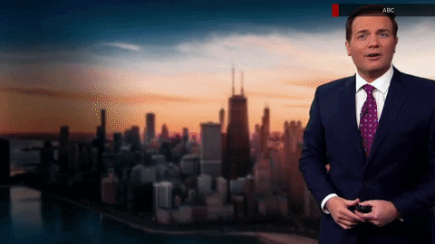
The new look uses the updated ABC globe alongside the station’s longtime Circle 7 logo, both of which appear in a flatter look.
With both of those elements being circular, the look takes advantage of that as the axis of the updated entrance animation for headers.
The quick sequence starts with a single, solid white dot that splits to become three before a swirling effect reveals the Circle 7 logo along with the network logo. This sequence, with the exception of the swirl, has some notable references to the bug animations in ABC’s Aperture look,
The three-dot sequence is also used as a decorative element in header bars and other locations.
Colors are typically blue and gold with dark overlays and white text, plus red mixed in for “alert” purposes. Yellow is typically an accent color, used in thin separators or footer bars.
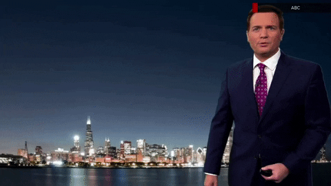
Elements such as header bars use a subtle blue gradient, similar to WLS’s current graphics package, which has been in use since October 2013 and uses heavy 3D elements along with glassy, metallic elements and lens flares that appear to the antithesis of the new look.
After this element, a solid bar slides out from the logo, with the header appearing as any additional elements unfold downward, sometimes in segments.
In other cases, elements animated in with a horizontal effect that also includes yellow, blue and white bars.
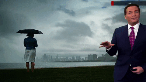
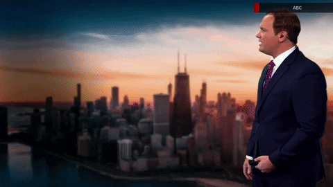
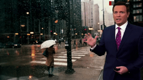
While WLS still has the ability to insert live cameras from around the region behind weather graphics, the new look focuses more on stylized, slightly blurred backgrounds ranging from wide cityscapes to a view of pedestrians hurrying by in the rain.
Many times, thanks to the new entrance animations, viewers are treated to brief glimpses of these backgrounds without anything on top of them.
There were cityscape views like these in the old look, but they tended to only remain in the background for the beginning of the sequence, with a loop of fluffy clouds set against a blue background replacing them.
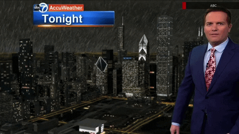
The new weather graphics appears to drop the use of 3D models of the city that change the lighting and atmospheric effects to match the forecasted weather in favor of doing this with photographic-style imagery, such as adding a semi-transparent cloud layer over the same city view.
This approach is subtler than the simulated views of the city and also lacks the ability to showcase key buildings or landmarks as well, but also feels a bit more realistic.
The vantage points tend to remain the same during these segments, rather than rotating around the city as it did before, a feature that did allow the station to showcase multiple areas of the city.
The new graphics package transitions to Proxima as its primary typeface. At WLS, the station has used Helvetica heavily, including in weather maps. This is expected to be the new font across lower third insert graphics as well.
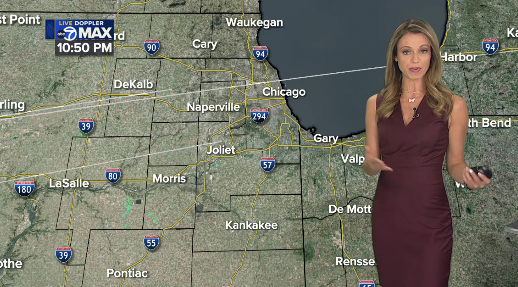
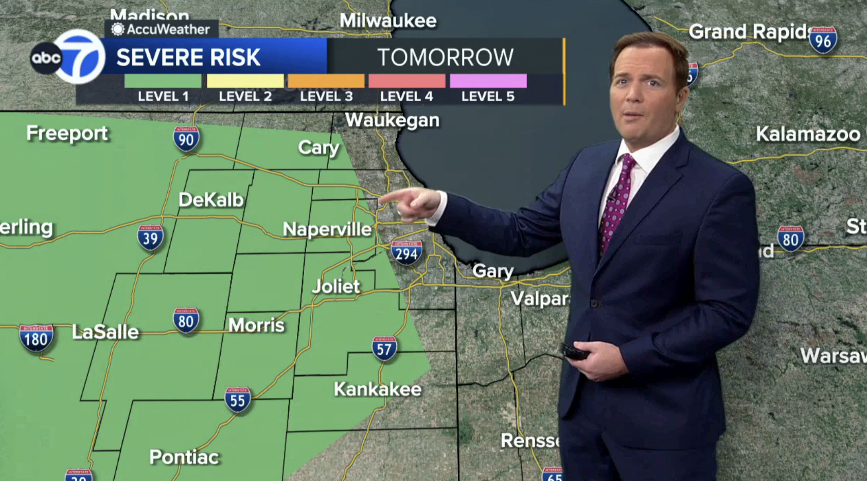
This Live Doppler 7 Max view actually combines multiple radar sweeps, including the one ABC 7 owns (which is the one to the right of DeKalb).
ABC 7 Chicago owns its own radar, known as Live Doppler 7 Max, and maps featuring this scan get a significantly condensed header element — to the point of almost being more of a “label” or “bug” in the upper left corner of the screen.
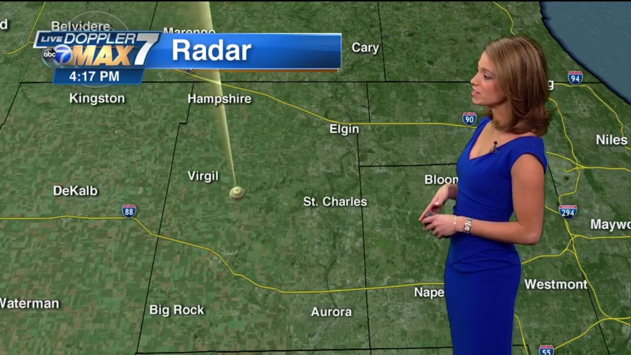
The previous Live Doppler 7 Max look, as shown the day it debuted in 2016, features a more complex logo and blue bar that often felt like it took up too much visual real estate. It’s shown in ‘max mode’ here, signified by the yellow. sweep and tower icon.
It does not appear ABC Chicago will be dropping its AccuWeather co-branding, but it has updated to a much simpler layout that takes up a smaller footprint on the screen.
The AccuWeather bar now mostly appears on a dark gray bar, as opposed to the orange the station had been using (and is key part of AccuWeather’s brand standards), but it now features the sun icon to the left of the logotype.
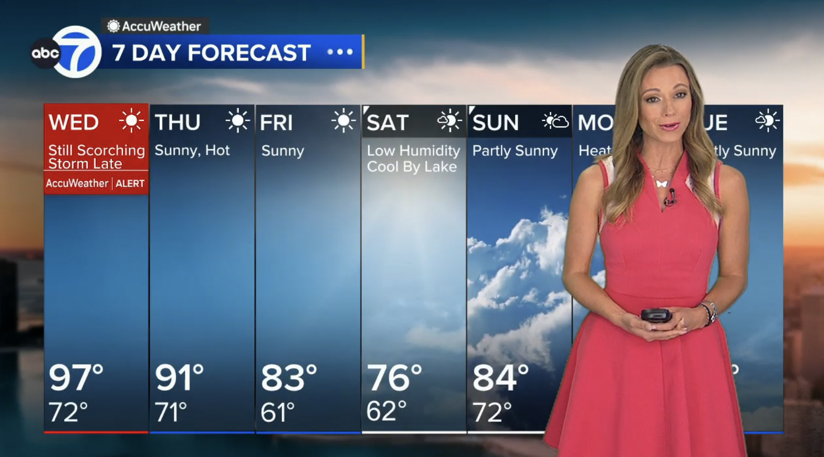
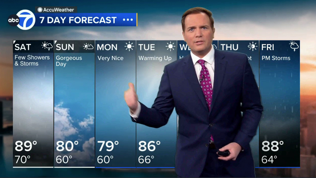
Another big change is the 7-day forecast board, which now extended the full 16:9 width of the screen.
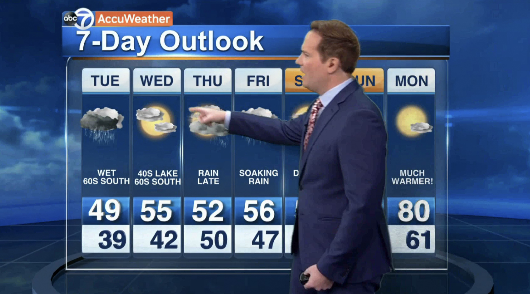
The old 7-day outlook layout.
The design keeps the vertical columns that have been a mainstay of these layouts at hundreds of TV stations for decades, but reimagines it, again, with more photorealistic imagery instead of the previous icon style.
While simple monotone icons still remain at the top of each day’s column, the entire column is now filled with an animated depiction of the conditions in a look that’s not dissimilar to the Apple iOS weather app.
This isn’t the first time a station has used this approach, but the application is notable because, in certain cases, the imagery can stretch across multiple columns. For example, if two days in a row are cloudy, there’s a single animated cloud background inserted that extended across both, separated only by a thin divider line.
For cases when there are dramatic shifts in conditions, the columns rightfully change at the border.
The extended forecast design also uses a distinct entrance animation that includes each column increasing in transparency, becoming slightly larger and then sliding gently into position.
The new look also includes a provision for “AccuWeather Alert” days, distinguished by a red header and underline. Weekends get a small triangular accent and white bottom border, while non-alert weekdays feature a blue border element long the bottom of the layout.
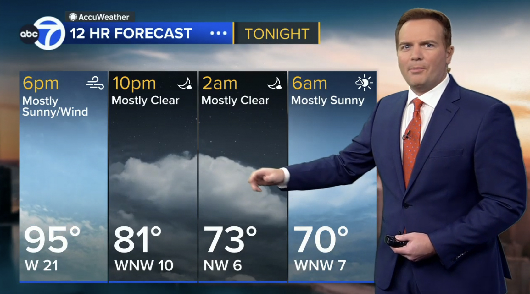
Similar layouts can be used for shorter forecasters, such as a 12-hour one, with windspeeds inserted instead of low temps.
The current graphics package at WLS debuted in 2013. Other ABC-owned stations have seen updates since, such as KABC in 2015 or WABC in 2016.
NewscastStudio’s Dak Dillon contributed to this report.
Subscribe to NewscastStudio for the latest news, project case studies and product announcements in broadcast technology, creative design and engineering delivered to your inbox.
tags
AccuWeather, Chicago, Vivid Zero, wls
categories
Branding, Broadcast Design, Broadcast Industry News, Graphics, Heroes, Local News, TV News Graphics Design, Weather