

NewsNation uses clean look with thick map frames for 2026 election coverage
Weekly insights on the technology, production and business decisions shaping media and broadcast. Free to access. Independent coverage. Unsubscribe anytime.
Nexstar Media Group’s NewsNation unveiled a series of new graphical and technology upgrades for coverage of the 2026 midterm elections, including a clean approach to graphics that drew on the network’s signature bracket look.
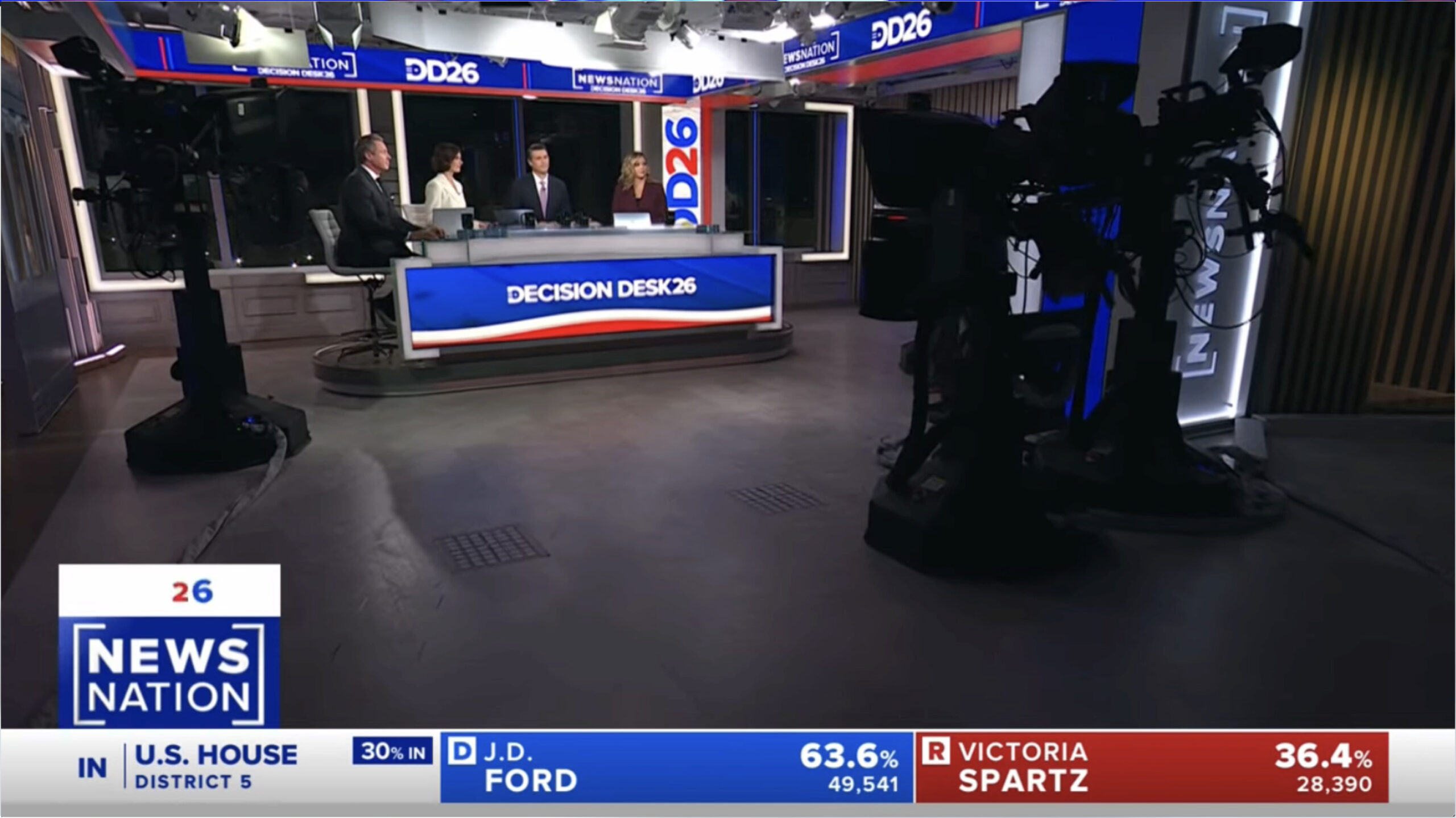
The network used its New York and Washington, D.C., studios, both of which contain scenery that references the bracket motif.
As it has in the past, NewsNation partnered with Decision Desk HQ for its election coverage and branded its coverage under that name, though “DDHQ” was also used as a shorthand version and, in other places, just “Decision Desk ’26” was used.
In many election-specific graphics, the square brackets that appear throughout the network’s sets and primary graphics package were used as a bold 3D frame element.
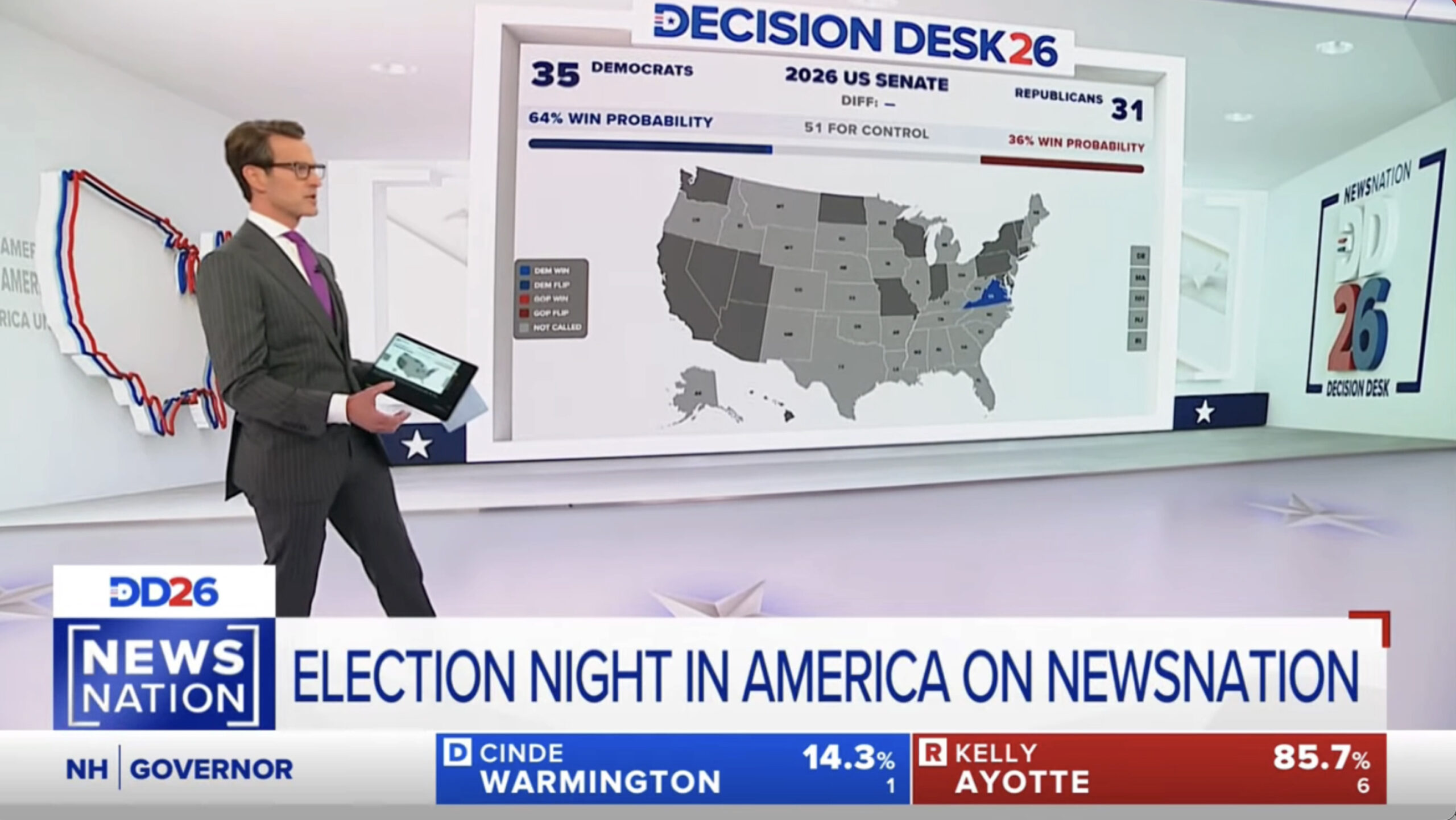
In New York, the massive video wall installed in the studio was used primarily as an interactive data presentation area, with talent controlling the graphics via a handheld tablet.
The data-driven graphics appeared inside a 3D frame element that, in turn, could be shown inside of a white and gray virtual environment that featured virtual logos, U.S. map outlines and brackets on its walls.
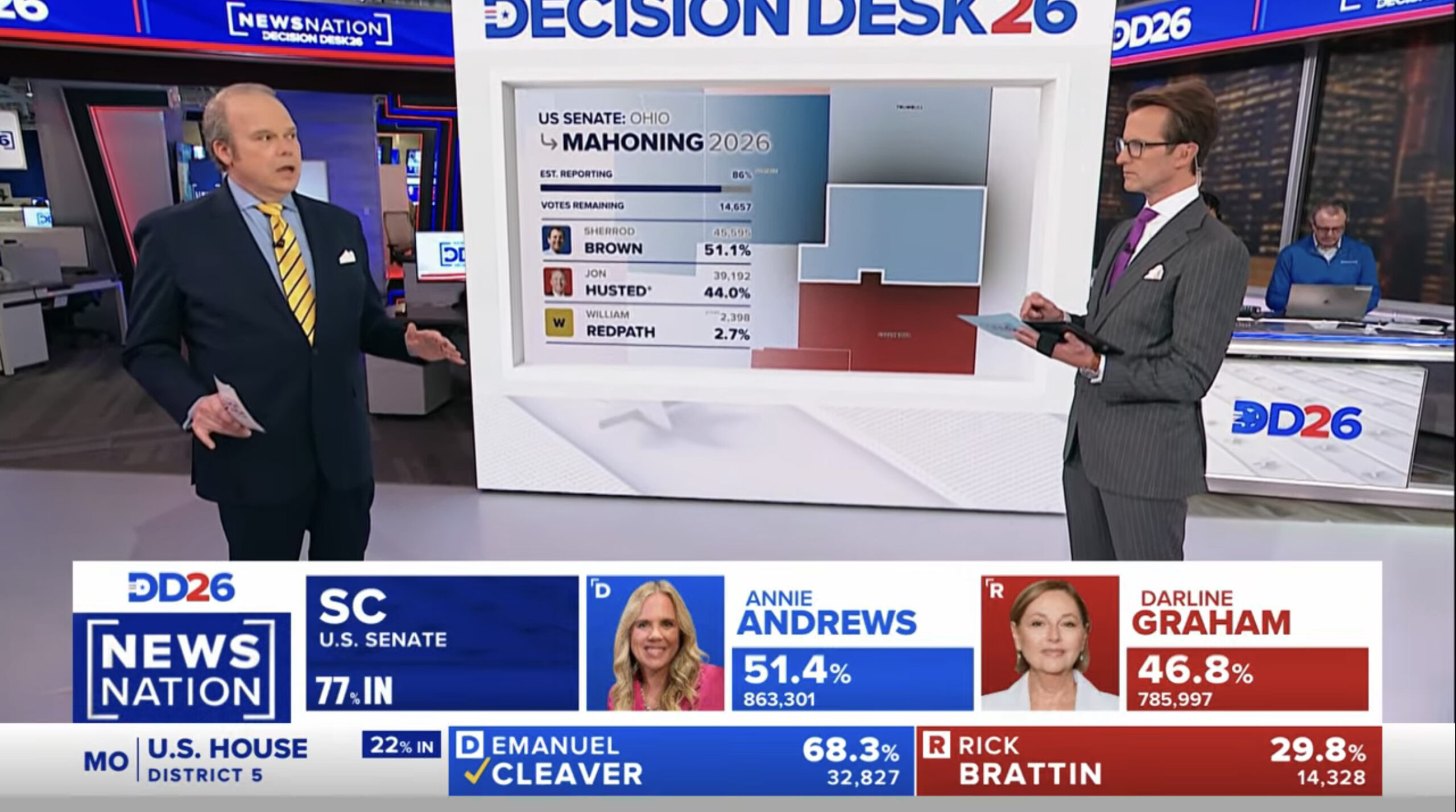
A smaller version could appear on one of the network’s secondary LED panel arrays, with an open workspace in the background.
NewsNation’s graphics introduced a simplified look by using map graphics that would focus on a specific county and its neighboring zones. The county was shown with a shadow effect and was color-coded based on which way the vote was leaning. Neighboring counties were also shown with color-coding to add context.
Outside of the adjacent counties, however, other parts of the state were ghosted out to allow specific candidate and vote data to be shown.
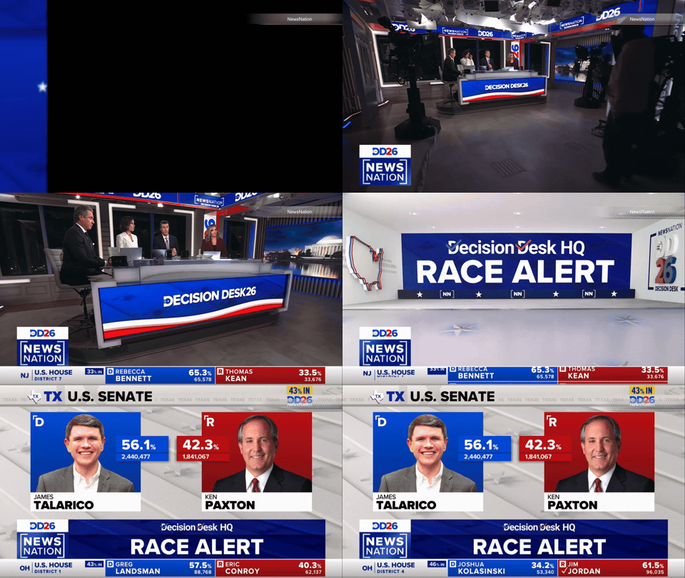
The virtual environment could also be used to showcase alert stingers before transitioning to full-screen results graphics.
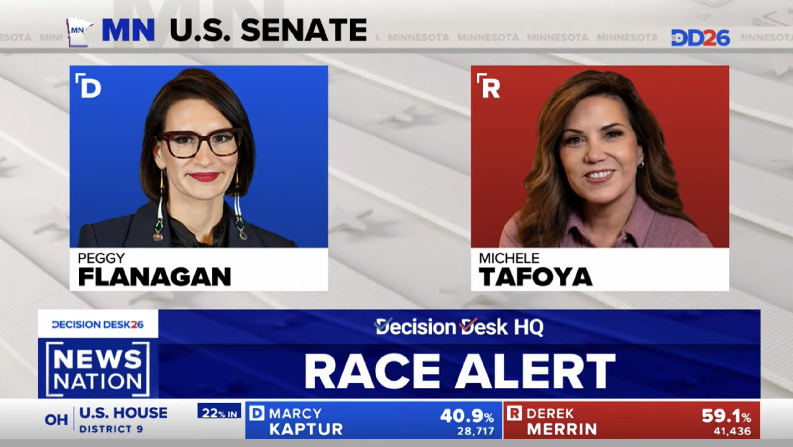
Results and candidate information were shown full screen with a tone-on-tone white and gray stars-and-stripes background, with the stripes there serving as a nod to the rectangular elements found elsewhere. The network also included a header bar with a state outline and abbreviation, along with the race name. Behind this was repeating text of the full state name along with an oversized version of the postal abbreviation.
Much of the NewsNation election design focused on clean layouts colored with white-gray, blue, and red, along with gradient effects and thin borders and separators to help reduce clutter.
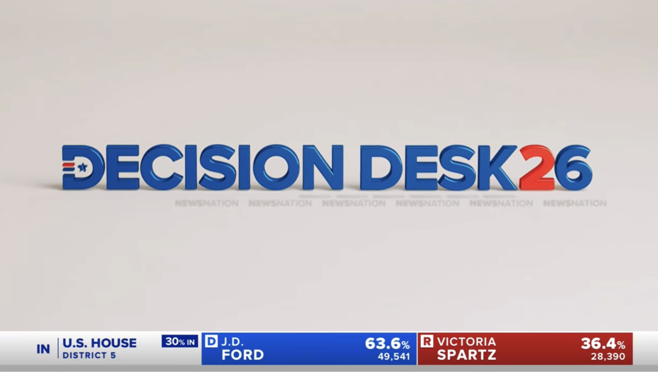
NewsNation also used what felt like an alternate look in select opens and wipes — a slightly glassier 3D take on the Decision Desk logo. While these were often set against a white-gray background with subtle shadows, the colors were slightly different, and even the gray felt a bit warmer.
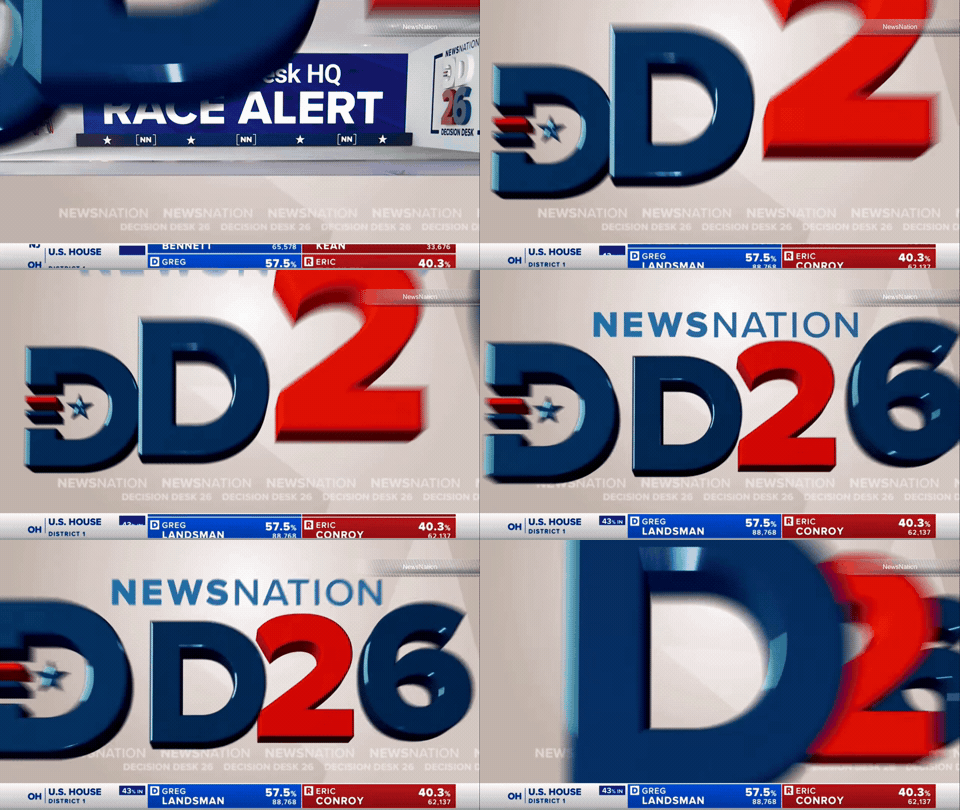
The 3D effect also felt a bit out of place. It had slightly soft edges instead of sharp bevels and a flatter look, like what was found in other parts of the package. Even within the alternate look, colors and 3D intensity varied.

tags
2026 Election, 2026 Election Coverage Roundup, Decision Desk HQ, NewsNation, NewsNation Channel, Nexstar Media Group, November 2026 Midterm Elections
categories
Broadcast Design, Broadcast Industry News, Cable News, Elections, Featured