
NBCNews.com rolling out new design
Subscribe to NewscastStudio for the latest news, project case studies and product announcements in broadcast technology, creative design and engineering delivered to your inbox.
First on NewscastStudio: We noticed today that NBCNews.com appears to be rolling out a new design on some of its sections.
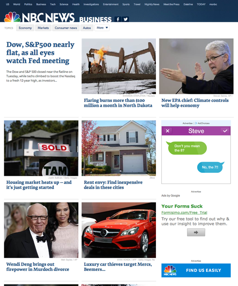
The new layout isn’t evident on the homepage, but certain section fronts, such as business, entertainment and technology are sporting a new look — a more grid-based design with a simplified header. See above for an example.
As we reported last week, visitors typing in “msnbc.com” are now being shown a warning message of the upcoming move away from all NBC News websites being hosted under the MSNBC umbrella.
The new section fronts are also located at simpler URL paths — nbcnews.com/business, for example — while story pages follow a similar naming scheme.
Previously, section fronts and stories used a bizarre mishmash of subdomains and rather cryptic URL paths. Take, for example, one page that isn’t on the new design that uses this URL path:
http://usnews.nbcnews.com/_news/2013/07/30/19778635-multiple-injuries-after-car-slams-into-kansas-city-daycare?lite
In the new header design, the NBC News logo and section title are positioned within a dark blue bar that forgoes any padding under — so the text butts right up against the lower edge of the blue.

The header also includes small text links to other section fronts, NBC News programs and msnbc.com.
Section content, meanwhile, is displayed in a three-across grid, similar to the design used on Today.com for some time now, and also uses a new typeface for headlines, Elena.
Story pages, meanwhile, receive a similar treatment, with Elena as headline type, open source Noto Sans as body type and Gibson for bylines and accent typography.

The new story page layout emphasizes large imagery and cleaner, easy to read text. Running down the left side are a running list of related headlines that can also be accessed by simply scrolling down the page after the current story ends. This is an interesting design tactic that almost certainly is aimed at keeping users on pages longer and reading more content without having to click to a new page.
It’s also worth noting that the new design seems to place a focus on “Topics” — which are listed in small pill shaped boxes just under the blue header bar and provide users with crosslinks to other related content. The search box also tells users it can be used to “search topics.”
It’s not clear if this design is part of the upcoming promised redesign of NBCNews.com, but it seems likely that this could be a way for NBC News Digital to test out the new look before the full blown launch.
Some sections, notably U.S. and World News, are still using the old layout that also includes unique header designers for each.
Advertising on the section fronts is placed within the grid, while on story pages it is relegated to the far right gutter.
Overall, the new look goes a long way to clean up what had become an incredibly cluttered and mismatched design. The msnbc.com homepage had become a rather messy collection of links, photos and boxes of headlines, while the rest of the site moved toward individually themed, blog style pages, each with its own header design, which lead to a distinct lack of consistency.
Subscribe to NewscastStudio for the latest news, project case studies and product announcements in broadcast technology, creative design and engineering delivered to your inbox.

tags
MSNBC, msnbc.com, NBC, NBC News, nbcnews.com
categories
Featured, Networks, Online and Digital Production