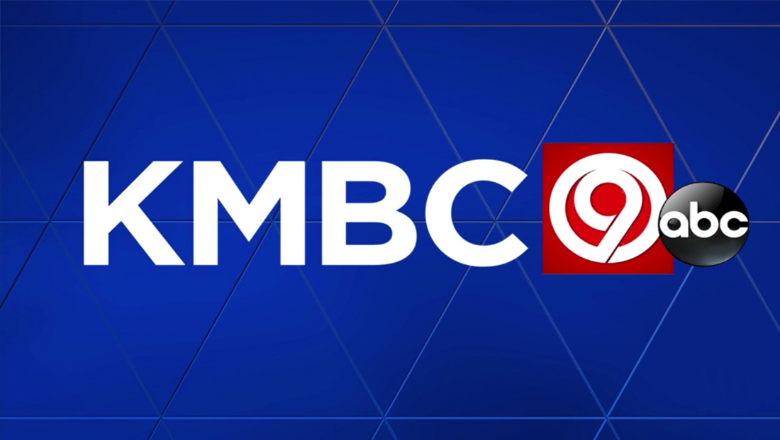
Kansas City station gets updated logo design

Weekly insights on the technology, production and business decisions shaping media and broadcast. Free to access. Independent coverage. Unsubscribe anytime.
Hearst’s ABC affiliate in Kansas City, KMBC, has updated its logo and branding.
The new look drops the Bankers Gothic font, a longtime fixture at Hearst stations that is gradually being phased out, with a cleaner, wide sans serif font.

KMBC kept its traditional “circle 9” logo, but now places it inside of a red square, removing the previous blue look.

In addition, the station has switched to using the “Today’s KMBC 9” branding, though its newscasts are still branded under “KMBC 9 News” name and “The Team You Trust” tagline.


tags
font, hearst, kansas city, kmbc, logo design
categories
Branding, Broadcast Design, Broadcast Industry News, Featured, Local News