
Apple TV streamer drops the ‘plus’ in confusing rebrand
Weekly insights on the technology, production and business decisions shaping media and broadcast. Free to access. Independent coverage. Unsubscribe anytime.
Apple has become the latest streaming service to unveil a rebrand that has the potential to create confusion.
The tech giant, which launched Apple TV+ Nov. 1, 2019, has announced it’s renaming it to just Apple TV.
Things get tricky, however, because “Apple TV” is also the name of both a streaming device and the app that allows users to access the streamer formerly known as Apple TV+.
Eddy Cue, senior vice president for services at Apple, explained the company opted to drop the “+” to help with consistency across the ecosystem of services. He noted that while “+” will continue to be used for services such as iCloud+ and Apple News+, those services also have free tiers.
Apple TV does not have a free tier, so the company seems to be attempting to restrict the “+” mark to services that have both.
Some outlets have noted there’s inconsistency with the service Fitness+, which doesn’t have a standalone free tier per se, but it’s worth nothing the “Fitness” name is also used for a standalone app that helps users track move, exercise and stand goals, among other similar data.
Using this app only requires a compatible device (namely Apple Watches, but iPhones can also track some of this data) and it also serves as the gateway to Fitness+ content for subscribers.
The plus-less approach does, however, align better with the Apple Arcade and Apple Music services branding, both of which don’t have free tiers.

Back over at Apple TV, Cue did note that the current generation of Apple TV hardware will be branded as “Apple TV 4K,” a move that could be confusing because 4K streaming is also available on other compatible devices in conjunction with the Apple TV service. There are also still many older generation Apple TV devices still out there that don’t support 4K, though Apple doesn’t actively sell them.
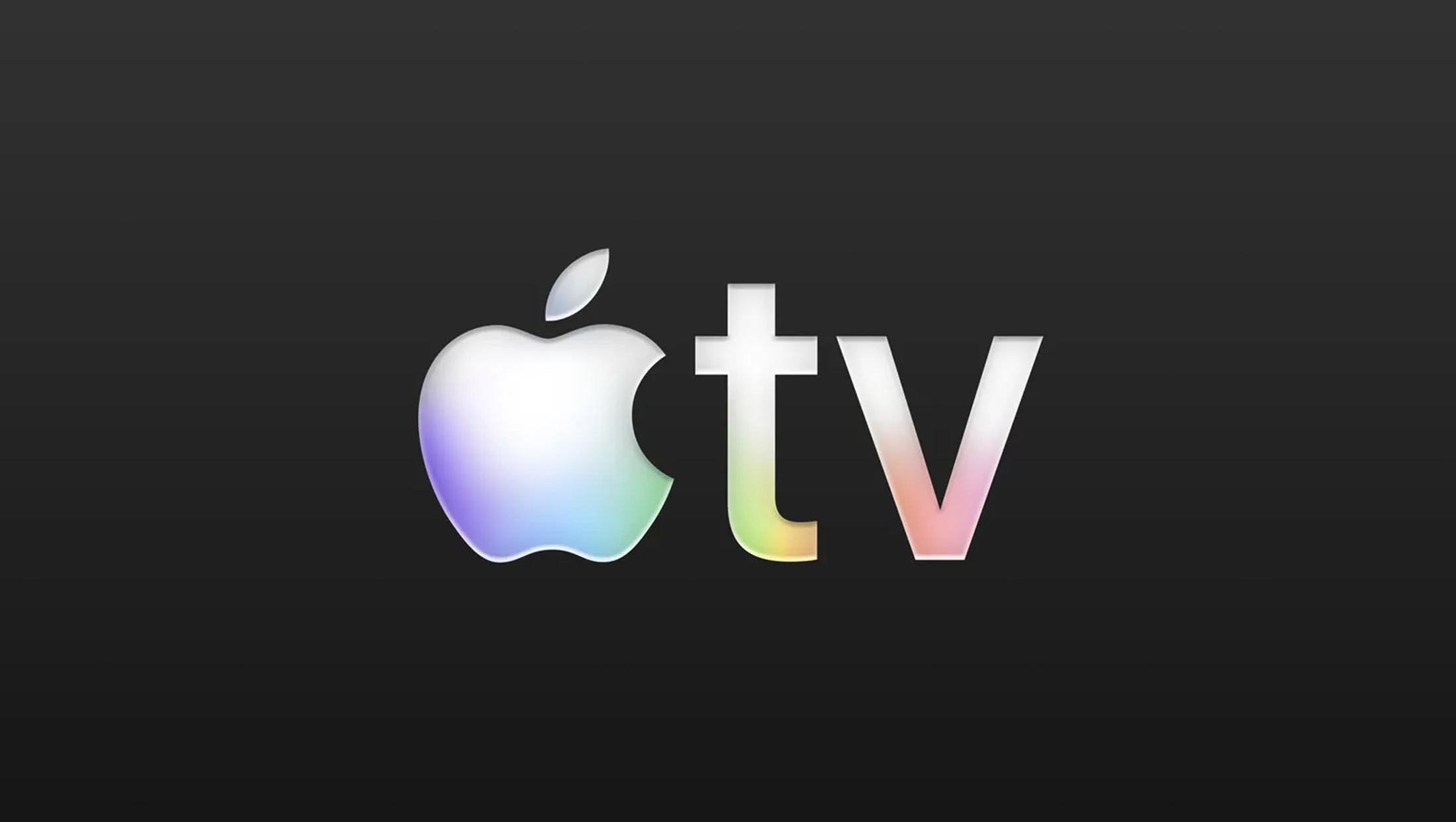
In addition to the name change, the streamer is also updating the logo and icon for both the streamer and app.
The new look retains the familiar apple icon and the letters “TV,” styled in all lowercase, in the company’s signature San Francisco font. What’s changed is the addition of subtle gradient bursts of color inside the lower parts of the logo.
There’s also a razor-like bevel effect that appears to come from the new “liquid glass” look the company rolled out across its operating systems earlier in 2025.
Dubbed a more “vibrant” approach by Apple, the colorful approach could be linked to the company’s former rainbow banded logo.
Its colorful, flowing feel also suggests the motion and hues of video content.
The rainbow effect is notably not applied in a simple linear fashion, which would have been more in line with the company’s former logo. Instead, the apple icon has violet, blue and a hint of green, the “t” has green and yellow and the “v” completes the spectrum with orange and red.
It’s also noteworthy that the color isn’t always applied or stacked consistently, such as with the yellow mostly living inside the lower hook of the “t” and the green fading up the vertical.
The color order is also done in the reverse of the traditional rainbow order, which also has the effect of meaning the apple icon doesn’t appear in the red part of the spectrum as might be expected.
Apple often incorporates subtle approaches into its design, and it’s possible this could be a nod to the “think different” approach the company has built its name around.
![]()
Incidentally, the logo for Apple TV 4K (the device) has the option of taking on a rainbow gradient as well — with the letters “4K” becoming bolder and filled with color in select applications. From a design standpoint, the even more vibrant look, as well as the thicker typography, used here creates a nice parallel to the new look for Apple TV that sends the message the device is a powerhouse.

Apple’s new TV logo design is notably much more colorful than the gleam of color that was added to the Max logo in April 2025 and carried over to its rebrand back to HBO Max in May 2025. The color wash for the WBD-owned streamer was inspired by the subtle colors that often appear in signal noise, an element that goes back to the HBO linear network’s early days.

tags
Apple, Apple TV, Apple TV 4K, Apple TV App, Apple TV Streaming Service, Branding, logo design, OTT, streaming
categories
Branding, Broadcast Business News, Featured, Streaming