
BreakingNews.com gets brand makeover along with site, app overhauls
Subscribe to NewscastStudio for the latest news, project case studies and product announcements in broadcast technology, creative design and engineering delivered to your inbox.
At the heart of the redesign of BreakingNews, as the official NBC News release points out, is an effort to make content more customized and sharable — but it’s also worth noting the considerable overhaul NBC News Digital has done to the brand as a whole.
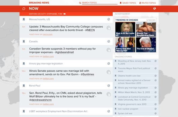
The new site drops the bold red for a shade that’s a bit more subdued and skewed more toward the orange end of the spectrum.
The new red shade is more in line with the somewhat muted color schemes that have become part of the so-called “flat design” trend that’s sweeping the Web.
The brand also has a new logo — a petal shape with simplified “B” inside of it.
The petal shape reads as a speech bubble, hinting at the goals of making BreakingNews more interactive and social. I also see a similarity to the red map markers made popular by Google Maps — a possible nod to the site’s new map based design (more on that later).
The “B”, which has had its outline simplified, also gets a small “tail” added to its lower left, another allusion to the speech bubble motif.
The site also dropped its “dot matrix” world map design (that always reminded me a bit of the Larry King Live set) for a more realistic one that includes geographic borders rather than just vague outlines of continents.
The map actually becomes a functional part of the website — users can hide the text overlayed over it and set news “hot spots” represented by colored circles scattered around the globe.
Although at first glance it seems a bit odd to hide this element by default, but it’s actually a pretty clever way to give users on big screen desktops some extra content.
The logo’s petal shape makes another appearance in the “Whoa” button next to each story — this time with a speech bubble and two dots inside of it that form a “whoa” face of sorts.
The app, meanwhile, also takes on a similar look and feel, including giving users access to a map based view (though, interestingly, it uses rather gaudy pin icons rather than colored circles).
Another somewhat hidden feature that’s worth noting is, that if a user scrolls down past all the headlines, some basic informational content about the site, its apps and more becomes accessible via an alternative navigation menu.
Subscribe to NewscastStudio for the latest news, project case studies and product announcements in broadcast technology, creative design and engineering delivered to your inbox.

tags
Breaking News, BreakingNews.com, NBC News, nbc news digital
categories
Featured, Online and Digital Production