
Bloomberg redesigns main website
Subscribe to NewscastStudio for the latest news, project case studies and product announcements in broadcast technology, creative design and engineering delivered to your inbox.
Bloomberg has launched a redesigned site that uses a mix of bright colors, unique layouts and typography tricks to create an interesting news reading experience. The site also changes the main name to Bloomberg Business.
As we reported in October, Bloomberg added a politics section to its site with a unique look and feel that is heavily echoed in the sitewide relaunch.
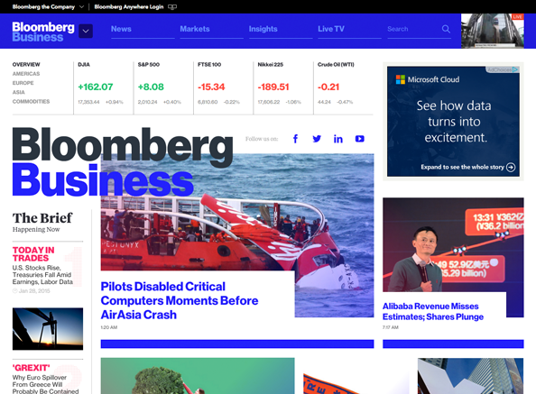
In addition to bright, almost glaring colors such as the blue bar running across the top of the screen, Bloomberg also overlays text over photos and other design elements — sometimes with a white box behind it and sometimes not.
For example, the homepage as of this writing featured a story about the AsiaAir crash and part of the “Bloomberg” name and much of the word “Business” hang over the upper left part of a photo of the recovery mission.
This makes the logo a bit hard to make out (give that the photo also has a heavy amount of blue) and also seems a bit unnecessary and distracting from the photojournalism. Meanwhile, the lower left of the image is covered by a white block that contains the clickable headline.
While a list of headlines runs down the left rail, additional large photos boxes are used for other top stories. Some of these boxes include “cut out” images that are set against rather garish gradient backgrounds rather than a traditional, block-shaped photo.

A story page with headline jutting into the blue header element.
The text overlay trick is used on story pages as well, where headlines are contained in a solid white box that juts into a background design.

The homepage gives prominent space to current market data, which are given prominent placement above the site logo, as well as the live feed of the Bloomberg TV, which features a thumbnail in the upper right.
Farther down the homepage, a variety of interesting layouts are used to present the news, including this grid-like structure of colorful squares and rectangles.
One of the grid-like collections of headline scrapes and links on the homepage.
As you scroll down pages, the bright colors continue, along with the use of animation and large photos.
It’s a bit hard to tell what, exactly, is the reasoning behind each layout — which range from traditional headline scrapes and thumbnails to carousels and the aforementioned grid.
Like with the politics section, which has a similar but still even more daring layout, the design of Bloomberg often seems to be “design for design’s sake” and lacking any true function, navigational use or storytelling advantage, though it certainly creates a highly scannable cure for dull news sites.
Subscribe to NewscastStudio for the latest news, project case studies and product announcements in broadcast technology, creative design and engineering delivered to your inbox.

tags
Bloomberg, Bloomberg Business, Bloomberg TV, redesign, website
categories
Cable News, Featured, Online and Digital Production