
‘PBS NewsHour’ gets airy new look
Weekly insights on the technology, production and business decisions shaping media and broadcast. Free to access. Independent coverage. Unsubscribe anytime.
The “PBS NewsHour” unveiled a new look and sound Monday — a drastic change for the iconic program.
“It was our goal to have the design reflect many of the values intrinsic to the Newshour’s journalism,” said Eric Siegel, who led the redesign efforts.

The values encompassed words such as “transparent,” “open,” “bright,” “clean” and “uncluttered,” Siegel said in an email interview with NewscastStudio.
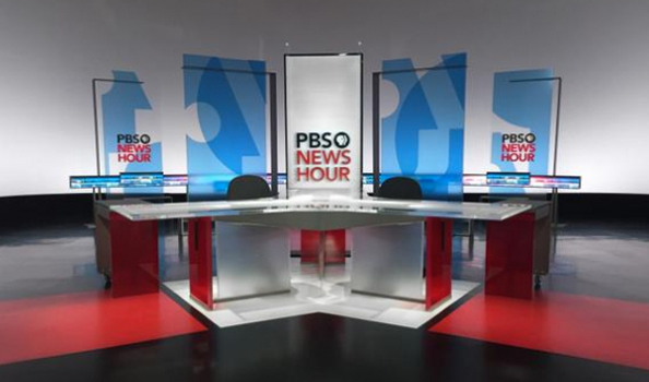
To translate that to the screen, the set makes heavy use of acrylic and aluminum for its mostly freestanding scenic elements.
Those elements, which are specially coated to prevent reflections from lights and teleprompters, make heavy make use of the PBS “face” logo overlaid and cropped in a variety of ways in blue, red and yellow.
Around the anchor desk, a band of panels show subtle animated graphics.
The entire set, meanwhile, is wrapped in a bright white cyclorama that contributes to the light, airy feel.
The set itself includes four areas, including an anchor desk equipped with Cineo Matchstix anchor fill lighting and anchored by a vertically mounted video panel between the two anchor chairs.

As a director himself, Siegel also placed special emphasis on finding ways for the NewsHour team to “bring in” remote guests and have the anchors relate to those guests in a visually natural configuration.
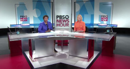
To accomplish this, the set is equipped with two additional displays that can be used for this and other purposes aside from the one in the anchor desk. The standup and sit-down interview areas boast a 90-inch display. The seated around is designed to accommodate one anchor and up to two guests.
The other area, situated downstage, is designed for roundtables of up to four guests in multiple configurations.
During the design process, the design team worked closely with Judy Woodruff and Gwen Ifill during the design process. Both gave notes about how they felt about the space and how it helped them relate to one another, said Siegel.
“We showed them color studies of themselves against the new set pieces. They requested some small alterations, and some additional creature comforts at the desk. Only when their needs were completely addressed did we proceed,” Siegel explained.
The Lighting Design Group and Lighting Designer Dennis Size worked with Siegel on the project to capture the unique vision of the project.
From a graphical standpoint, the new graphics package from Troika uses the same clean color scheme of white, gay and red along with unified typography in a slightly blockier typeface than the show’s logo appears in.

Similar to the on set renditions of the PBS logo as well as closely cropped versions of the show’s logotype.
The graphics package, meanwhile, is clearly designed to maximize full 16:9 space; especially the OTS boxes. The show’s lower thirds are unobtrusive and subtle.

tags
Eric Siegel, PBS, PBS News Hour
categories
Graphics, MoGraph, Networks, News Set Design, Set Design, Television News Music, TV News Graphics Design, TV News Graphics Package, TV News Motion Graphics Design, TV News Music, TV News Music Package, TV News Set Design, TV Set Design