
Readers pick notable Channel 5 station logos
Weekly insights on the technology, production and business decisions shaping media and broadcast. Free to access. Independent coverage. Unsubscribe anytime.
The number 5 certainly provides the opportunity for some creative logo designs — something that’s clear from the number of suggestions we received for the readers’ choice of Channel 5 TV station logos.
WEWS-TV and WPTV-TV
![]()
WEWS-TV, the Scripps ABC affiliate in Cleveland, Ohio, uses a variation on the famous “Circle 7” logo.
The logo, features a silver-y circle with blue center, incorporates a slanted “5” where the lower curve of the number is incorporated into the circular outline.
WEWS-TV’s sister station, WPTV-TV in West Palm Beach, Fla., uses a similar logo, though the slant on the left is much less extreme.
![]()
KXAS-TV
![]()
Dallas’ NBC O&O KXAS-TV combines its state’s iconic star symbol with a bold “5” to create a highly recognizable logo.

In the logo, the negative space in the “5’s” “hook” is replaced with a star outline. Like the character itself, the start slants slightly forward and the left “arm” of the star is carefully lined up with the base of the horizontal stroke above it.
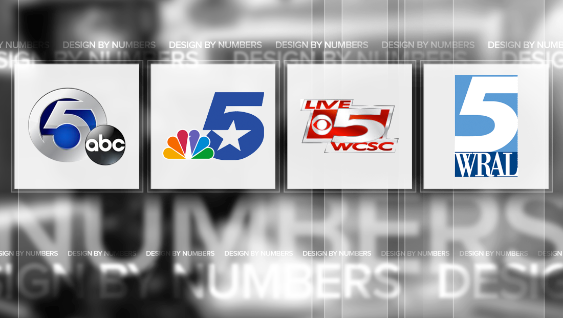
WCSC-TV
![]()
Raycom’s CBS affiliate in Charleston, S.C., WCSC-TV, not only uses its channel number prominently in its logo, but also in its news branding — having used the moniker “Live 5 News” for years.
The station’s (very) red logo, meanwhile, surrounds its branding, number, call signs and network logo in a forward slanting polygon.
A previous version of the logo, in a more subdued blue, stretched the “5” to extend the entire height and width of the blue box.
![]()
WTVF
![]()
Another Scripps station, Nashville’s WTVF-TV, uses a much different logo. The station, which brands as “NewsChannel 5,” uses a red square with rounded corners with a stylized “5” in it.
The numeral features a exaggerated round “tail” in the lower left as well as a thicker start to its downward stroke.
The station has used this logo for years — including the somewhat unique use of serif typeface Clearface in the logotype.
WRAL-TV
![]()
Capitol Broadcast’s WRAL-TV in Raleigh, also sports a highly recognizable logo.
The logo includes two stacked rectangles in two shades of blue. The larger of the top, which is also in portrait orientation, has a winding path of negative space “carved” from it that creates a flowing “5.”
The upper right stroke, part of the downward curve and far left tail of the “5” all extend past the edge of the box, while the “point” in the middle left does not, which helps significantly with readability.
Under the number, the station’s call signs appear in an elegant, narrow sans serif typeface.
KSTP
![]()
Although it’s undergone changes over the years, Twin Cities ABC affiliate KSTP-TV, owned by Hubbard Broadcasting, has kept its curvy “5” logo mostly the same.
The logo, which almost looks calligraphic, features an abundance of curves, with the lower half almost forming a complete circle. Also in this area, the number’s “tail” is created using an exaggerated oval shape that almost looks like a backward comma.
The flourish at the top of the logo, meanwhile, looks like a flag with a sharp point, a design elements that’s repeated in the middle left of the logo just before the curve begins.
In its most recent iteration, the station added two swirls that surround the logo. The design, however, isn’t quite as refined as it could be since the swipes lack the elegance of the “5.” The curves are also significantly different, which subtracts from the opportunity for a more cohesive look.
This post is part of a semi-regular series on NewscastStudio that takes a look at TV station and network logos that include the numbers 1 and up. These posts aren’t meant to be a comprehensive list of all logos featuring the number in question, but rather a look at notable logos with creative, historic or an otherwise significant impact on branding design. If you have other logos with the number featured in this post, feel free to share it in the comments.


tags
cleveland, design by numbers, hubbard broadcasting, kstp, KXAS, logo design, logos, minneapolis, nashville, raleigh, raycom, scripps, St. Paul, twin cities, WCSC, west palm beach, wews, wptv, wral, WTVF
categories
Branding, Broadcast Design, Design By Numbers, Local News