
‘The View’ returns with new host, tries to put square graphics in a round logo
Weekly insights on the technology, production and business decisions shaping media and broadcast. Free to access. Independent coverage. Unsubscribe anytime.
In addition, the show’s open has been updated to remove the angular graphics in favor of rectangular, boxy graphics with a rather generic sans serif typeface that appears both inside boxes and as ghosted accents.
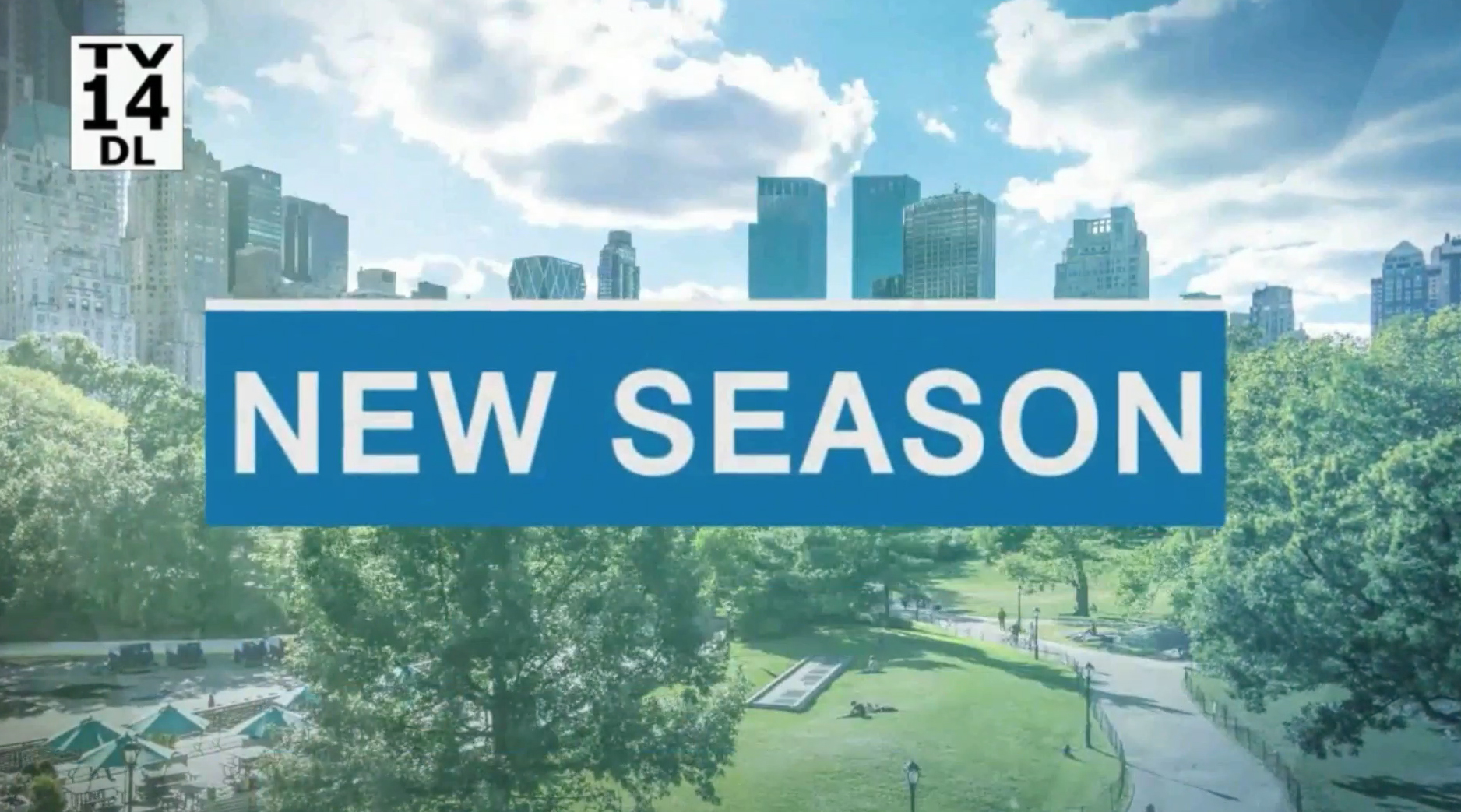
The open also uses generic, stylized shots of New York City — Central Park in particular, as well as some subtle angles.
Overall, while the rectangular graphics do certainly give the show a more flexible space for text, the show’s look now incorporates a mix of circles, arcs, “V” shapes and straight edges — not to mention inconsistent typography — creating an odd hodge·podge of elements.

tags
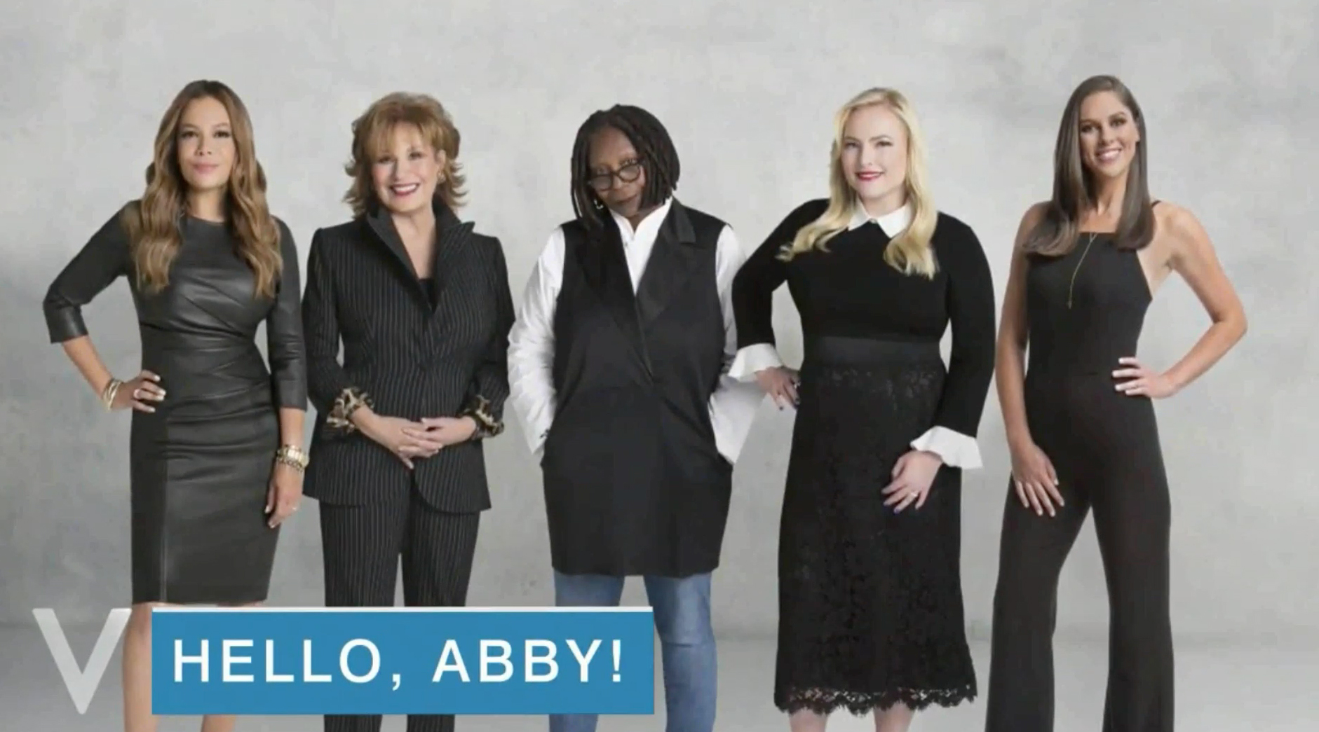
Abby Huntsman, ABC, ABC Studios NYC, Studio TV1, The View
categories
Branding, Broadcast Design, Broadcast Industry News, Featured, Graphics, Networks