
A look back: CBS News
Weekly insights on the technology, production and business decisions shaping media and broadcast. Free to access. Independent coverage. Unsubscribe anytime.
Related post: NBC News
1984
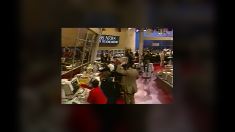
For its election night coverage in 1984, CBS built a special working newsroom-style set featuring yellowish-tan walls and broad spans of glass panels. Dubbed the “CBS News Election Headquarters,” the space was stocked with plenty of (now vintage) computers and monitors.


The main background behind anchor Dan Rather included the blue wall seen at the left in the photo above. A large “84” logo adorned the upper part of this area and monitors were stacked in two vertical columns as well as across the lower part of the wall.


Here is a sample of an electoral vote graphic used that year. Using the numeral “270” as a 3D element, CBS filled in the letters as results came in and states were called. Despite the fact that the graphics lack the degree of sophistication we see today, this was a quite effective alternative to always display a map of the United States, though it doesn’t provide a state-by-state overview.

This is another interesting graphic that CBS used that year. By tilting the perspective of the United states and adding a large gray block, the effect was a 3D map floating on Dan’s desk. This is somewhat indicative of the high-tech 3D environment that we see today, though it certainly had its limitations.
For one, Dan couldn’t actually point to a state, only indicate its general area, because the graphic was keyed over his camera shot (notice how his non-raised hand disappears behind the word “WIN.” It also creates a somewhat awkward framing and also doesn’t allow for on-air camera movements.

The one shot of Dan, seen here, was a simple blue background a row of monitors. It’s somewhat bland but also allows the focus to be on the anchor rather than the scenery.
2000

The year 2000 saw CBS using its existing “Evening News” set with some modifications. Here is Dan Rather’s one-shot, with a large flag mural taking the place of the normal background. Quite frankly, this is one of the ugliest background graphics we’ve ever seen. There are way too many “wrinkles” in the flag, creating a very busy background that distracts way too much. The style in which the background is done, a sort of faux fresco, also doesn’t lend itself to the year 2000.

In this example of CBS’s full-screen electoral college map, you can see the straitforward look the network chose to use. However, the graphics also have a certain elegant look to them and the hints of purple is a nice touch that prevents overload of the reds, whites and blues.

Here is CBS’s approach to touchscreens; a monitor built into the anchor desk and shot from the ceiling above. Dan would simply point to the various states as he dicussed them, though there was some limited touchscreen functionality. However, it’s a far cry from today’s technology and approaches and, even at the time, seemed a bit outdated.

This view provides a look at the view behind the anchor desk. You can see the additional workstations that have been brought in to accomodate election coverage, placed strategically close to the anchor chair and expanded anchor desk.
CBS had used this layout for several years but one disadvantage to it was viewers would often see seemingly bodyless heads bobbing around behind the anchors, which was distracting and a bit strange.
This image also shows a sample of the the election logo CBS used for several years before replacing it this year. The design featured a round, seal-like shape decked out with stars and 3D, beveled lettering.
2004

For 2004, CBS opted to use a combination of its main set and an “Election Data Center.” Because of this, CBS was able to give its broadcsts a more modern, fresh feel for the parts broadcast from this area. We especially like the blue ticker going across the top of the set.

The main set, however, was pretty much the same as in past years. Even the background, which had since been replaced with three rear projection screens, remained very similar to 2000, though the graphic has been improved slightly.


CBS’s graphics during the 2004 election took a very gold-hued theme and was also decorated with starts and animated rings. This was a good direction and way to create a presidential-look without relying too heavily on the more traditional colors.

Overall, CBS’s election night graphics have show evolution over time, but still remain fairly far behind those of other networks. That said, CBS seems to be taking a more traditional approach to its coverage that doesn’t focus on fancy technology and gadgets.
It will be interesting to see what changes, if any, CBS makes to its set for this year’s coverage.
NewscastStudio will be blogging live throughout election night, so check back then for full coverage of all the sets, graphics and other creative aspects of the election coverage.

tags
CBS, CBS News, dan rather
categories
Elections, Graphics, Set Design