
Today.com rolls out design tweaks
Subscribe to NewscastStudio for the latest news, project case studies and product announcements in broadcast technology, creative design and engineering delivered to your inbox.
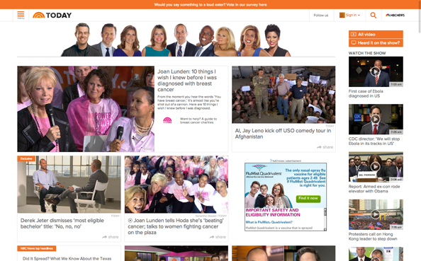
Today.com has been tweaked a bit.
The new page moves what was a prominent feature of the the old layout — a segment-by-segment timeline that gave users instant access to almost every story and topic discussed on the broadcast version of the “Today Show.”
In the new design, this timeline now runs down the right side of the page. This new location isn’t quite as effective as the old location and doesn’t “read” as a timeline as well — so it’s easy to think, at first glance, that those boxes are just more stories. One change that could help make this better would be to boost the size of the small timestamps.
The site’s section fronts and story pages have also seen some subtle changes — mainly the removable of shadow effects and a general “clean up” of extra clutter.
Meanwhile, the site has retained is block-style layout, but simplified outlines. Also retained is the massive “happy family” photo of the ever-expanding “Today Show” cast running across the top of the page — but the banner is still glaringly Photoshopped together from different sources. You’d think NBC could spring for a single photoshoot for all of its talent (though, with nine hosts who seem to be on a dizzying, ever-rotating schedule of vacations, days off and on location assignments, maybe this just isn’t possible logistically).
These changes follow a slew of changes at the show’s parent website, NBCNews.com.
Subscribe to NewscastStudio for the latest news, project case studies and product announcements in broadcast technology, creative design and engineering delivered to your inbox.

tags
NBC News, nbcnews.com, Today, Today Show, today.com, website
categories
Featured, Networks, Online and Digital Production