A look back at the ‘Washington Week’ broadcast design over the years
Weekly insights on the technology, production and business decisions shaping media and broadcast. Free to access. Independent coverage. Unsubscribe anytime.
As PBS’s “Washington Week” settles into a new set, here’s a look back at some of the show’s previous broadcast designs.
The show’s overhaul includes a new logo, graphics and music as well as a new set.
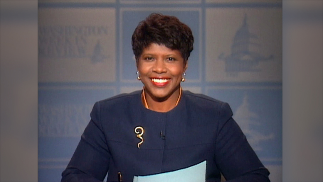
Dating back to when the late Gwen Ifill moderated the show, the show, then known as “Washington Week In Review,” used a light blue and white checkered background, with each square featuring a different Washington, D.C. or political icon.

tags
PBS, Washington Week with The Atlantic
categories
Broadcast Design, Broadcast Industry News, Featured, Set Design