
‘Washington Week’ overhauls logo, graphics and music
Weekly insights on the technology, production and business decisions shaping media and broadcast. Free to access. Independent coverage. Unsubscribe anytime.
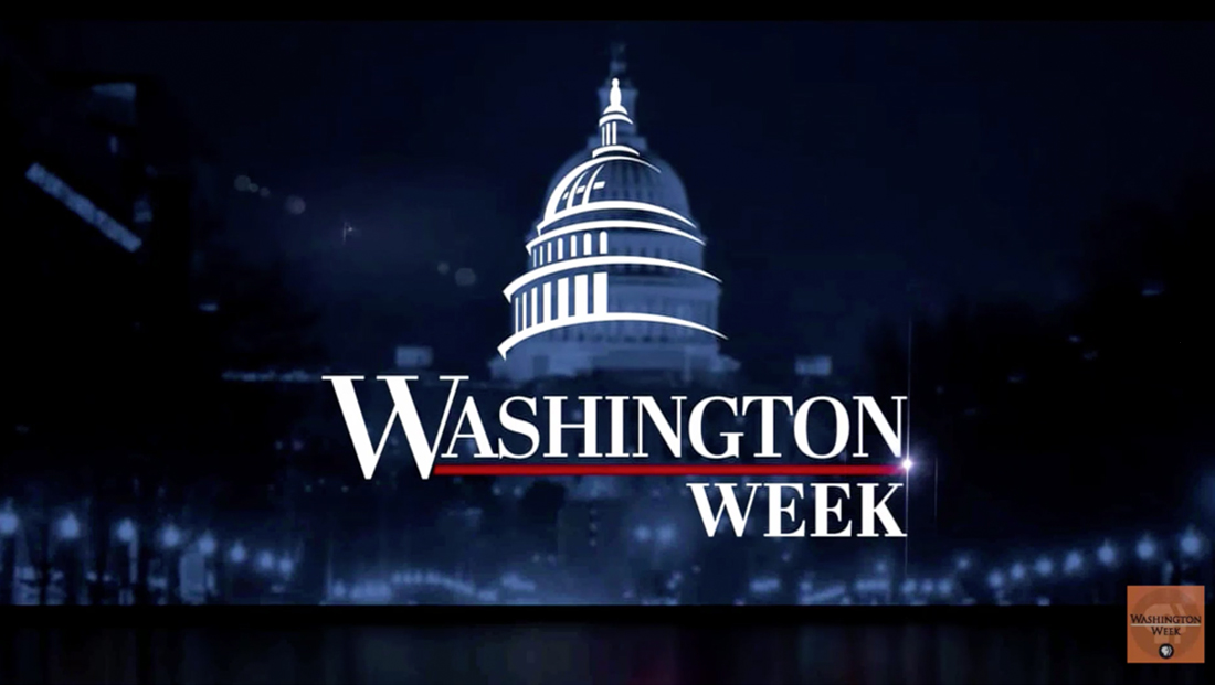
In addition to debuting a new set, PBS’s “Washington Week” also bowed a new logo, graphics package and musical theme last week.
The new logo places the word “Washington” in slightly larger type above the word “Week,” which is placed on the right side in the logotype which uses the Bodini-esque font Abril Display.
The first “W” in the design is displayed in “drop cap” style.
A red line separates the two tiers of text, which serves as the “path” for a burst of light in animated versions, including the show’s new title card.
The title card also features a deep blue tinted background that depicts a blurred view of a street leading up to the Capitol. Part of the Capitol dome is visible on screen, but roughly half of it is covered by an illustrated icon that uses bold, sharp strokes.

tags
FF DIN, PBS, Stephen Arnold Music, Ultra Graphics Design Studio, Washington Week with The Atlantic, weta
categories
Broadcast Design, Featured, Graphics, Theme Music, TV News Graphics Design, TV News Music