
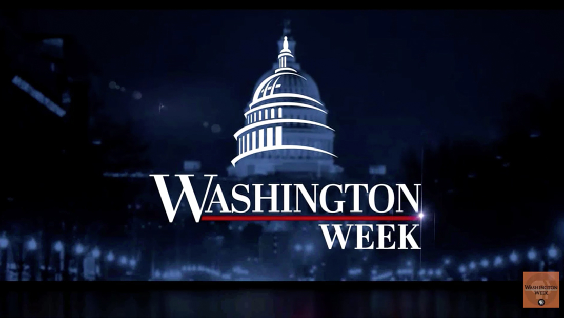
‘Washington Week’ overhauls logo, graphics and music
Weekly insights on the technology, production and business decisions shaping media and broadcast. Free to access. Independent coverage. Unsubscribe anytime.
In addition to the logo update, the show also switched to new graphics from James Jackson of Ultra Graphics Design Studio.
The new logotype is parked in the lower left of the screen during most of the show.
When lower thirds are inserted, the logotype gets a dark blue background that also boasts the Capitol dome icon.
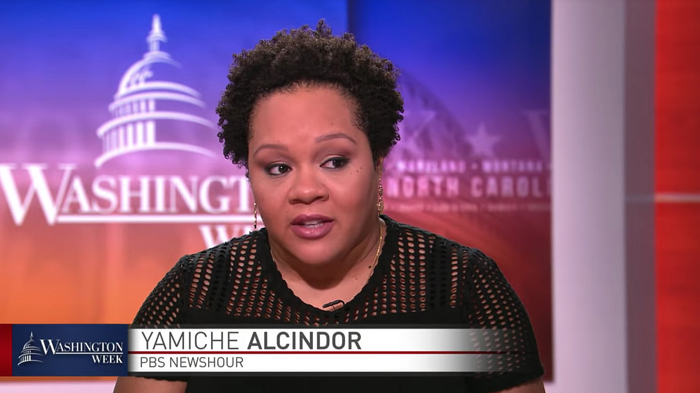
To the right, a white gradient divided by a red line features two tiers of text set in FF DIN serves as the lower third insert graphics.
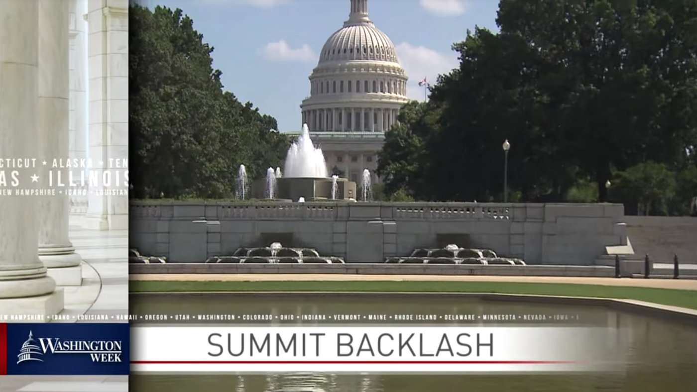
The show’s extended open, which previews the topics of conversation, features an L-bar graphic that covers the left and lower portion of the screen.

Another prominent element is ticker-style text of state names, which is featured alongside imagery of columns and white gradient banners.
Other elements include large, masked “W” shapes that are used as a wipe — along with layered square photography with the state name microtext.
Notably, the show open no longer introduces the weekly panelist members, who are mainly journalists covering Washington, D.C.
The show also updated its music featuring a custom sound from Stephen Arnold Music with a subtle bed used during the teases and a hard hitting signature as the show’s logo appears.
“The team at WETA/PBS had a clear and distinctive vision for the direction of the new sound – music that would carry forth the journalistic integrity and mission of the program, but with a modern, energetic, clean and forward-looking sensibility,” notes Chad Cook, Stephen Arnold Music’s VP/Creative, about the new theme.
“It was a true privilege for Stephen Arnold Music to compose a new sonic brand and custom music package for Washington Week, such an iconic and venerable program that has been on the air for 50 years now.”

tags
FF DIN, PBS, Stephen Arnold Music, Ultra Graphics Design Studio, Washington Week with The Atlantic, weta
categories
Broadcast Design, Featured, Graphics, Theme Music, TV News Graphics Design, TV News Music