
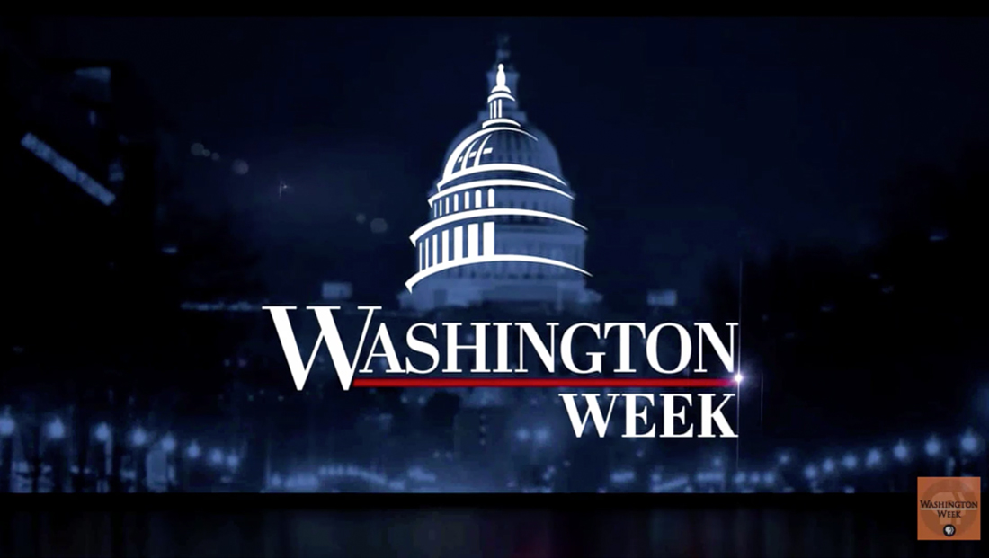
‘Washington Week’ overhauls logo, graphics and music
Subscribe to NCS for the latest news, project case studies and product announcements in broadcast technology, creative design and engineering delivered to your inbox.
The show previously used a straightforward logotype in Trajan along with blue and orange graphics, though a different logo, shown at the top of the image below, is used online.
Oddly, this logotype design was used concurrently with the other look — but appears to be restricted to social media and the show’s website.
As of this writing, the show’s social media accounts still use this version of the logo and imagery of the old set.
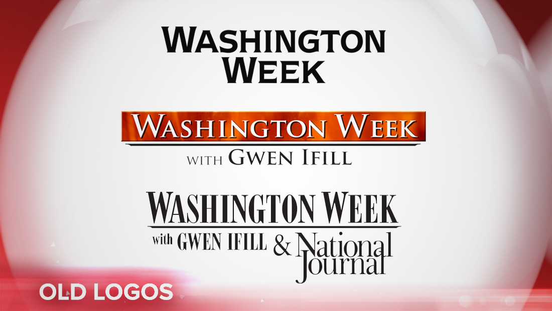
The show, which has been through a myriad of looks over the years, previously used a Bodoni-like typeface during the late Gwen Ifill’s tenure as moderator.
The new look sheds the color orange — which moderator Robert Costa noted was a prominent part of the show’s old set.
Previously, the “Washington Week” sound featured strong horns, while the new SAM theme mixes a driving beat with jazz elements.

Subscribe to NCS for the latest news, project case studies and product announcements in broadcast technology, creative design and engineering delivered to your inbox.

tags
FF DIN, PBS, Stephen Arnold Music, Ultra Graphics Design Studio, Washington Week with The Atlantic, weta
categories
Broadcast Design, Featured, Graphics, Theme Music, TV News Graphics Design, TV News Music