NBC unveils Tokyo Olympics logo design

Subscribe to NewscastStudio for the latest news, project case studies and product announcements in broadcast technology, creative design and engineering delivered to your inbox.

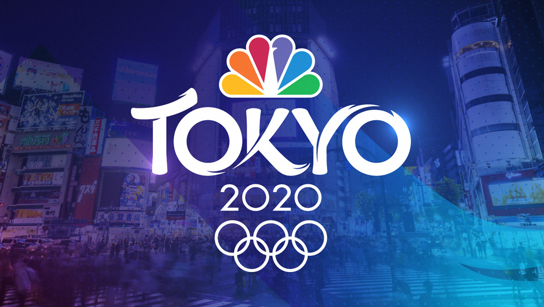
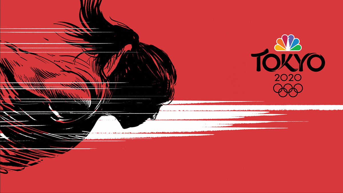
NBC also released imagery that combines both photographic backgrounds with textural dots and oversized letterforms, as well as line-art style illustrations with textured and sharp edges that tie into the flairs in the logo design.
The Tokyo 2020 logo will be embedded within thousands of hours of linear and digital coverage as well as a consumer engagement campaign that will begin more than a year before the Opening Ceremony.
“Our branding goal was to develop a logo that honored the rich culture of Japan, while also exploring the vibrant union of art, technology, fashion and pop culture that defines Tokyo today,” said David Barton, art director, NBC Olympics in a statement. “The design of the word ‘Tokyo’ is bold and fluid, illustrating with each character the dynamic movement of an Olympic athlete with a subtle reference to the distinct line forms of the Japanese written language.”
The “T” in the design could be read as a subtle reference to a traditional pagoda roofline, while the flourishes draw from Japan’s artistic history.
“This will be our most versatile Olympic logo ever,” said Mark Levy, SVP, original content and creative, NBC Sports Group. “From 60-inch television screens to mobile phones, from billboards to apparel, the logo needs to stimulate an emotional response with consumers no matter where they see it, and they are engaging with brands in more places than ever before.”
NBC Olympics’ Tokyo 2020 logo was created in association with Los Angeles branding firm Mocean.
Subscribe to NewscastStudio for the latest news, project case studies and product announcements in broadcast technology, creative design and engineering delivered to your inbox.


tags
2020 Summer Olympics, david barton, logo design, Mark Levy, Mocean, NBC, NBC Olympics, Tokyo
categories
Branding, Broadcast Design, Broadcast Industry News, Graphics, Heroes, Olympics