
The Facebook ‘aging challenge’: TV station logo edition
Weekly insights on the technology, production and business decisions shaping media and broadcast. Free to access. Independent coverage. Unsubscribe anytime.
For WESH in Orlando, Florida, which hasn’t changed logos, the challenge shows two different changes: The trend of “HD” branding and the station’s switchover to a new group graphics package.
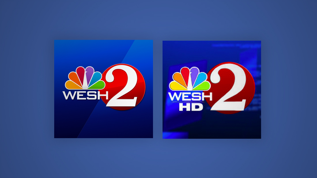
The station’s oldest logo from 2010 looks very much like today’s — though with the letters “HD” added and a different, albeit similarly colored, background.
Back in 2010, TV stations were in the midst of the conversion to digital television and high definition broadcasting, and it quickly became popular to add “HD”-related labels to logos as well as the station’s on air branding.
The more recent version of WESH’s profile photo, meanwhile, features a diagonal line and gloss effect on the red circle behind the “2,” both inspired by the station’s “diagrid” graphics package, that most of its sister Hearst stations use.
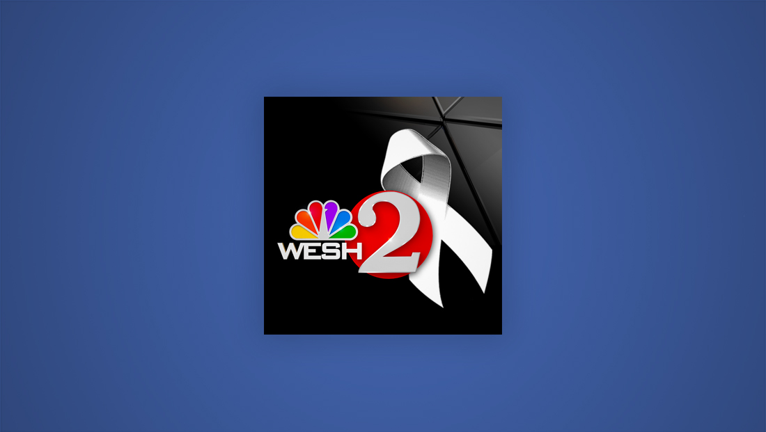
WESH’s profile photo was changed in June 2016 after the Pulse Nightclub shooting, when the background was changed to black and a white ribbon was added.
It’s not uncommon for stations to change social icons after a local natural disaster or mass casualty event — either with honorarium ribbons or messages of support or unity.


tags
Chicago, Facebook, KWTV, logo design, new york, oklahoma city, orlando, wesh, wls, WNBC, wncn
categories
Branding, Broadcast Design, Broadcast Industry News, Featured, Local News