
How Facebook’s new logo design affects broadcasters
Weekly insights on the technology, production and business decisions shaping media and broadcast. Free to access. Independent coverage. Unsubscribe anytime.
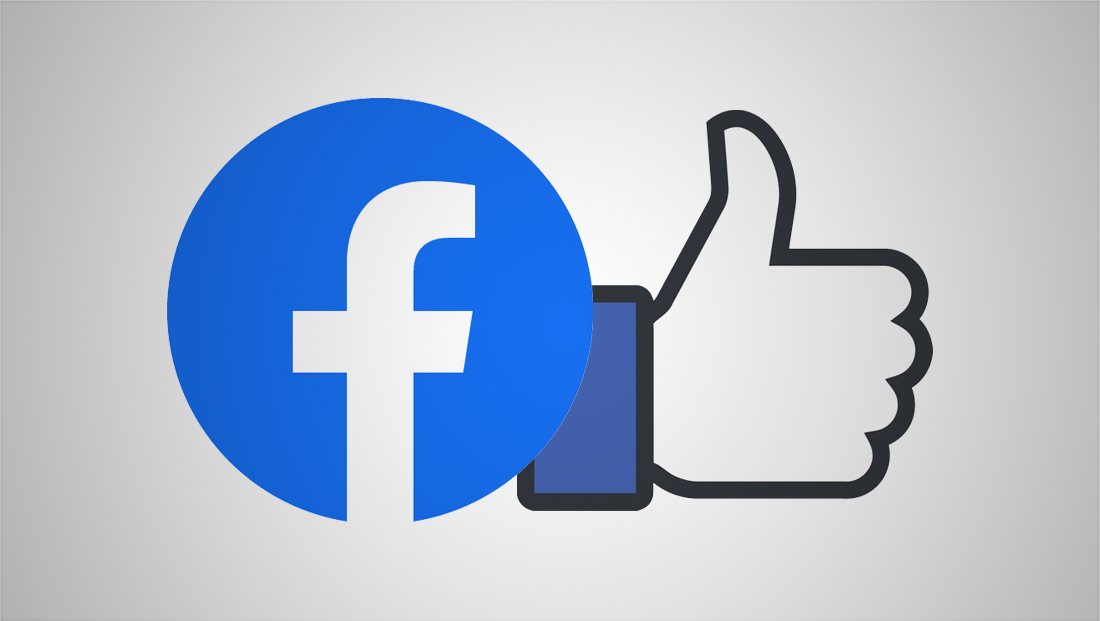
Facebook has also refined the guidelines for Facebook Live and Facebook Watch.
What this means:
- The Facebook Live logo, with the bright red box for the word “live” has been updated with the new circle icon and blue color.
- Facebook Watch uses a different logo. Facebook Watch has several sub-brands, including “Partners & Creators,” “Sports Partnerships” and “Funded News,” but the base logo is the same for all of these.
- These logos should be used only when referring specifically to the service.
Facebook has continued to offer separate logo designs for each of its services, such as Messenger, Instagram, WhatsApp and Oculus. As of now, none of these logos have changed and should continued to be used where appropriate.
Finally, the switch to a circular icon appears to cement Facebook’s use of the circle as a visual element — with its profile photos for both personal pages and business or brand pages using this shape for some time now.
If you haven’t already, it’s also a good time to update your avatar image to fit in the circular footprint — which can also likely be used on other social media platforms as well.
Facebook’s “f” logo and full logotype are customized versions of Freight Sans Pro.
What this means:
- The old logotype font Klavika, should no longer be used.
- You should never just type the “f” or word “Facebook” using the font as a way to attempt to recreate the logo. There have been spacing and other adjustments made to the design that mean this won’t match exactly.
- If Freight Sans Pro is not available, Facebook suggests San Fransisco for in its iOS apps or Roboto for Andorid ones. Helvetica should be used for most web applications.


tags
Branding, Facebook, instagram, logo design, Messenger, Oculus, WhatsApp
categories
Broadcast Design, Broadcast Industry News, Featured