
How Facebook’s new logo design affects broadcasters
Weekly insights on the technology, production and business decisions shaping media and broadcast. Free to access. Independent coverage. Unsubscribe anytime.
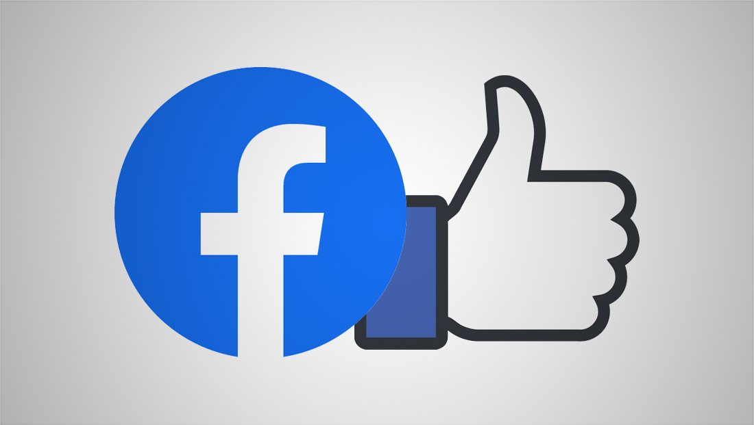
Facebook still allows the use of the iconic “thumbs up” icon “to represent the concept of ‘liking’ something on Facebook.”
What this means:
- “Only use the Thumb Icon with a clear written call to action (for example: “Like us on Facebook”, “Install our app on Facebook”, “For use with Facebook”) to reference your Facebook presence,” reads the brand standards.
- Facebook says no other icons should be used when the thumb icon is used.
- Don’t substitute the Thumb Icon for the word “like” in text.
- There are distinct versions of the “thumbs up” icon that are provided by Facebook (such as with “like” buttons) or in apps or part of its “reactions” that include “like” and “love” and these should not be changed.
- The cuff should always remained attached to the hand — and, when used as a “reaction” or icon, the background color should remain the brighter blue shade Facebook calls “reaction blue.”
When Facebook originally announced the new logo in April 2019, it said it would still use the full logotype of its name (what it refers to as its “wordmark”) — however, it should only be used when referring to the company as a whole, but this has since changed.
Facebook the company (not the app) gets a new logo https://t.co/2ei9AH9Bwj #LogoDesign
— LogoDesignMix (@LogoDesignMix) November 4, 2019
“It is not interchangeable with the “f” Logo or ever used to represent facebook.com or the Facebook mobile app,” reads the company’s updated brand standards.
![]()

However, on Nov. 4, 2019, Facebook announced a redesigned corporate logo to further make the company itself stand out better.
As part of the Nov. 4 updates, the company also added an “FB” version of its logotype, as explained in a design blog post.
What this means:
- Most likely, if you’re creating a graphic that relates to, for example, Facebook Inc.’s financial results, then the Nov. 4 wordmark would be appropriate to use.
- To save space you can also use the new “FB” logotype when referring to the company.
- However, if a graphic is focused on the Facebook’s core social media service, facebook.com or mobile apps, then the “f” icon should likely be used instead. However, it appears that with the Nov. 4 updates, Facebook is saying you can also use the full Facebook app logotype as well (but not the corporate logo or “FB” logo).
- It’s also worth noting the icon or “FB” is much less complex and therefore easier to display prominently at many sizes ranging from tickers to video wall graphics and OTSs.
The new logo can be downloaded here.

tags
Branding, Facebook, instagram, logo design, Messenger, Oculus, WhatsApp
categories
Broadcast Design, Broadcast Industry News, Featured