
Raleigh’s WRAL debuts new graphics package that blends flat, 3D looks
Weekly insights on the technology, production and business decisions shaping media and broadcast. Free to access. Independent coverage. Unsubscribe anytime.
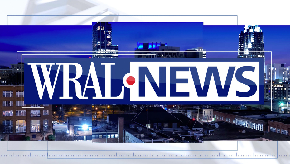
WRAL in Raleigh, North Carolina, debuted a new graphics package in late April 2021 that manages to find middle ground between the trendy flat approach and the highly 3D and glassy look that much of the industry is shifting toward.
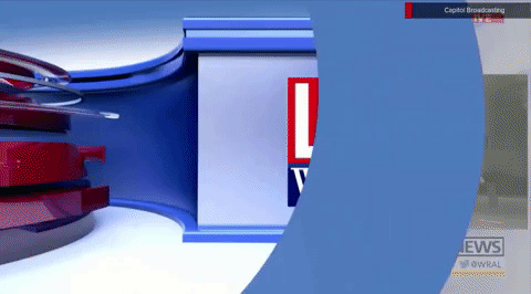
The new look is features backgrounds with oversized, 3D versions of the station’s “WRAL News” logotype that move past the viewport at a variety of angles.
While the logo is rendered with multiple heavy bevels and reflection effects, it’s not done in the super-glassy or metallic look found in many news graphic packages.
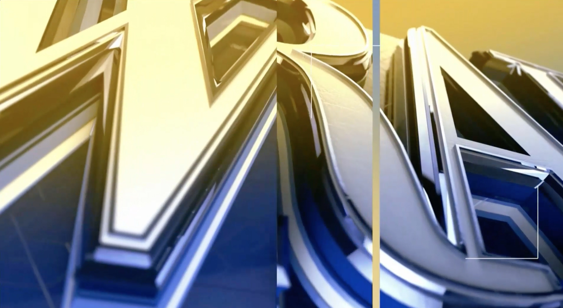
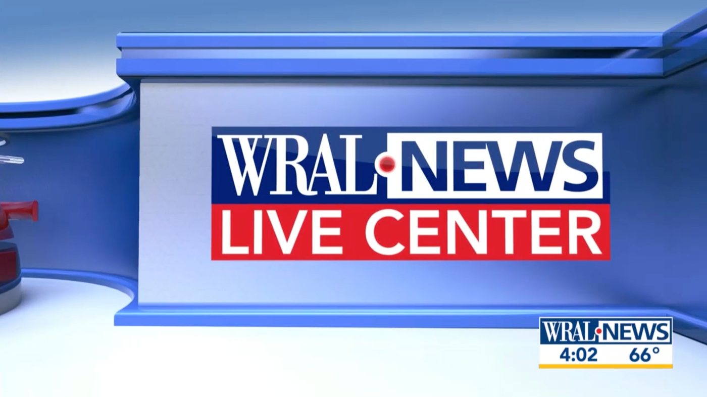
In this freeze frame of the morning news open, the oversized ‘WRAL’ logotype in a serif font is shown with its multiple beveled edges but somewhat dull surface that still manages to interact with light. Also visible in a yellow bar that’s part of the wipes between the brief parts of the open.
Backgrounds have largely shed the blue and gold light washes used before, though color is still used for select dayparts, such as the brighter yellow shown here for the morning newscasts.
Meanwhile, the sans serif ‘News’ is has a small metal ‘railing’ around the edge of each letter. Additional thin box accents and the glassy red dot are also shown.
Drawing on the rectangular news logotype lockup, the graphics package also incorporates segmented block wipe elements and facets as well as thin animated rectangle and hashmark accents, particularly in the opens.
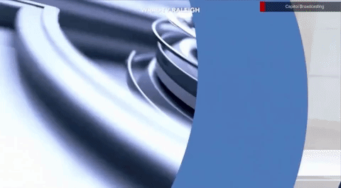
The red circle, meanwhile, becomes a key visual element of the new look, especially in the opens when it becomes, quite literally, the focal point where the logo enters the screen and then a dramatic wipe to video when the shiny orb flies toward the viewer.
In animated form, the red dot becomes one of the package’s most glassy elements — and is often shown, especially when used as a wipe or transition, as having centric ring segments.

The package’s stingers take viewers “inside” the logo, with a 3D space that imagines the logotype as having “valleys” and a vantage of being to the left of the “News” looking toward the red dot and blue box that curves around it.
Radiating rings wipes are also incorporated into many of these stingers and transitions, which are used for weather and other franchise stings as well as transitions to live shots.
This allows the red dot to sit off to the side for a cohesive look while the straight surface of the “side” of the box (which, in this imagery 3D world, would be the part to the right of the upper part of the “L”) serves as a “wall” for text or franchise logos.
The shape and concentric elements of the circle can also be found in backgrounds and as “frames” for pre-show teases and other applications.
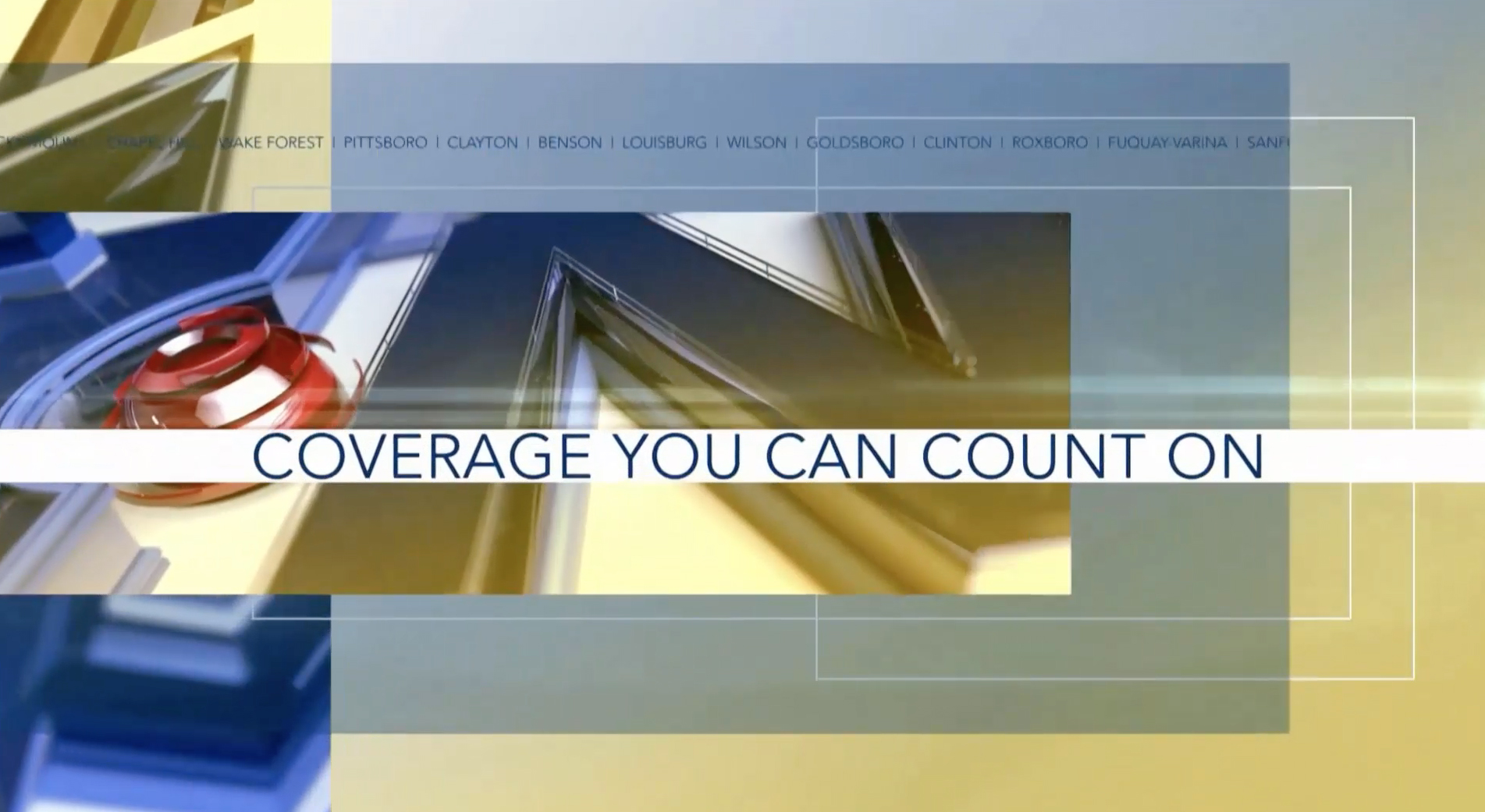
Another common theme is the use of widely spaced microtext elements, including in both insert and fullscreen graphics as well as video wall graphics. In most cases, however, the design eschews cluttering the look with too many letters, often only having a key phrase or branding element repeat a handful of times on a single line — and retaining the generous spacing.
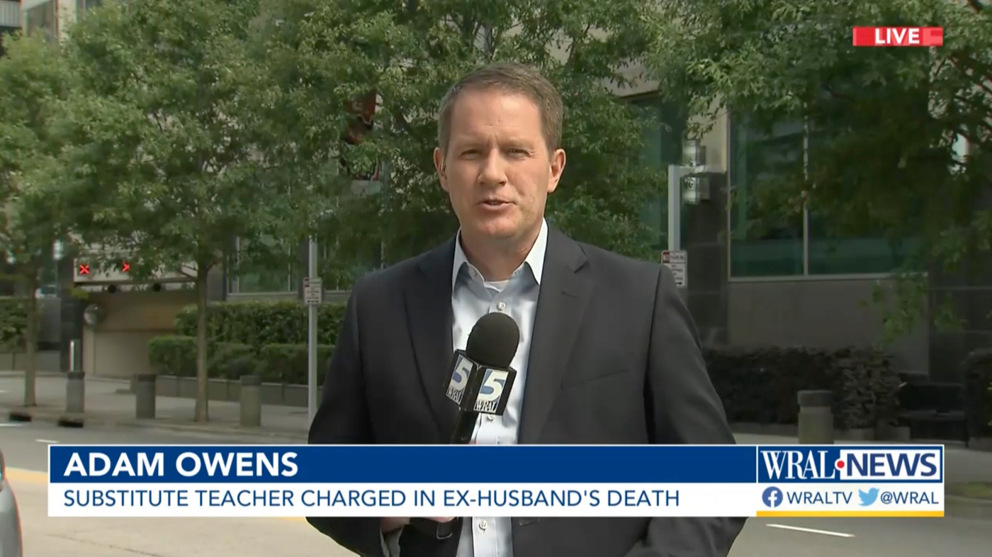
Lower third banners are simple, decidedly more flat and draw on the use of thin rectangular boxes found in the open.
As part of the new lower thirds, the station’s news branding appears in the lower right of the screen, with the option for a time and temp bug and social media icons below.
Lower thirds themselves can be one, two or three tiers and animation allows the station to switch the words and size cleanly on air.
Prior to the redesign, the station used clean horizontal bands for its lower thirds that were similar in many ways, but without the border accents and a slight space between them and the bug.
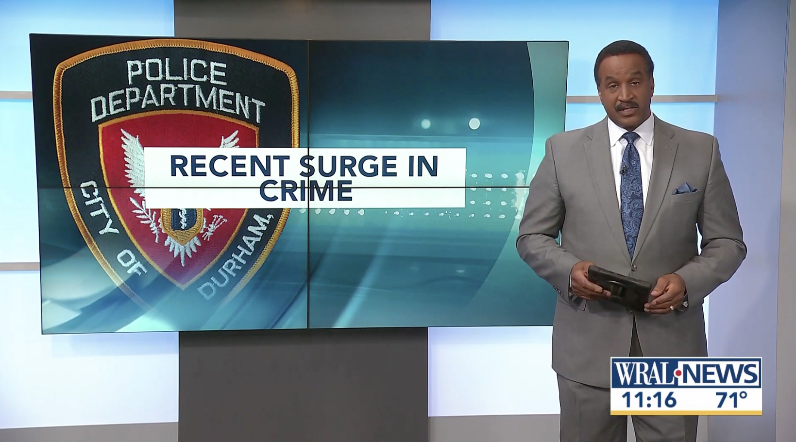
WRAL’s set has a variety of video walls, thanks to the new studio that debuted in November 2019 from FX Design Group and the station uses them generously for topical graphics, maps, charts, video clips and even radar loops that anchors can interact with. However, for more simple applications, the station uses a clean look with a concentric ring background, topical imagery and a title in a box that’s centered both horizontally and vertically in the middle of the graphic. Similar layouts can also be used above two shots at the anchor desk.

tags
raleigh, wral
categories
Branding, Broadcast Design, Broadcast Industry News, Featured, Graphics, TV News Graphics Package, Video Wall Graphics